The border-color property accepts the colors in multiple trends such as the exact name of the colors, a hexadecimal representation of the color, and the RGB/RGBA representations.
This article provides the possible ways to set the border-color property of an HTML element.
How border-color property works in CSS
An element is surrounded by four borders, top, bottom, lower and upper. The border-color property in CSS follows the syntax provided below:
The border-color keyword remains the same whereas the value depends on the user requirement and it can be the exact color name, hexadecimal value of color, or RGB/RGBA combination.
How to use border-color property in CSS
This section comprises of several scenarios to apply border-color property in CSS.
Example 1: Using the RGB combination
In computing, the RGB (Red Green Blue) is the widely used standard when going through color management. The value of R, G, and B varies from 0 to 255 and each combination of values returns a different color.
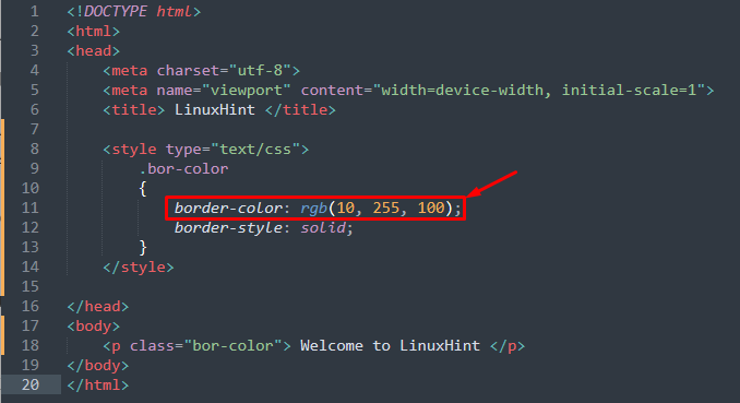
For instance, the following HTML code practices the internal CSS class to set the border color.
<html>
<head>
<meta charset="utf-8">
<meta name="viewport" content="width=device-width, initial-scale=1">
<title> LinuxHint </title>
<style type="text/css">
.bor-color
{
border-color: rgb(10, 255, 100);
border-style: solid;
}
</style>
</head>
<body>
<p class="bor-color"> Welcome to LinuxHint </p>
</body>
</html>
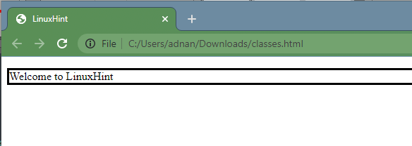
The image of the above code is provided below:
Output:
Example 2: Using RGBA combination
The RGBA(Red, Green, Blue, Alpha) is an extension of RGB, and the Alpha represents the transparency of the color. The Alpha value ranges from 0.0 to 1.0 (0.0 is the least transparent and 1.0 is the most transparent). The code provided below practices the internal CSS to apply RGBA:
<html>
<head>
<meta charset="utf-8">
<meta name="viewport" content="width=device-width, initial-scale=1">
<title> LinuxHint </title>
<style type="text/css">
.bor-color
{
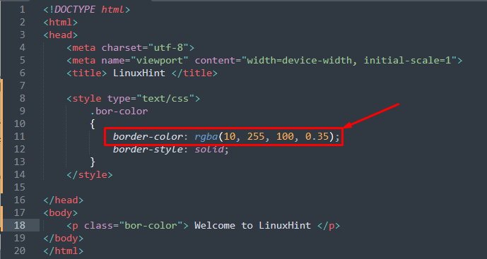
border-color: rgba(10, 255, 100, 0.35);
border-style: solid;
}
</style>
</head>
<body>
<p class="bor-color"> Welcome to LinuxHint </p>
</body>
</html>
A CSS class is created named “bor-color” that contains the border color property. This class is then used in the paragraph element of body.
Output:
Example 3: Using the name of a color
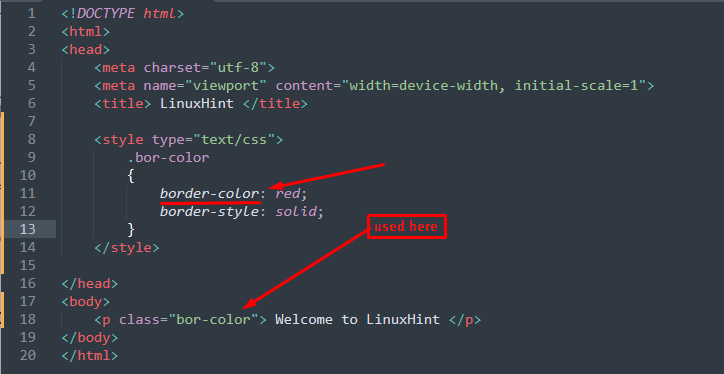
The exact color name can be used for specifying the border color as illustrated in the following code
<html>
<head>
<meta charset="utf-8">
<meta name="viewport" content="width=device-width, initial-scale=1">
<title> LinuxHint </title>
<style type="text/css">
.bor-color
{
border-color: red;
border-style: solid;
}
</style>
</head>
<body>
<p class="bor-color"> Welcome to LinuxHint </p>
</body>
</html>
The above HTML code contains,
- a style tag to add a CSS class named “bor-col” to set border-color
- and a paragraph is created that is associated with the CSS class
Output:
Example 4: Using HEX value of the color
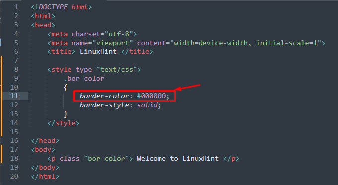
The hexadecimal value of a color can also be used for the border color. The following code practices the hexadecimal code of black color to use it for the border color:
<html>
<head>
<meta charset="utf-8">
<meta name="viewport" content="width=device-width, initial-scale=1">
<title> LinuxHint </title>
<style type="text/css">
.bor-color
{
border-color: #000000;
border-style: solid;
}
</style>
</head>
<body>
<p class="bor-color"> Welcome to LinuxHint </p>
</body>
</html>
A CSS class is defined in the above code to set the border-color in hexadecimal format and a paragraph is created to use that CSS class.
Output:
Example 5: Using border-color property on individual borders
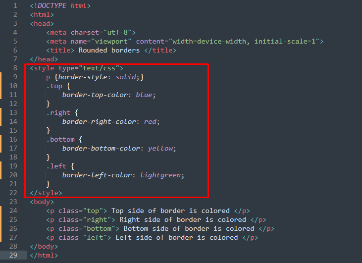
The border-color property is subdivided into border-bottom-color, border-right-color, border-top-color, and border-left-color to color the border sides. The following code is practiced to give colors to border sides individually.
<html>
<head>
<meta charset="utf-8">
<meta name="viewport" content="width=device-width, initial-scale=1">
<title> Rounded borders </title>
</head>
<style type="text/css">
p {border-style: solid;}
.top {
border-top-color: blue;
}
.right {
border-right-color: red;
}
.bottom {
border-bottom-color: yellow;
}
.left {
border-left-color: lightgreen;
}
</style>
<body>
<p class="top"> Top side of border is colored </p>
<p class="right"> Right side of border is colored </p>
<p class="bottom"> Bottom side of border is colored </p>
<p class="left"> Left side of border is colored </p>
</body>
</html>
In the above-written code,
- four CSS classes are created named as “top”, “right”, “bottom”, and “left” that are used to apply “border-top-color”, “border-right-color”, “border-bottom-color”, and “border-left-color”.
- the paragraph’s borders are styled solid
- four paragraphs are created and each contains a CSS class
Output:
Conclusion
The border-color property of the CSS enables changes in the border color according to the requirements. This descriptive post provides the demonstration of using the border-color property in CSS to change the color of the border. There are numerous ways to do so, the border-color property accepts the colors in multiple trends such as the exact name of the color, a hexadecimal representation of the color, and the RGB/RGBA representations. At the end, you would have learned the application of border-color property in CSS by exploring multiple scenarios stated in this guide.

