Is There a Way to Apply Styles to Safari Only?
There are multiple ways to restrict styles that will apply only to Safari browsers. By using the “::i-block-chrome” users restrict Chrome to get styles and work for Safari. Or the usage of specific code to apply styles only to Safari.
Follow the below demonstration to apply designs only on the Safari browser:
Step 1: Create a Div in the HTML File
Create the div on which styling is going to appear and then assign the class:
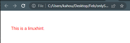
<p>This is a linuxhint.</p>
</div>
Step 2: Add Styling
To add style, “@media screen” is used to display different graphics or CSS properties when screen size changes. The “-webkit-min-device-pixel-ratio:0” is a Boolean media feature that is not standard. After that, assign color property to “myClass”:
{
.myClass
{
color:red;
}
}
Our webpage looks like this on Chrome and Safari as well:
Step 3: Add CSS Properties for Safari
The “::i-block-chrome” part blocks CSS properties to work on Chrome and makes it work for Safari. For the sake of an example, change the text color from red to blue:
{
.myClass
{
color:red;
}
::i-block-chrome,.myClass
{
color:blue;
}
}
After adding this, the webpage looks like this on Chrome and Safari:
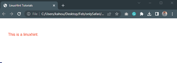
The above output shows the same “<p>” tag with the class “myClass” getting different colors on the Safari browser.
Bonus Tip: For the Older Version of Safari
Users can change “Step 3” according to their Safari browser version. Some of the version-specific codes are written below along with the version range:
Safari 10.1+
If the browser version has a range of 6.1 to 10.1. Then, this code sets the value of “Large” for the CSS “font-size” property and it appear only appear on Safari:
//Setting Media query targeting devices with a minimum resolution of 0.001 dots per centimeter.
{
@media
{
.safari_only
{
font-size: large; }
}
}
If this does not work then try to use below alternative code:
{
@supports (-webkit-appearance:none)
{ .safari_only
{ font-size: large; }
}
}
Safari 11+
The code below works perfectly well for the version over version 11.0. It does not work perfectly well on other browser versions:
{
@supports (-webkit-appearance:none) and (stroke-color:transparent)
{
.safari_only { font-size: large;}
}
}
Conclusion
The CSS styles can be applied only for the Safari browser by utilizing the code in “@media” queries. There are different sorts of codes for different versions of Safari browser. Users must pick a code that runs perfectly for the browser according to the browser version. That is how the styles can apply to safari only.