“Tailwind Breakpoints” are the essential components of the responsive design that controls the layout while adapting to the specific device size or the viewport. The “Media Queries”, however, apply styles conditionally based on the browser parameters. The “Media Queries” are mostly used in designing the architecture of the CSS by breakpoints. “Tailwind CSS” framework uses responsive breakpoints alongside the Tailwind elements that can be customized by applying its built-in “aspect ratio” utilities.
This article elaborates on the complete procedure to apply the “Aspect Ratio” in “Tailwind Breakpoints and Media Queries”.
How to Apply “Aspect Ratio” in Tailwind Breakpoints and Media Queries?
To apply the “Aspect Ratio” in Tailwind Breakpoints and Media Queries, use the Tailwind built-in “aspect ratio utilities”. These help to control the aspect ratio of the specified HTML element.
Follow the given steps to apply the “aspect ratio” in Tailwind Breakpoints and Media Queries.
Prerequisites
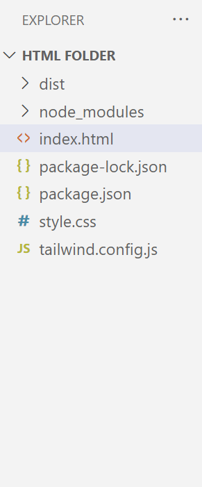
Before moving on to the practical implementation, first, create a Tailwind project with the following mandatory files. In this case, a project named “Linuxhint” is created that is used for applying the “Aspect Ratio” in “Tailwind Breakpoints and Media Queries”:
Project File Structure
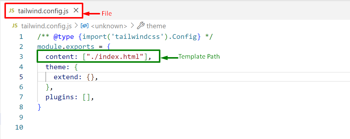
Step 1: Configure the Template Path
Firstly, configure the created HTML file path in the Tailwind “tailwind.config.js” configuration file “content” section:
Press “Ctrl+S” to save the file.
Step 2: Write the HTML Code
Next, write the simple HTML code in the “index.html” file present in the “Linuxhint” project directory and use the “aspect ratio” utilities with breakpoints:
In the above code lines:
- The “<link>” tag specifies the link of the created/compiled CSS file “/dist/output.css” to link it with the existing HTML file “index.html”.
- The “body” section defines “<h1>” element that uses the following Tailwind classes i.e., “Text Decoration” to underline the text, “Font Size” to enlarge the text, “Font Weight” to bold, “Text Align” to set the content in “center”, and the “Text Color” to apply specified color, respectively.
- After that, an “<iframe>” tag specifies a frame element that utilizes the “horizontal margin (mx)”, “Border Width” and “Border Color” Tailwind classes.
- Also, define the “aspect:square” ratio with the “lg” breakpoints to apply the “aspect-square” utility only for large screen sizes and above.
Step 3: Output
The output shows that upon resizing the browser screen up to “lg:1024px” and above, the given frame aspect ratio converts to the “aspect:square(1/1)” as defined in the code.
Conclusion
Tailwind offers the built-in “aspect:auto”, “aspect:square”, and the “aspect:video” utilities to apply the corresponding aspect ratio in Tailwind Breakpoints with media queries. It helps in providing the desired aspect ratio of the HTML element. This article demonstrated the complete procedure to apply the aspect ratio in Tailwind Breakpoints and Media Queries.


