Example # 1
To create the animated cursor, we are using HTML, CSS, and JavaScript in this code. First, we must make the HTML file in visual studio code. You can use any editor of your choice. Here, we are using visual studio code. We select the language for the HTML code as “HTML”. And then write the code here. We also provide the code for the animated cursor in this example. You can use this code for making the animated cursor. Now, get started with the HTML code.
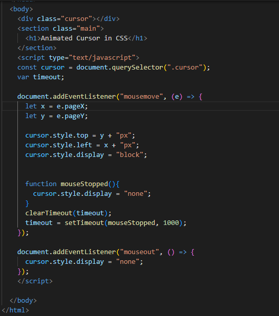
We create the “div” class “cursor” and a “section” class named “main” inside the “div”. Then, we create the following heading, our heading 1, and close the “section” tag here. Next, we are using “javascript” in this “HTML” file. We use the “script” tag, and in its type, we give the name of the “javascript”, which is “text/javascript”. With this, we define the “const” cursor and use the “query. selector”. The “query. selector” is used for returning the element, “document”, that will match the selector, and this selector is “cursor”.
Now, we are using “var” and named it “timeout”. Then comes the “addEventLisner” method. It will attach an event handler to the element that we specify here. The event here is the “mousemove”, which attaches to the “document” element. We are using “let” to declare a variable “x” and initialize it with “e.pageX”. The “pageX” property will return the cursor’s horizontal axis when the cursor event is triggered. And the “y” variable with the same “let” data type, initialize this “y” with “e.pageY”. The “pageY” property will return the cursor’s vertical axis when the cursor event is triggered. Also, set the “cursor. style” to “top”, “left”, and “display”.
After this, we use the “function mouseStopped”, so when this function calls, it will display “none”. Then, we are using the “clear TimeOut” function and pass “timeout” as a parameter and set this “timeout” below. We again use “addEvenetLisner” and close the “script” tag here. These are all about “HTMLhtml” and “javascript”. Now, we are going to use CSS for styling.
CSS Code
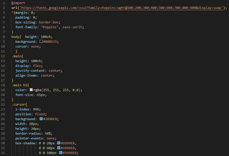
In the CSS, we import the “URL” and use the “*” selector, which is used for selecting all the elements. We set the “margin” and “padding” inside the “*” selector to “0”. The “box-sizing” we set here is “border-box”, which is used for specifying the behavior of the “width” and “height” and selecting the “font-family”. Then, we use “body” and set the height to “100vh”. The “background” is “black” and sets the “cursor” to “none”.
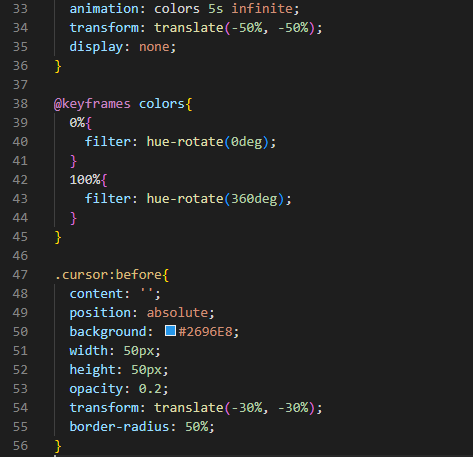
Now, we are styling the “main”, and its height is set as “100vh”. We are using the “flex” display and “justify-content” to the “center”, also “align-item” to the “center”. Apply the “white” color to the “h1” and use the “0.8” alpha value for this. We set the “font size” of this heading to “65px”. Now, set the “z-index” of the “cursor” as “999”. The “position” for this is “fixed” and set as the “background”. The “width” and “height” both are “20px”, and the “border-radius” is “50%”. The “pointer-event” is “none”. The “box-shadow” will add one or more shadows around the frame of elements. We set the “h-offset”, which is the horizontal offset, to “0”, and the “v-offset”, which is the vertical offset, to “0”, and the “blur” is “20px” and “blue”. The same “h-offset” and “v-offset” are in the next two lines but the “blur” value changes in each as “60px” and “100px”.
We use animation for “5s” and the “transform: translate” property here. Also, set its “display” to “none”. Now, keyframes are used for the animation. Also, we are using the “before” selector here and setting the “content” before this. Set the “position” to “absolute” and “background” to “blue”. The “width” and “height” is “50px”. The “opacity” we use is “0.2”, and the “transform-translate” property is here. The “border-radius” is “50%”.
Output
Example # 2
In this example, we create the external JavaScript file and link this file to our HTML file and link the CSS file.
We create one “main” class named “bg_canvas” inside this. We have a “div” class “header”. We create the heading in this “div”. The other div name is “cursor”, and, after the second “div”, we close the “main” and link the JavaScript file here. We placed the name of the JavaScript file, “animatedmouse.js”, and closed the “script” tag.
CSS Code
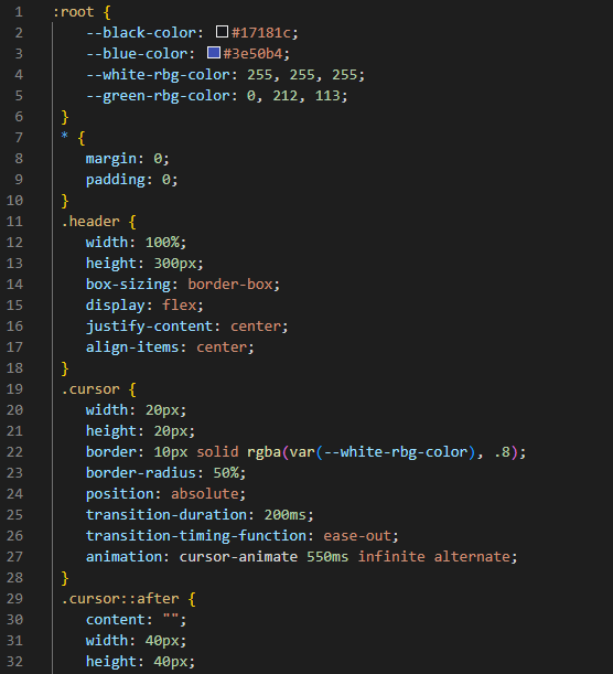
We set the “root”, which selects the root elements in the HTML and sets the “black” color, “blue” color, and “white” color in “rgb” form, and “green” in “rgb”. Then, we use the “*” selector, which selects all the elements, and we do some styling here, which will apply to all “elements”. We just set “margin” and “padding” here to “0”.
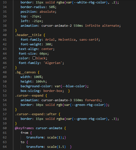
Then, we style the “header”. The header’s “width” and “height” is “100%” and “300px”, respectively. The “box-sizing” is “border-box”, and the “display” is “flex”. We “justify-content” and “align-item” in the “center”. We also style the “cursor” and set the “width” and “height” as “20px” each. We also set the “border” to “10px” width of the “solid” type and set the color of the border. The “transition-duration” we use is “200ms”. We use “animation” and animate the cursor for “550s”. Then, we use the “after” selector with the “cursor” and set the content. We also set “width” and “height” as “40px”, “border” as “15px” in the “solid” type, “border-radius” as “50%”, and “absolute” in “position”. The “top” and “left” is set as “-25px” for each and then use the “animation” property. Now comes the “header-title” and style. We set its “font-family”, and the “weight” of this font is “300”. We align it in the “center”, and “font-size” is “60px”. The “color” is “black” for the font. Now, we will style “bg_canvas”, which is the name of the class “main”. Its “width” is “100%” and “height” is “100vh” and sets its “background-color” and “box-sizing”.
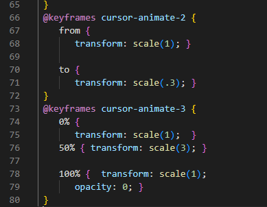
After this, we use “cursor–expand” and the “animation” property. We also set the “border” for this. Then, we use the “after” selector with this “cursor–expand” and set its “border”. Then, we are using the “keyframes” here, which we use for animation, and use the “from” transform scale (1) “to” transform scale (1.5), and the same in the following lines:
JavaScript Code
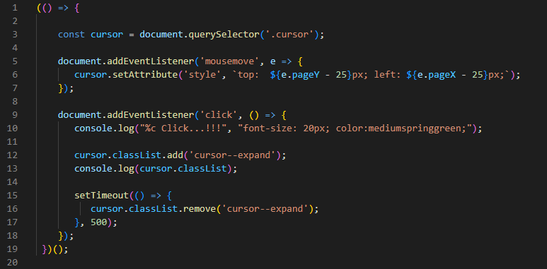
In the following image, this is the JavaScript code. And this code is the same as the previous JavaScript code, which we have explained in our first example. We save the JavaScript file with the “.js” file extension and must link this file with our HTML file.
Output
Conclusion
In this guide, we have discussed the animated cursor in CSS. We have written this article to explain how to make your cursor an animated cursor using CSS. We have used different properties in CSS, and we used the HTML and JavaScript code and have linked these files for making the animated cursor. We have explored two different examples to make the animated cursor of different styles. I hope that after reading this article you will make the animated cursor in your websites to make your website more attractive.

