This write-up will exemplify the method to make columns span in Tailwind CSS.
How to Make Columns Span in Tailwind?
To make the columns span in Tailwind, make an HTML program. Then, utilize the “col-span-<value>” utility and define the columns’ number to span. It is required to define the number of columns each specific element should span. Finally, view the changes on the HTML web page for verification.
Check out the following steps for practical implementation:
Step 1: Make Column Span in HTML Program
Create an HTML program and use the “col-span-<value>” utilities with the grid items to make a column span. For instance, we have used the “col-span-2” and “col-span-3” utilities as below:
<h1 class="text-2xl text-center">
Tailwind CSS - Spanning Columns
</h1>
<div class="grid grid-cols-3 gap-3 m-3">
<div class="bg-teal-500 p-5">1</div>
<div class="bg-teal-500 p-5">2</div>
<div class="bg-teal-500 p-5">3</div>
<div class="col-span-2 bg-teal-500 p-5">4</div>
<div class="bg-teal-500 p-5">5</div>
<div class="col-span-3 bg-teal-500 p-5">6</div>
</div>
</body>
Here, in the parent <div> element:
- “grid” class is used to create a grid layout.
- “grid-cols-3” class sets the number of columns in the grid to 3.
- “gap-3” class sets a spacing of 3 units between each grid item.
- “m-3” class applies a margin of 3 units around the grid container.
In the child <div> elements:
- “col-span-2” class indicates that the element should span across 2 columns in the grid.
- “col-span-3” class specifies that the element should span across 3 columns in the grid.
- “bg-teal-500” class sets the teal color to the background of the grid item.
- “p-5” class adds a padding of 5 units to the content inside the child
items.
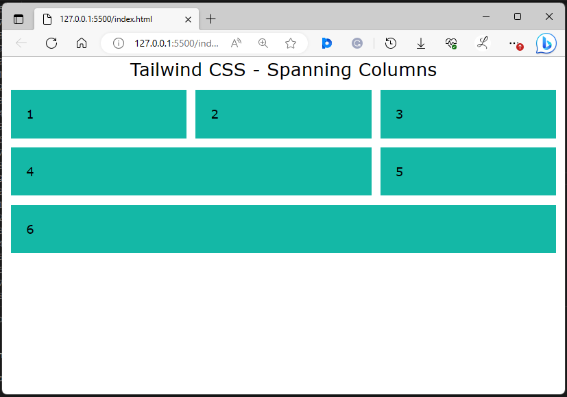
Step 2: Verify Output
To ensure that the column span has been applied or not, view the HTML web page:
In the above output, the column span can be seen according to which it was specified.
Conclusion
To make the columns span in Tailwind, use the “col-span-<value>” utility in the HTML program and specify the number of columns each element should span. For verification, view the changes on the HTML web page. This write-up has exemplified the method to make columns span in Tailwind CSS.
About the author
Laiba Younas
I have done bachelors in Computer Science. Being passionate about learning new technologies, I am interested in exploring different programming languages and sharing my experience with the world.