This article explains the use of “aspect-{ratio}” utilities in Tailwind.
How to Use the “aspect-{ratio}” Utilities in Tailwind?
Tailwind provides three built-in “aspect-{ratio}” utilities including “auto()”, “square(1:1)”, and “video(16:9)” to control the relative horizontal and vertical sizes i.e., an aspect ratio of the specified element. These utilities are useful to set the element at a fixed ratio while resizing the screen.
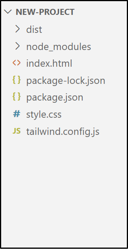
Project File Structure
The project named “New-Project” is taken as a sample having the following mandatory files for building “Tailwind CSS”:
The HTML file “index.html” in the above project is used throughout this write-up to use the Tailwind “aspect:{ratio}” utilities.
This section carries out some examples to explain its usage practically.
Example 1: Use the “aspect-{ratio}” Utilities to Set the Specified Aspect Ratio of an Element
This example applies the “aspect-video” utility to set the given HTML element content at its defined ratio “16:9”.
HTML Code
Overview of the following HTML code:
<link href="/dist/output.css" rel="stylesheet">
</head>
<body>
<h1 class="underline text-3xl font-bold text-center text-orange-600">Welcome to Linuxhint!</h1><br>
<iframe class="w-full aspect-video" src="https://www.youtube.com/embed/CwzcQTGqN6A"
title=" YouTube video player"
frameborder="1"
allow=" accelerometer; autoplay; clipboard-write; encrypted-media; gyroscope; picture-in-picture" allowfullscreen>
</iframe>
<body>
According to the above code snippet:
- The “<link>” tag links the “html” file to the “/dist/output.css” file in the header section.
- The “body” section adds a heading using the “<h1>” tag that applies the
- “Text Decoration”, “Font Size”, “Font Weight”, “Text Align”, and the “Text Color” Tailwind classes, respectively.
- After that, the “<iframe>” tag includes a frame element that utilizes the “aspect-video” utility to set the given iframe at the “16:9” aspect ratio and the “width” to set its width.
- The given “<iframe>” element also uses the “title” attribute to define the video title, the “src” attribute to embed a YouTube video, the “frameborder” attribute having value “1” to add a border around it, the “allow” attribute to specify the embedded video permissions, and lastly, the “allowfullscreen” attribute to show the video in full-screen mode, respectively.
Output

As analyzed, while resizing the browser screen, the aspect ratio of the given frame element remains fixed i.e., “aspect-video(16:9)”.
Example 2: Use the “aspect-{ratio}” Utilities With the Desired Arbitrary Value
Apart from the built-in “aspect-{ratio}” utilities, the user can also add a custom aspect ratio as an arbitrary value. Let’s see its practical implementation:
Here, a new “aspect-{ratio}” is specified with the given “<iframe>” element to set its content at the defined ratio.
Output
Run the above code in the live server and open the “source code” to view the aspect ratio of the corresponding HTML element:

The outcome confirms that the given HTML element aspect ratio is set at the specified ratio.
Example 3: Apply the “aspect-{ratio}” Utilities Conditionally
Like other Tailwind classes, the “aspect-{ratio}” utilities can be applied conditionally on the element with the help of the variant modifiers (hover, focus, and others). Let’s perform it practically:
The above code snippet sets the given “<iframe>” element aspect ratio “aspect-video”, while on mouse hover, it will change to the specified “aspect-square”.
Output
As analyzed, the aspect ratio of the given “iframe” element changes upon the mouse hover as defined in the code.

Note: The user can also Apply the Aspect Ratio in Tailwind Breakpoints and Media Queries.
Conclusion
Tailwind CSS “aspect-{ratio}” built-in “auto”, “square”, and “video” utilities are used to set the relative dimensions of an HTML element. Apart from the built-in utilities, the user can also define a new aspect ratio as an arbitrary value and use it with the HTML element. This article explained the use of “aspect-{ratio}” utilities in Tailwind.