The fly-out or drop-down menus show the website’s page hierarchy. It eradicates the need for users to load multiple pages. The fly-out menu is utilized to display the context or drop menu when the user requests it. It is also referred to as a sub-menu. These menus are expanded on mouse hover. The fly-out menu can be built without using JavaScript.
This post will explain the procedure to create a fly-out menu with CSS.
How to Create a Fly-out Menu With CSS?
In HTML, add the following elements to create a fly-out menu:
-
- The “<ul>” element is implemented with the “fly-menu” class. Within this element, add the “<li>” element to include the menus.
- The “<li>” elements hold the source URL and names of the pages that display as menus.
- The URL has defined in the attribute “href” of the HTML “<a>” element:
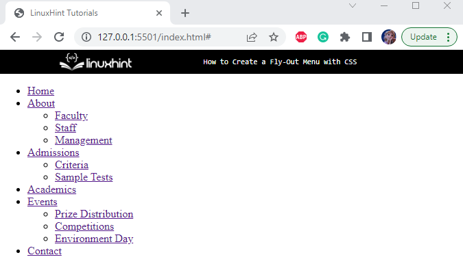
<li><a href="#">Home</a></li>
<li><a href="#">About</a>
<ul>
<li><a href="#">Faculty</a></li>
<li><a href="#">Staff </a></li>
<li><a href="#"> Management </a></li>
</ul>
</li>
<li><a href="#">Admissions</a>
<ul>
<li><a href="#">Criteria</a></li>
<li><a href="#"> Sample Tests</a></li>
</ul>
</li>
<li><a href="#">Academics</a></li>
<li><a href="#">Events</a>
<ul>
<li><a href="#">Prize Distribution </a></li>
<li><a href="#">Competitions</a></li>
<li><a href="#">Environment Day</a></li>
</ul>
</li>
<li><a href="#">Contact</a></li>
</ul>
The structure of the fly-out menu has been successfully created using the HTML elements:
Now, apply the CSS properties to style HTML elements.
Step 1: Style “fly-menu” Class
margin: 15px;
width: 150px;
font-family: Verdana, Geneva, Tahoma, sans-serif;
}
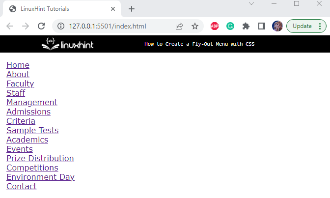
The “fly-menu” class of the “<ul>” element is specified with these properties:
-
- “margin” gives space at every side of the element.
- “width” determines the element’s width.
- “font-family” property assigns the element’s font style. The list of mentioned fonts ensures that if the first style is not supported by the browser, the other will be applied automatically.
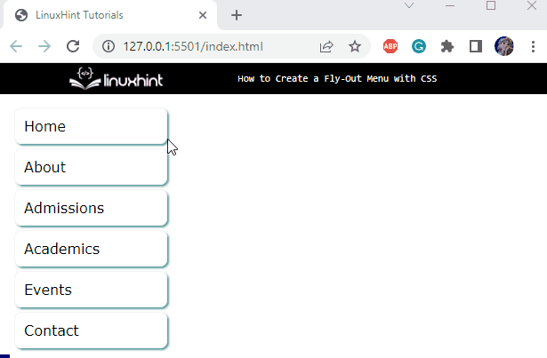
Output
Step 2: Style “li” Element
position: relative;
display: block;
}
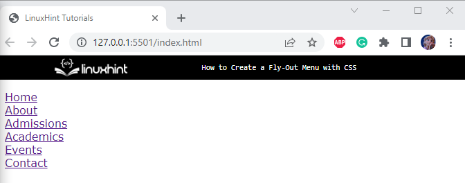
The child element “<li>” of the “<ul>” tag having class “fly-menu” is styled with the following properties:
-
- “position” property with the value “relative” adjusts the element’s position relative.
- “display” property with the value “block” takes up the whole width and starts from a new line.
Step 3: Style “li” and “ul” Elements
position: absolute;
width: 100%;
display: none;
}
The “<ul>” element within the “<li>” tag of the “fly-menu” class is applied with these properties:
-
- “position” with the “absolute” value sets the element’s position relative to the positioned parent element.
- The “width” and “display” properties are explained above.
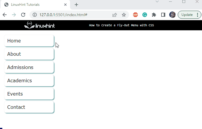
Output
Step 4: Style “a” Element
display: block;
width: 100%;
margin: 5px;
padding: 10px;
color: black;
border: 1px solid rgb(245, 244, 244);
box-shadow: 2px 2px cadetblue;
border-radius: 8px;
transition: all 0.3s ease;
text-decoration: none;
}
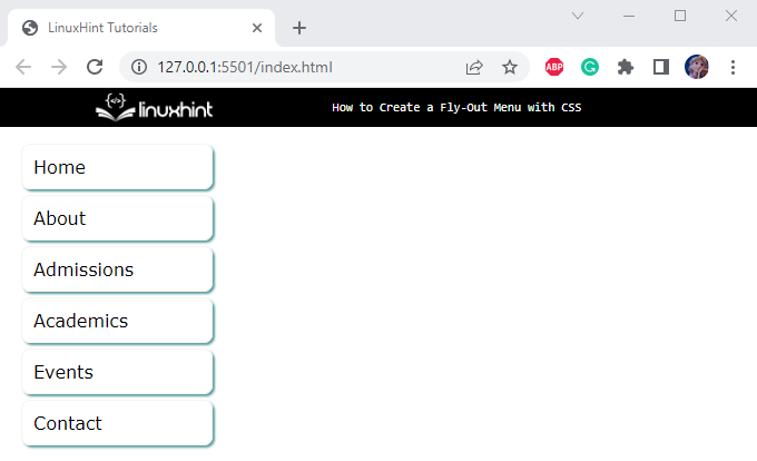
The “<a>” element of the class “fly-menu” is assigned the following properties:
-
- The text within the “<a>” tag is by default blue, add the “color” property to appoint the text color.
- The “border” property is applied to enclose the elements in a border.
- “box-shadow” is a shorthand property to add shadow, which holds the values for horizontal offset, vertical offset, blur effect, and color.
- The “border-radius” property makes the element’s corners round.
- “transition” property defines the speed of the element’s animation over a given period of time.
- “text-decoration” property with the “none” value removes the underline text decoration.
Output
Let’s add some hover effects to the fly-out menu.
Step 5: Style “a” Element on “hover”
background-color: #009;
color: #fff;
}
The “:hover” pseudo-class is utilized to apply the styling when the mouse hovers on the element. These styling properties are explained below:
-
- “color” state the color of the element’s text.
- The “background-color” is implemented to change the background color.
Output
Step 6: Style “li” Element on “hover”
display: block;
transform: translate(175px, -45px);
}
The “<li>” element on hover will display its child “<ul>” elements with the following properties:
-
- “display” with the “block” value fixes the display of the “<ul>” element in the block. It means that the element will take up the entire width.
- “transform” property with the “translate()” function value establishes the animation effect on the element. The “translate()” function holds two parameters for the “x-axis” and “y-axis” respectively.
- On hover, the “<ul>” element will display as a block in the “x-axis” and “y-axis” spaces.
Output
In this way, we can efficiently create a fly-out menu for our application.
Conclusion
To create a fly-out menu with CSS, the “<ul>” and “<li>” elements of HTML can be implemented to create the fly-out structure. The CSS “display” and “transform” properties along with many other useful properties are used to formulate or design it. This post has provided a comprehensive procedure to create a fly-out menu using CSS.