In this article, we will discuss each of the mentioned approaches one by one and provide a suitable example of each method.
So, let’s get started!
Method 1: Place Two Divs Side by Side in CSS Using grid
The CSS “grid” layout allows the user to place two or more two divs side by side. Basically, the grid is a value of the display property used to create a layout consisting of rows and columns.
Syntax
Syntax of the display property with grid layout is given below:
Now, let’s check out an example related to placing two divs side by side in CSS using the grid layout.
Example
Here, we will create two child divs inside the parent div, having the class names as “parent”, “child” and “child”:
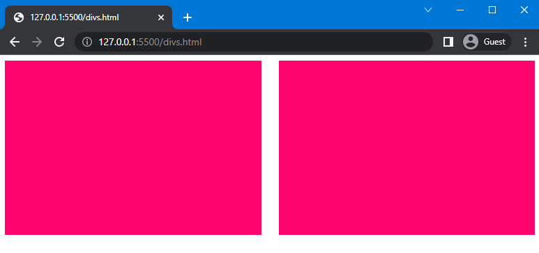
Next in the CSS section, use “.parent” to access the parent div and set the value of the display property as “grid”. Next, set the fraction using the “grid-template-columns” property to create space for columns. In our case, we will set fractions as “1fr” and “1fr”, which means both divs have acquired equal space. Furthermore, we will set the gap between two columns using the column-gap property and set its value as “25px”.
CSS:
display: grid;
grid-template-columns: 1fr 1fr;
column-gap: 25px;
}
In the next step, we use “.child” to access both child div and set the height of divs as “250px” and set the background color as “rgb(253, 5, 109)”:
height: 250px;
background: rgb(253, 5, 109);
}
This will show the following outcome:
Let’s move to another method to place div side by side
Method 2: Place Two Divs Side by Side in CSS Using flex
The “flex” is the value of the display property that allows placing two divs side by side. This property is used to set a flexible length for the flexible item. It shrinks or grows the flex item to fit in its container.
Syntax
The syntax of display property with flex is given below:
Let’s move to the example to understand the stated concept.
Example
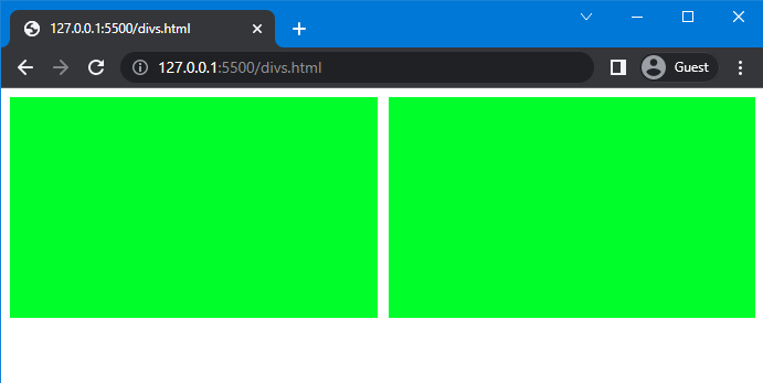
We will consider the same HTML file and apply “flex” to the parent container. Here, we will set the value of the display property as flex and set the gap between the child divs as “10px”:
display: flex;
gap: 10px;
}
After that, set the width, height and background color of the div as “650px”, “200px”, and “rgb(0, 255, 42)”, respectively:
width: 650px;
height: 200px;
background: rgb(0, 255, 42);
}
The outcome of the given code is given below:
Method 3: Place Two Divs Side by Side in CSS Using float
The CSS float property specifies the floating direction of an element. More specifically, this property can be utilized for placing two divs side by side in CSS.
Syntax
The syntax of the float property is:
Here is the description for the above-given values:
- none: It is used to restrict floating.
- left: It is used to float elements on the left side.
- right: It is used to float elements on the right side.
Let’s move to the example of placing div side by side.
Example
Now, we will create two divs inside the <body> tag and assign class name as “div1” and “div2”:
Then, use “.div1” and “.div2” to access the containers added in the HTML section. We will use both divs in the same class because the properties and values that we are going to assign to both are the same.
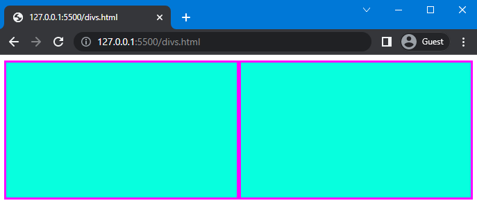
Next, we assign the value of the float property as “left” and set the width and height of the div as “50%” and “40%”. We also use the box-sizing property and set its value as “border-box”. Furthermore, set the background color of the div as “rgb(7, 255, 222)” and set the values of border property as “3px”, “solid”, and “rgb(255, 0, 255)”:
float: left;
width: 50%;
height: 40%;
box-sizing: border-box;
background: rgb(7, 255, 222);
border: 3px solid rgb(255, 0, 255);
}
Note: You can place two divs side by side without using box-sizing property and border property by setting the different background colors of the divs.
Once you implement the above code, executes the HTML file and see the result:
Note: To create a gap between two divs, first create another div and then set the margin of the div accordingly.
Conclusion
Divs can be placed side by side by using three different methods of CSS, which are the “flex” and “grid” values of the display property and the “float” property. Each of the methods works efficiently; however, you can utilize any of them according to our requirements. In this guide, we have discussed three methods to place div side by side Using CSS and provided related examples.


