Alignment refers to the positioning of something in a particular way, which can be either text or buttons. The button alignment refers to how you want to position your buttons, i.e. to the left, right, or at the center of the webpage.
This article will discuss the use of CSS to align a button to the right. Various CSS properties are available for the text or button positioning. We can do this by using the Float property, Text-align property, and Justify-content property.
Float Property to Align the Button to the Right
The CSS float property determines how the data is structured and positioned on a webpage.
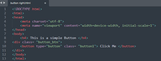
We first have to create a button in the HTML file. We utilize the Sublime text editor to put this illustration into practice. The HTML code to create a simple button is shown in the following image:
In this code, we created a button in the HTML file. We utilized the <div> tag which is used as a container to wrap the HTML elements inside it. The “div class” attributes are used to style the HTML file with CSS. We added a text that is displayed on the button.
You can see the button we just created and displayed on the left side of the page by default.
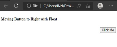
Now, the next thing we need to do is to position this button on the right corner of the page. The CSS script is utilized to accomplish this. The button is placed to the right using the CSS Float attribute. The “.button_btn” refers to the div class that we created in the HTML code to make a button. Now, we can access and apply the design to the button created inside this container. We use the “float” property in it and set its value to “right”. It provides us with some values – none, right, left, initial, and inherit. Since we intend to position the button to the right, therefore, we employ the “right” value for the float property in CSS.
The previous script, when executed, yields the output which is shown in the following image. The button is placed to the right of the screen when the float property’s value is set to “right”.
Text-Align Property to Align the Button to the Right
The next property we use to align a button to right is the “text-align” property in CSS. We created an HTML file. Inside the <body> tag of the HTML, we created a heading that is shown at the top of the webpage using the <h4> tag. Then, we created a button inside the <div> class. Define a text that is displayed on the button.
This will get us the output webpage presented in the image. The text that we added is displayed at the top right corner of the page while right below it is the button that we created.
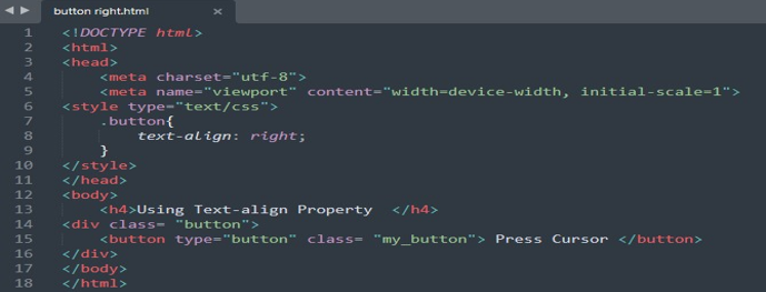
To move this button that we created in the previous code to the right side of the page, we exercise the “text-align” property. We utilize the “text-align” in the CSS script. The CSS code is given below:
The text-align property is used to position the element in the different directions. This property provides us with certain values to position the elements including left, right, center, initial, inherit and justify. Since we want the button to be positioned on the right corner of the webpage, we utilize the “right” value for the “text-align” property in CSS.
Now, we work with the CSS script to style the button that we created in the HTML file. The “.” refers to the div class that we created in HTML, followed by the class name. This is our example of a “button”. This allows us to style the element inside the mentioned class. The “text-align” property is set to the “right” value to make the button align to the right corner of the web page.
You can see how the simple application of the “text-align” property helps you in the alignment of the button to your desired position. For our needs, we adjusted it to the right and the output image shows a button with “press cursor” text aligned on the right side.
Justify-Content Property to Align the Button to the Right
The last property that we will execute to get the button aligned to the right corner is the “justify-content” property. In the previous instances, the first thing we did was to create an HTML file. You can do it in any text editor or visual studio; we implement it on the sublime text editor.
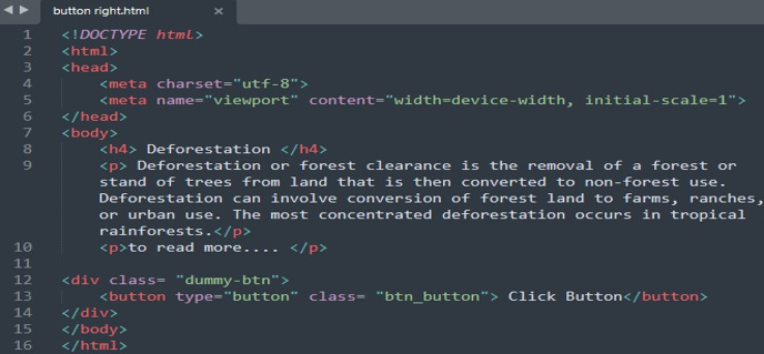
In the HTML file, inside the <body> tag, we first created a heading with the <h4> tag. Then, we created a dummy data using the <p> tag. The <p> tag is used when we write the paragraphs in HTML. We then started the <div>. In an HTML document, the div tag designates a partition or segment. The HTML elements are placed inside the “div” tag and then the CSS styling is applied. We specified the div class name “dummy_btn”. We style the button in CSS by using this class name. Afterward, inside the button tag, we defined the “button type” and “button class”, additionally. We added the text that appears on the button.
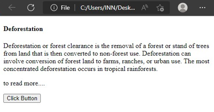
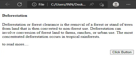
This image exhibits a heading and a paragraph. At the bottom of this content, a button that we created in HTML is displayed.
Now, we style this button with the CSS script using the “justify-content” property. In the CSS script, we started the “style” tag. Inside the style tag, we have the “.dummy-btn” to style the button that we created in the div class with this name. Inside the braces, we used the “display: flex”. To utilize a flexbox, a flex container must have the display flex attribute. The adjustable length for the adjustable items is specified via the flex property. We then set the justify-content property.
The output of the previously generated code snippet is shown in the following image:
Conclusion
In this article, we discussed the three CSS properties to align the button to the desired position. We utilized the float property, text-align property, and the justify-content property. Each of the mentioned properties is explained in detail with the HTML and CSS codes. We implemented the example code using the sublime text editor. By utilizing the several properties, this tutorial makes the alignment of the buttons in CSS simple.

