This tutorial will show you how to add an image overlay using the “after” pseudo-element in CSS. We will add the image overlay effect with the help of the “after” pseudo-element.
Example # 1:
To use the “after” pseudo-element in CSS, we create an HTML file. The code we write in the HTML file is given in this example. You can use the text editor that you want and start coding on it. Write the code which is presented in the following image. We write this code in the Visual Studio Code software. By selecting the HTML language in this new file, we just write “!”. Press enter then the necessary tags will automatically appear on this file. Start coding in its body.
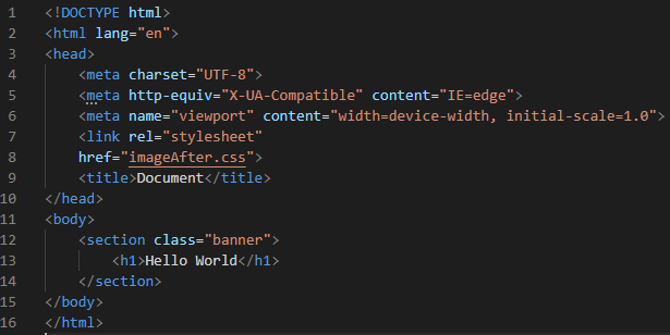
We create a “section” class named “banner” and put a heading inside this “banner”. We also link this HTML with the CSS file, so all the stylings we do in the CSS file will be applied to this HTML code. We save it with the “.html” file extension.
CSS Code:
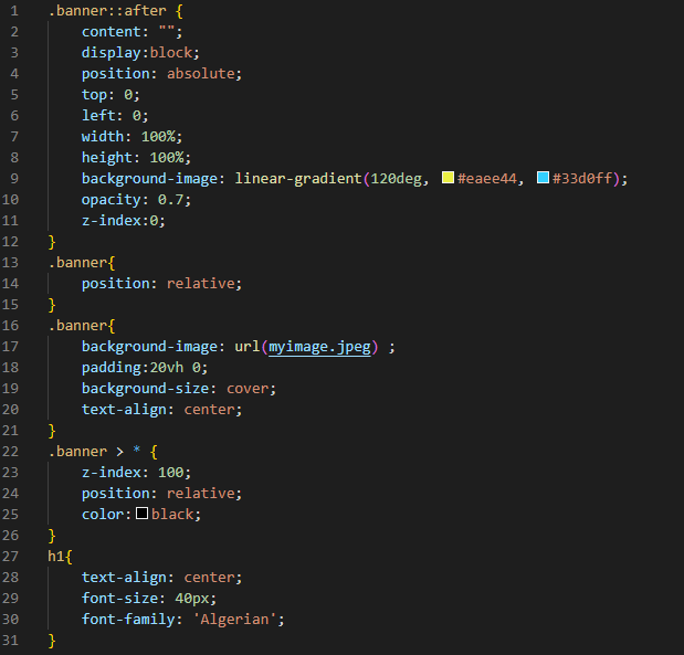
In this CSS code we use the “after”pseudo-element to create the image overlay. For the “after” pseudo-element, we must have the content, so we put the “content” here. We create an element inside the “banner” after the content of the banner. Now, we make the “display” “block” and give the “position” to this banner as “absolute”. The “top” and “left” are both “0”. Then, we set the “width” to “100%” the same as the “height” with “100%” value. We use the “linear-gradient” for the “background image” to make the image more attractive. We give a “120deg” to this and put two colors on this property. Then, we set its “opacity” and put the “0.7” value for this. We use the z-index value here and put “0” for this.
Then, we set the position of the “banner” to “relative”. We also use the background image inside the banner. The “padding” we set for this is “20vh” for both “top” and “bottom”, and “0” for the “left” and “right”. We set the “cover” for the “background-size” and the “text-align” to the “center”. Now, we use the banner and select all the elements of the banner using the “*” selector. When we use this “*” selector, it gets all the elements and apply the styling which we put inside it on all the elements. As our overlay covers both the text and the image, we use the “z-index” to solve this and we set the “z-index” content to “10”. And set the “relative” for its “position”.
We set the content color to “black” so that the content written inside the banner appears black on the image. We “align” the heading” to the “center” and use the “Algerian” font-family for this heading. Also, we set its size to “40px”.
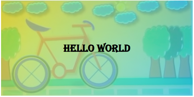
Output:
You can get the output on the default browser when you press the “ALT+B” or click the right mouse button on the HTML file and then select the “open in default browser”. The given output will render on the browser.
Example #2:
Here, we have another example in which we create the overlay of the image using the same pseudo-element and change our code a little bit and show you how it works.
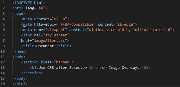
The HTML code is the same for this example. But here, we change the heading which is written inside the banner. We separate this heading into two lines by using the “<br>” tag.
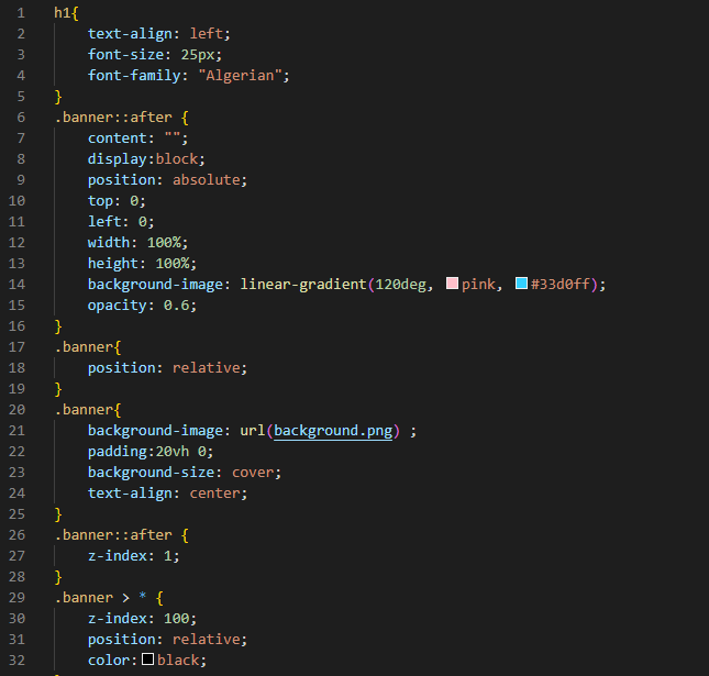
First, we set the heading a little bit by applying some style properties to it. We set the “text-align”, “font-size”, and “font-family” of the heading. Then, comes the “after” pseudo-selector which creates an overlay between the image and the text. Whenever we use this “after” selector in CSS, we must define the “content” first. After this, we set its “display” to “block”. The “top” and “left” values that we put here are set to “0”. While the “width” and “height” values are set to “100”. We then apply the “linear-gradient” and select two colors for this which is “pink” and “blue”. Also, the “opacity” property is used here to give a transparent view of the background image. We set its value to “0.6”. We use the “background-scenery.jpg” as the background image for this. We place this image name in the “background-image” property “url”.
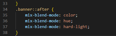
Then, we use the padding to create the space and set its “top”, “bottom”, “right” and “left” values using one “padding” property. Here, the “200vh” defines the “top” and “bottom” padding and the “0” defines the “left” and “right” padding. The “background-size” is “cover” as we used in our first example. Then, we set the “banner” and “z-index”. For this, we first use the “after” pseudo-element. Inside this, we set the “-index” to “1”. It gives a “1” z-index to the overlay. Below this, we set the “z-index” for the “content” and apply “10” for the content z-index. We use the “*” selector with the “banner” before giving a z-index to the banner content. This z-index applies to all the content written in the banner. We also use the “mix-blend-mode” for the overlay that we previously created. This “mix-blend-mode” property helps to mix the multiple elements.
When we use this property with our overlay, it creates some amazing new combinations for us. We can make our overlay an advanced overlay by using this “mix-blend-property” in CSS. After completing this code, we must save it with a “.css” file extension as it is the CSS file.
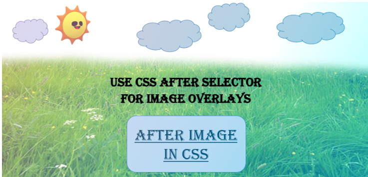
Output:
Conclusion
We discussed the “after” pseudo-element in CSS to make the overlay image in this tutorial. We learned that the overlay is created between the background image and the text so we can select the text, which means the text is separated from the image. We used the “mix-blend-property” on these image overlays to make them more attractive. We also explored the different examples and explained these examples in this tutorial. We provided all details in this tutorial which is necessary for you to understand this “after” pseudo-element in CSS. Now, you can create these overlays on your projects after understanding these examples which will help you a lot in your future coding.