In this guide, we will do all these flipping techniques by using the CSS properties. Here, we will learn about the image flip in CSS using different properties.
Example #1:
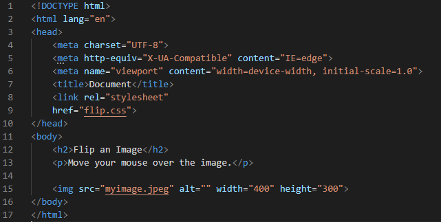
To flip the image in CSS, we must have the HTML code where we add the image. Then, we create a CSS file to apply the properties so that our image flips. We can flip our image in any direction of our choice. We have the Visual Studio Code where we have to perform these examples. So, we open the file and select the language as “HTML” and create this HTML file. Then, we have to do some code here which is given in the following image. When we complete this code, we have to save it.
To display the heading on top of the page, we add the “<h2>” tag. Then we have a paragraph, and this paragraph is displayed next to the heading. After this, we do the main code which is adding the image code. We add the image after the heading and the paragraph. We use the “<img>” tag and in its “src”. We give the path or name of the image that we want to add. We set its width value to “400” and its height value to “300”. We also set this width and height in our CSS file. Now, we move to create our CSS file in which we use the different properties to make our image a flipping image.
We use the image “hover” selector. It is used to select the image when the cursor moves over the image. The “webkit-transform” is the CSS property that is used to transform the image into 2-D and 3-D. We can rotate our image by using this. The “scaleX” is used to rotate the image in the horizontal direction. This code will rotate the image horizontally when we move the cursor over this image.
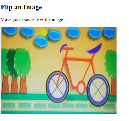
This is the original image before moving the cursor over the image. When we hover over this image, it rotates in the horizontal direction.
The rotated image is also shown in the following:
Here, you can see that the image rotates horizontally. The previous image is the rotated image after moving the cursor over the image.
Example #2:
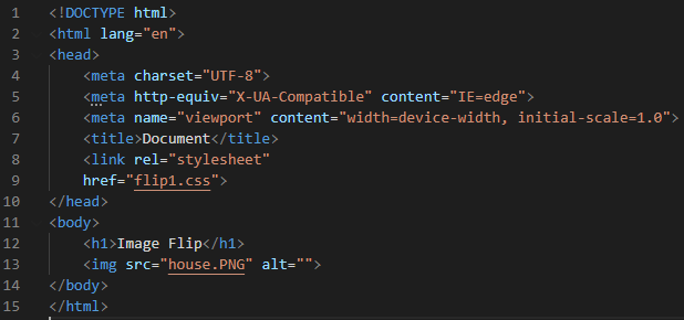
This is the HTML file. You can see that we added an image here in this code. We used the “house.png” image in this example.
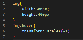
We set the image “width” to “500px” and the image “height” to “400px”. After this, we have an image “hover” which “transforms” the image on the horizontal axis when the cursor hovers over this image.
Output:
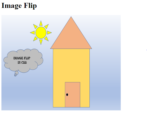
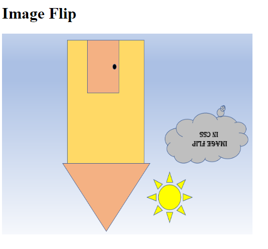
The previous image is the original image before the transformation on the horizontal axis. The following image is the image after the transformation when we move the cursor over the image. You can easily see the difference between the previous image and the following given image.
Example #3:
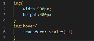
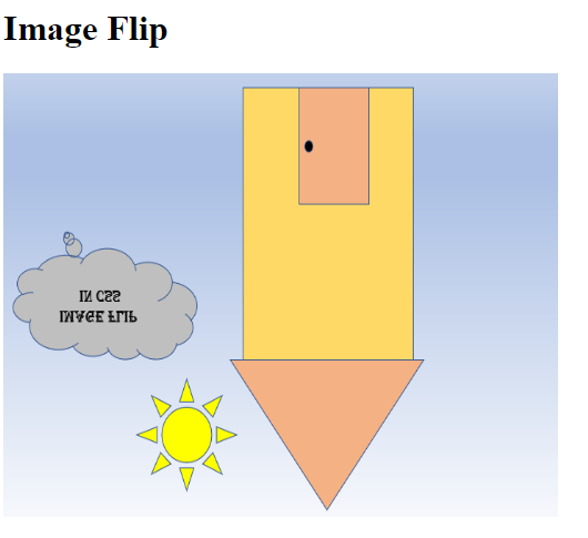
Here, the “width” and “height” values are the same, and the image is the same. But we rotate the image vertically after hovering over the image. So, we use the “transform” and set it to “scaleY(-1)” so it will rotate our image in the vertical direction.
Now, see that the image rotates in the vertical direction when we hover over this image. Here, the image is shown in an upside down direction which rotates vertically after hovering over this.
Example #4:
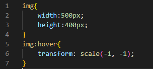
In this code, we use the two values in the “scale”. We use the “transform”. In its “scale”, we pass the two values “-1, -1” which rotates the image in the vertical and horizontal directions. When we move the mouse on this image, it rotates in both directions.
See that the image is rotated both on the vertical and horizontal axis when we hover over it. The previous image is the image after hovering over the original image.
Example #5:
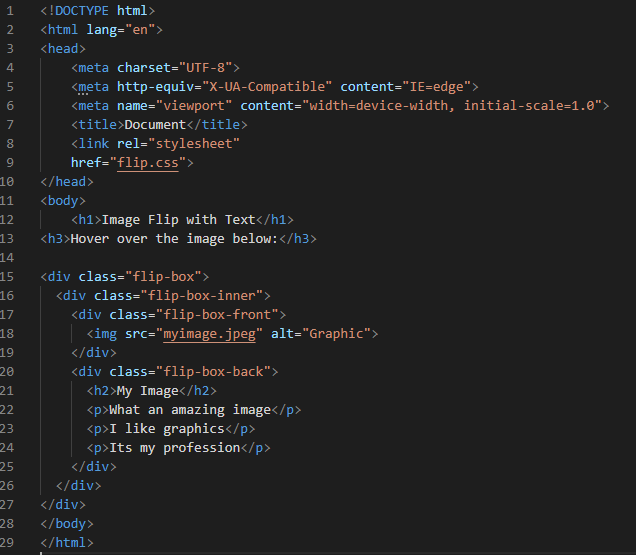
This example is different from the previous examples. We create the different div classes using the different names. The first div class is named “flip-box”. The second div class is names the “flip-box-inner”. And the third div class is named “flip-box-front”. After defining all these div classes, we put an image named “myimage.jpeg”. We then create another “div” with a “flip-box-back” name. Now, we write some paragraphs in this div. We use all these div classes in our CSS file.
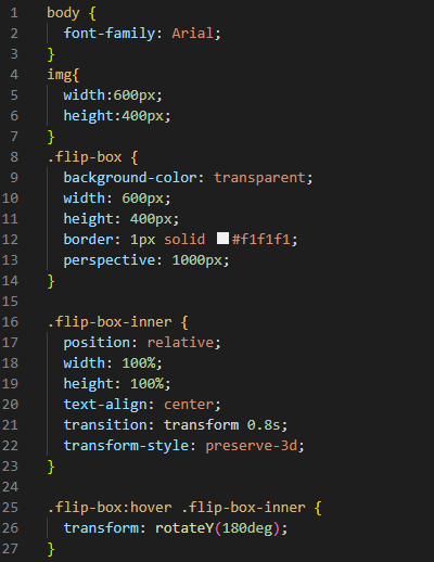
We use the “body” and the “font-family” to “Arial”. Then, we set the “flip box” container’s width and height to “600px” and “400px”, respectively. Now, we add the “border” and set it to “1px” in its width with a “solid” type so we can show that when this image flips, it goes out of the box when we move the cursor over it. We add the “perspective” and set it to “1000px”. We use it when we must add some three-dimensional effect to the image.
Now, we have another container which is a “flip-box-inner”. This container sets the position of the front and the back side of the image. We set the “position” to “relative”, and the “width” and “height” to “100px”. We use the “transition” property to control the animation speed and set it to “0.8s”.
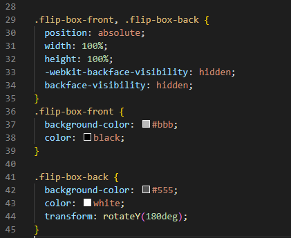
After this, we use the “transform-style” to render the image in the three-dimensional space. We set it to “preserve-3D”. Then, we have a “flip-box” hover, so when we hover over the image, it will move in the horizontal direction since we use the “transform” to “rotate” and set it to “180deg”. We have the “flip-box-front” and “flip-box-back”. Then, we give the position to both here. We set the “position” for both to “absolute”. The “height” and “width” for both containers are set to “100px” and “100px”, respectively. We also set the “WebKit-backface-visibility” to “hidden”. This property is used when we rotate the image and set it here whether the user will see the back face of the image or not.
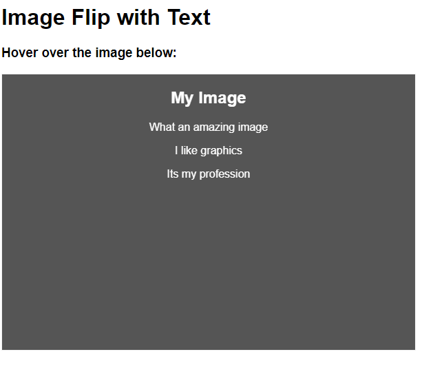
So, here, we hide it by using the “hidden” tag with this property. Now, we style the front side by using a “flip-box-front” container. We set the “background-color” to “#bbb” and the “color” of the font or text to “black”. Finally, we style the back side of the image by using the “flip-box-back”. Its “background-color” is set to “grey”, and the font “color” is set to “white”. We use the “transform” property and set its value to “rotateY(180deg)”.
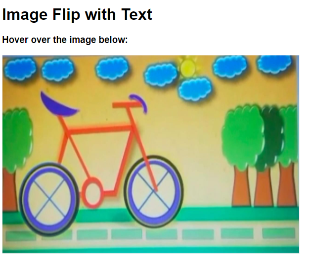
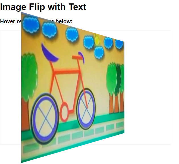
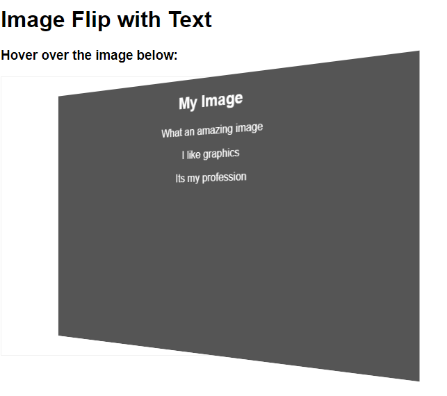
In the output, we have the multiple images in which you can notice the rotation of the image. In the last image, the back side of the image is also displayed here. You can see how it rotates when we hover over this image. All the text which we have written in the HTML code will appear on the back side of the image when this image rotates after hovering.
Conclusion
In this guide, we used the image flip concept in CSS. We performed the different intersecting examples here. We flipped our image in the vertical direction or the horizontal direction or in both directions after hovering. We also performed one example in which we rotate our image at 180 degrees when we hover over the image. We used the CSS properties in all the examples and rendered all the outputs in this guide. You will see how the image flips or rotates vertically and horizontally.

