In this article you get a detail knowledge on
How to create a form
To create a form use <form> tag, inside this form tag use <label> tag with the class .form-label for the title of a text field then use tag for creating different form fields as your requirement. Form fields are specified by the type=“*” attribute with the class .form-control to apply the default form setting from bootstrap.
- Text
- Password
- Date
- Datetime
- File
- Number
- Radio
- Checkbox
- Submit
- Reset
- Range
Replace one of these with * to create different fields.
Code
<div class="col-md-6">
<label class="form-label">First Name</label>
<input type="text" class="form-control">
</div>
<div class="col-md-6">
<label class="form-label">Last Name</label>
<input type="text" class="form-control">
</div>
<div class="col-md-12">
<label class="form-label">Address</label>
<input type="text" class="form-control">
</div>
<div class="col-md-6">
<label class="form-label">City</label>
<input type="email" class="form-control">
</div>
<div class="col-md-4">
<label class="form-label">States</label>
<select name="" id="" class="form-select">
<option value="">Punjab</option>
<option value="">Sindh</option>
<option value="">Kpk</option>
<option value="">Balochistan</option>
</select>
</div>
<div class="col-md-2">
<label class="form-label">Zip</label>
<input type="text" class="form-control">
</div>
<div class="col-md-6">
<label class="form-label">Upload Domicile</label>
<input type="file" class="form-control">
</div>
<div class="col-md-6">
<label class="form-label">Gender</label>
<br>
<div class="form-check form-check-inline">
<input type="radio" class="form-check-input" name="rdo" checked>
<label class="form-check-label">Male</label>
</div>
<div class="form-check form-check-inline">
<input type="radio" class="form-check-input" name="rdo">
<label class="form-check-label">Female</label>
</div>
<div class="form-check form-check-inline">
<input type="radio" class="form-check-input" name="rdo">
<label class="form-check-label">Other</label>
</div>
</div>
<div class="col-md-12">
<br>
<button class="btn btn-primary form-control">Submit</button>
</div>
</form>
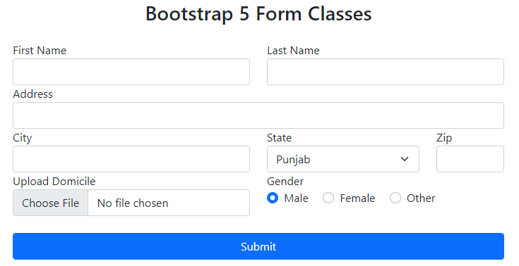
This is how a simple form is created.
Types
There are three types of forms in bootstrap.
- Vertical Forms
- Horizontal Forms
- Inline Forms
Vertical Forms
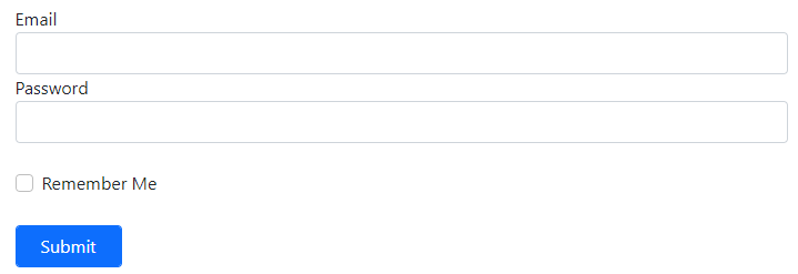
In these kinds of forms label and text fields are stacked vertically.
Code
<div class="col-md-12">
<label class="form-label">Email</label>
<input type="text" class="form-control">
</div>
<div class="col-md-12">
<label class="form-label">Password</label>
<input type="password" class="form-control">
</div>
<div class="col-md-12">
<br>
<div class="form-check">
<input class="form-check-input" type="checkbox">
<label class="form-check-label">
Remember Me
</label>
</div>
</div>
<div class="col-md-2">
<br>
<input type="button" class="form-control btn btn-primary" value="Submit">
</div>
</form>
This is how vertical forms are created.
Horizontal Forms
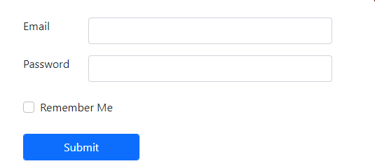
In these kinds of forms label and text fields are stacked horizontally.
Code
<div class="row">
<div class="col-sm-1">
<label class="form-label">Email</label>
</div>
<div class="col-sm-4">
<input type="text" class="form-control">
</div>
</div>
<div class="row mt-3">
<div class="col-sm-1">
<label class="form-label">Password</label>
</div>
<div class="col-sm-4">
<input type="password" class="form-control">
</div>
</div>
<div class="col-md-12">
<br>
<div class="form-check">
<input class="form-check-input" type="checkbox">
<label class="form-check-label">
Remember Me
</label>
</div>
</div>
<div class="col-md-2">
<br>
<input type="button" class="form-control btn btn-primary" value="Submit">
</div>
</form>
This is how horizontal forms are created.
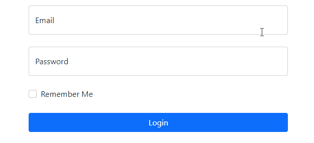
Inline Forms
In these kinds of forms every form field is stacked horizontally in a row. These forms are useful where space is limited or where you want to make things compact.
Code
<div class="row">
<div class="col-sm-4">
<input type="text" class="form-control" placeholder="Email">
</div>
<div class="col-sm-3">
<input type="password" class="form-control" placeholder="Password">
</div>
<div class="col-sm-2">
<input type="button" class="form-control btn btn-primary" value="Login">
</div>
</div>
</form>
This is how inline forms are created.
Components
Following are the components that are used in a form. These components only work properly inside a <form> tag.
Text-Fields
Text-field is where you type some information like name, password, email, number, address.
Code
Text-fields are created by using <input> tag and set its type attribute to “text” with the class .form-control. Use .form-control-lg class for large size text-field, .form-control class for default text-field and .form-control-sm for small text-field. One more thing I want to mention here is that for creating a read only text-field use .form-control-plaintext class with a keyword readonly in an <input> tag.
Radio-Buttons
Radio buttons are the rounded buttons which are used where you have to select from two or three options.
Code
Radio-buttons are created by using <input> tag, then set its type attribute to “radio” with the class .form-check-input and give the same value of name attribute to every radio button. If you want to activate any button by default then use checked keyword or if you want to disable any button then use disabled keyword in input tag.
CheckBox
Checkboxes are small boxes which are used where you have to select from multiple options.
Code
Checkboxes are created by using <input> tag, then set its type attribute to “checkbox” with the class .form-check-input. If you want to activate any button by default then use checked keyword or if you want to disable any button then use disabled keyword in input tag.
Textarea
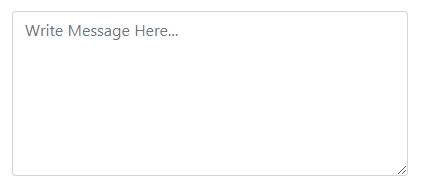
Textarea is where you type descriptive information like message, feedback.
Code
Textarea is created by using the <textarea> tag with the class .form-control.
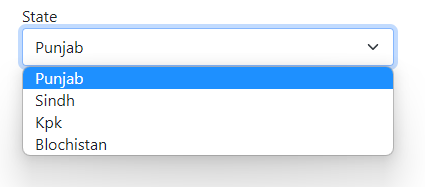
Selection Menu
Selection menus are used where you want your user to select an option from a dropdown menu.
Selection Menu is created by using <select> tag with the class .form-control and wrapping it around <option> tags. Use .form-control-lg class for large size selection menu, .form-control class for default size selection menu and .form-control-sm for small size selection menu.
Floating-lables
Floating labels are the combination of placeholders and labels
Code
<div class="col-md-6">
<div class="form-floating">
<input type="text" class="form-control" placeholder="Email">
<label>Email</label>
</div>
</div>
<div class="col-md-6">
<div class="form-floating">
<input type="password" class="form-control" placeholder="Password">
<label>Password</label>
</div>
</div>
<div class="col-md-12">
<div class="form-check">
<input class="form-check-input" type="checkbox">
<label class="form-check-label">
Remember Me
</label>
</div>
</div>
<div class="col-md-2">
<input type="button" class="form-control btn btn-primary" value="Login">
</div>
</form>
Floating labels are created by wrapping <label> and <input> tag inside a div with the class .form-floating and the important thing is for floating labels to work properly, placeholder and label is compulsory.
Conclusion
To create a form use <form> tag, inside form tag to create a text field use <input type=“text”>, to create a checkbox use <input type=“checkbox”>, to create radio buttons use <input type=“radio”>, to create textarea use <textarea> tag and to create selection menu use <select> tag and wrap it around <option> tag. In the above article every important thing about bootstrap form is covered.

