What is Flexbox
The flexbox layout model provides an efficient and dynamic arrangement of elements by placing them inside a container with equally distributed space. This layout makes elements responsive which means that the elements change their behavior according to the kind of device displaying them.
A flexbox basically makes elements flexible and provides them with appropriate position, and symmetry.
It consists two of two components which are flex container, and flex items. Both of these components are explained below.
What is a Flex Container
This is a component of a flexbox that defines the properties of the ancestor element by setting its display to flex or inline-flex.
What is a Flex Item
A flex item describes the properties of the successor elements, moreover, there can be numerous flex items present inside a flex container.
Now that we have a good understanding of a flexbox and its components, we will explore various properties that are associated with the flexbox.
Flexbox Properties
Below we have explained in great depth the various properties linked with a flexbox.
display property
For the purpose of stating how an element will be displayed, the display property is used.
Syntax
Parameters explained
flex: This value displays an element as a flex container.
Example
Suppose you want a div container to be displayed as a flexbox. This is how it is done.
HTML
Here, we have generated a div container and a paragraph has been nested inside it.
CSS
display: flex;
background-color: aquamarine;
}
Using the class assigned to the div element we are setting its display to flex, and giving it a certain background color.
Output
The div was successfully displayed as a flexbox.
The rest of the properties related to flexbox are divided into two categories, which are flex container properties, and flex item properties. We will discuss both the classes separately.
Flex Container Properties
Properties that fall under this category are as follows.
flex-direction property
This property is used to describe the direction of elements present in a flexbox.
Syntax
Parameters explained
row: This default value arranges the elements horizontally.
row-reverse: This value places elements in a row but with a reverse direction.
column: It arranges the items vertically.
column-reverse: It arranges the elements in a column but in a reverse manner.
Example
Let’s place certain items in a flexbox having direction “row”.
HTML
In the above code, we are creating a larger div container and nesting four more div containers inside it.
CSS
display: flex;
background-color: aquamarine;
flex-direction: row;
}
Here we are displaying the larger div as a flex container and giving it some color, and lastly its direction is set to row.
CSS
background-color: lightgrey;
width: 150px;
margin: 15px;
padding: 20px;
font-size: 35px;
}
Now we are styling our items inside the container using basic CSS properties.
Output
The items have been arranged in a row.
justify-content property
If the items in a flexbox do not consume the horizontal space entirely then this property aligns them across the main axis.
Syntax
Parameters explained
flex-start: It positions elements at the start of the container and is the default value.
flex-end: This places the elements at the end of the container.
center: This positions the elements at the center of the container.
space-between: It adds space between items.
space-around: It adds spaces before, between, and after each item.
space-evenly: This gives each item equal spaces.
Example
Suppose you want to justify your content to the center of the flex container.
CSS
display: flex;
background-color: aquamarine;
justify-content: center;
}
The center value will position all the flex items in the center of the container.
CSS
background-color: lightgrey;
width: 150px;
margin: 15px;
padding: 20px;
font-size: 35px;
}
Using basic CSS we are styling the elements.
Output
The items were placed in the center successfully.
align-items property
If the items in a flexbox do not consume the vertical space entirely then this property aligns them across the cross-axis.
Syntax
Parameters explained
stretch: It is a default value that stretches the items to fit in the container.
center: This positions the elements at the center of the container.
flex-start: It positions elements at the start of the container and is the default value.
flex-end: This places the elements at the end of the container.
baseline: This positions the elements at the baseline of the container.
Example
Here we have shown how the baseline value of the align-items property works.
CSS
display: flex;
background-color: aquamarine;
height: 200px;
align-items: baseline;
}
To demonstrate this property properly we are providing some height to the flex container and setting the align-items property to baseline.
Output
The property is working properly.
flex-wrap property
If there is not much space on a single flex line then this property decides whether to wrap elements or not.
Syntax
Parameters explained
nowrap: This default value does not wrap elements.
wrap: It wraps the elements if required.
wrap-reverse: It wraps the elements if required but in a reverse fashion.
Example
To understand this property consult the example below.
CSS
display: flex;
background-color: aquamarine;
flex-wrap: wrap-reverse;
}
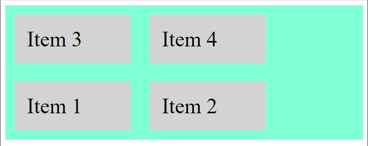
In the above code, we have set the flex-wrap property to wrap-reverse which means that if required items in the container will be wrapped but in a reverse manner.
Output
Items were wrapped in a reverse way.
align-content property
It alters the behavior of the flex-wrap property and is pretty much similar to the align-items property with the only difference being that it aligns the flex lines rather than the flex elements.
Syntax
Parameters explained
flex-start: It positions elements at the start of the container and is the default value.
flex-end: This places the elements at the end of the container.
center: This positions the elements at the center of the container.
space-between: It adds space between items.
space-around: It adds spaces before, between, and after each item.
space-evenly: This gives each item equal spaces.
Example
Here is an example of the property under discussion.
CSS
display: flex;
background-color: aquamarine;
height: 300px;
flex-wrap: wrap;
align-content: space-between;
}
Here we have further increased the height of the container so that you can understand this property in a better way. Furthermore, we have assigned the align-content property the space-between value which will add space between elements.
Output
Space between items was added successfully.
flex-flow property
It describes the direction of elements while specifying whether to wrap elements or not, moreover, it is a shorthand property for the follwoing.
- flow-direction
- flow-wrap
Syntax
Parameters explained
flow-direction: It defines the direction of elements.
flow-wrap: It states if the elements should be wrapped or not.
Example
Consider the example below to understand the working of this property.
CSS
display: flex;
background-color: aquamarine;
flex-flow: column-reverse wrap;
}
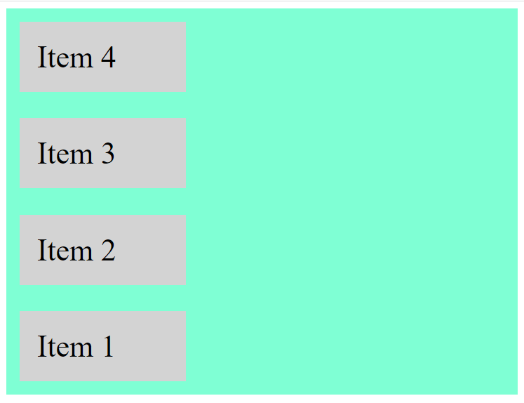
Using the shorthand property, we have set the direction of the flex items as column-reverse while wrapping them using the wrap value.
Output
Items were wrapped in a column but in reverse order.
Now we will discuss our next category.
Flex Item Properties
Properties associated with flex item are as follows.
order property
It defines the order of a flex element relative to other elements present in a flexbox.
Syntax
Parameters explained
num: This value defines the order of a flex item. By default, the value is 0.
Example
Here is how you set the order of items in flexbox.
HTML
To understand this property properly we are assigning each nested div some id.
CSS
display: flex;
background-color: aquamarine;
height: 250px;
}
.items div {
background-color: lightgrey;
width: 150px;
margin: 15px;
padding: 20px;
font-size: 35px;
}
Here we are first displaying the div container as a flexbox and providing it some height to demonstrate the working of this properly, and lastly we are styling our flex items.
CSS
order: 4;
}
#item2{
order: 1;
}
#item3{
order: 2;
}
#item4{
order: 3;
}
Using those ids we are assigning some order to each item.
Output
Items were placed in the order assigned.
align-self property
This property is used to define the positioning of items inside a flex container. This property overrides the align-items property and is used on flex elements.
Syntax
Parameters explained
auto: This is a default value that either inherits characteristics from ancestor container or if there is no ancestor container then it stretches the item.
stretch: It stretches the items to fit in the container.
center: This positions the elements at the center of the container.
flex-start: It positions elements at the start of the container and is the default value.
flex-end: This places the elements at the end of the container.
baseline: This positions the elements at the baseline of the container.
Example
Consider the example below.
CSS
align-self: center;
}
#item3 {
align-self: flex-start;
}
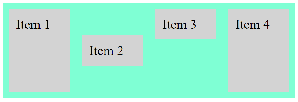
Using the ids assigned, item 2 has been positioned at the center of the container, however, the item 3 has been placed at the start of the container.
Output
Both the items were aligned successfully.
flex-grow property
This property describes the extent to which an element will grow relative to the other elements present inside the container.
Syntax
Parameters explained
number: This value states the extent of growth of an element. By default, the value is 0.
Example
Suppose we just want to grow one item with respect to others. Here is how you do it.
CSS
flex-grow: 10;
}
We set the value of the flex-grow property to 10 which means item 2 will be 10 times larger as compared to other items.
Output
The property is working properly.
flex-shrink property
This property defines the extent to which an element will shrink relative to the other elements present inside the container.
Syntax
Parameters explained
number: It states the extent to which an element will shrink. By default, the value is 0.
Example
Here is an example of this property.
HTML
<div style="background-color: bisque;">1</div>
<div style="background-color: rosybrown;">2</div>
<div style="background-color: palevioletred;">3</div>
<div class="item" style="background-color: sandybrown;">4</div>
<div class="item" style="background-color: plum;">5</div>
</div>
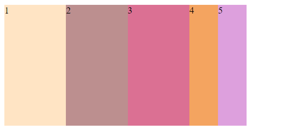
To understand the working of this property, we have created a larger div container and nested five more div containers inside the larger one. Moreover, each div has been assigned a different background color so that the concept of this property can be demonstrated properly.
CSS
display: flex;
width: 400px;
height: 200px;
}
.container div {
flex-basis: 100px;
}
Here we are displaying the larger div as a flexbox, moreover, we are also giving it some width and height. Lastly, we are setting its flex-basis to 100px which defines the starting length of a flex item.
CSS
flex-shrink: 4;
}
Using the class assigned to the last two div containers we are setting their flex-shrink to 4 which means that these items will be 4 times smaller than other items in the grid.
Output
Items 4 and 5 are smaller than the rest of the items.
flex-basis property
For the purpose of setting the starting length of a flex item, this property is used.
Syntax
Parameters explained
auto: It is a default value that provides an item with the length equal to that of the flex item.
num: It states the original length of an item.
Example
Suppose you want to give a flex item some initial length. We have shown how it is done.
CSS
flex-basis: 300px;
}
We set the flex-basis of item 4 to 300px, which means that the original length of the fourth item will be 300px.
Output
The initial length of the third item was set successfully.
flex property
This property sets the growth, shrinkage, and length of an item all at once, moreover, it is a shorthand property for
- flex-growth
- flex-shrink
- flex-basis
Syntax
Parameters explained
flex-grow: It specifies the growth of flex item with respect to other items in the container.
flex-shrink: It states the shrinkage of an item relative to other items
flex-basis: It provides the starting length of an item.
Example
Consult the example below to understand the flex property.
CSS
flex:0 0 250px;
}
The item 2 will neither grow nor shrink, however, it will have a length of 250px.
Output
The property is working properly.
Conclusion
Properties associated with flexbox are classified into two categories which are flex container properties, and flex box properties. Properties related to flex container are; flex-flow, flex-direction, align-content, justify-content, etc. Meanwhile, properties linked to flex item are; order, flex-grow, flex-basis, align-self, etc. All of these properties are discussed in this tutorial along with relevant examples.


