What is A Stacked Bar Plot in Seaborn
A stacked bar plot is a visual representation of a data set in which the category is highlighted with certain shapes such as rectangles. The data provided in the dataset is represented by the length and heights of the bar chart. In a stacked bar plot, one axis includes the proportion of counts associated with a specific classification of a column in the dataset, while the other axis represents the values or counts connected with it. Stacked bar plots could be represented horizontally or vertically. The vertical bar chart is known as a column chart.
A stacked bar plot is a type of graph where each bar is graphically divided into sub bars to show numerous columns of data at the same time.
It’s also worth remembering that a bar plot only shows the mean (or another estimator) value, whereas showing the range of possible values through each scale of the categorical data may be more helpful in many circumstances. Other plots, such as a box or a violin plot, would be more appropriate in this scenario.
Syntax of the Seaborn Stacked Bar Plot
The syntax of Seaborn’s stacked bar plot function is extremely simple.
Here is the DataFrameName in the Plotting data set. This is considered a wide form if x and y are not present. Aside from that, it will be long-form inside this DataFrameName. The plot method must be set to stacked=True to plot the Stacked Bar layout. We may also pass a color list, which we used to color separately every sub bar in a bar. Some other optional parameters also play a significant role in plotting the stacked bar plots.
order, hue_order: The categorical levels must be plotted in order; otherwise, the levels are assumed from the data items.
estimator: Within each categorical bin, use this statistical function to estimate.
ci(float, sd, None): The width of the confidence intervals should be drawn around the estimated values if “sd,” skip the scaling and show the observations’ standard deviation instead. There will be no bootstrapping and no error bars if None is specified.
n_boot(int): The frequency of bootstrap cycles to use when calculating statistical models is defined.
orient: The plot is oriented in a certain way (vertical or horizontal). This is normally inferred from the input variables’ types, but it can be utilized to clarify uncertainty in which both x and y variables are integers or when visualizing a wide-form data.
palette: Colors to utilize for various hue levels. Should be a dictionary translating hue ranges to matplotlib colors, or anything that color palette() can understand.
saturation: Colors should be drawn at a proportion of the actual saturation large areas profit from moderately de-saturated colors, but unless we want the plot colors to meet the input color specifications exactly, set this to 1.
errcolor: The lines that represent the statistical model are colored differently.
errwidth(float): Line thickness of error bars (and caps).
dodge(bool): Whether or not elements should be moved along the categorized axis when hue nesting is employed.
Example 1:
We have a simple stacked bar plot that shows the sales of the car over different months. We included some libraries which are necessary for this example code. Then, we created a data frame in the variable “df”. We have three fields with the car name that have different percentages of sales per year and in the index field, we included the month names. Then, we created the stacked bar plot by calling the df.plot and passed the parameter kind as a bar, and stacked the value to true inside it. After that, we assigned the label to the x and y-axis and also set the title for the stacked bar plot.
import seaborn as sns
df.explode('Z')
import pandas as pd
df = pd.DataFrame({'BMW': [14, 33, 43, 81, 52, 24, 18, 85, 12, 68, 75, 21],
'Cvics': [22, 23, 10, 72, 31, 48, 52, 42, 32, 21, 55, 35],
'Ferrari': [35, 48, 12, 35, 63, 20, 32, 53, 20, 35, 27, 58]},
index=['Jan', 'Feb', 'Mar', 'Apr', 'May', 'Jun', 'Jul', 'Aug', 'Sep', 'Oct', 'Nov', 'Dec'])
df.plot(kind='bar', stacked=True, color=['blue', 'red', 'orange'])
plt.xlabel('Sales Months')
plt.ylabel('Sales ranges')
plt.title('Car sales in a year')
plt.show()
The visual representation of the stacked bar plot is as follows:
Example 2:
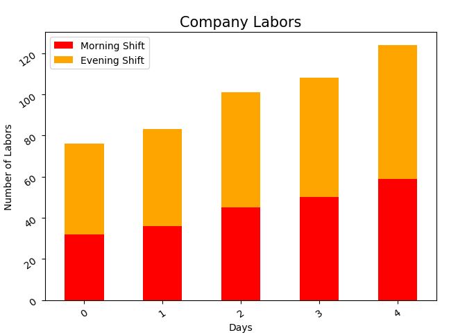
The following code demonstrates how to add axis titles, and an overview title, and on how to rotate the x-axis and y-axis labels for better readability. We created the data frame of the laborers with the morning and evening shifts over the days inside a variable “df”. Then, we created a stacked bar plot with the df.plot function. After that, we set the title for the plot as ‘Company Labors’ with the font size. The labels for the x-axis and y-axis id are also given. In the end, we gave an angle to the x and y variables which rotates according to that angle.
import matplotlib.pyplot as plt
import seaborn as sns
df = pd.DataFrame({'Days': ['Mon', 'Tue', 'Wed', 'Thur', 'Fri'],
'Morning Shift': [32, 36, 45, 50, 59],
'Evening Shift': [44, 47, 56, 58, 65]})
df.plot(kind='bar', stacked=True, color=['red', 'orange'])
plt.title('Company Labors', fontsize=15)
plt.xlabel('Days')
plt.ylabel('Number of Labors')
plt.xticks(rotation=35)
plt.yticks(rotation=35)
plt.show()
The stacked bar plot with the rotational x and y labels is shown in the figure as follows:
Example 3:
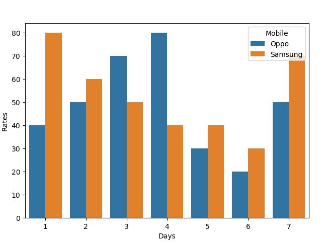
We may use the same bar plot to display a set of categorical values. The end outcome will not have a stacked appearance, but will instead depict the observations on a single graph with several bars. In the example code, we set the data frame which has the data of the mobile having different rates on different days. This plot shows the rates of two mobile simultaneously as we set the x and y variable parameter in the seaborn bar plot function with the hue set as mobile.
import matplotlib.pyplot as plt
import seaborn as sns
df = pd.DataFrame({"Rates": [40, 80, 50, 60, 70, 50, 80, 40, 30, 40, 20, 30, 50, 70],
"Mobile": ['Oppo', 'Samsung', 'Oppo', 'Samsung', 'Oppo', 'Samsung', 'Oppo', 'Samsung', 'Oppo', 'Samsung', 'Oppo', 'Samsung', 'Oppo', 'Samsung'],
"Days": [1, 1, 2, 2, 3, 3, 4, 4, 5, 5, 6, 6, 7, 7]})
s = sns.barplot(x="Days", y='Rates', data=df, hue="Mobile")
plt.show()
The plot is visualized with the two bars in the following graph figure:
Conclusion
Here, we briefly explained the stacked bar plot with the seaborn library. We showed the stacked bar plot with different visualization of the data frames and also with different styling of x and y labels. The scripts are simple to comprehend and learn using the Ubuntu 20.04 terminal. All three examples can be changed as per the work needs of users.


