Seaborn is a Python information visualization framework. This one has an intuitive user interface, aesthetically compelling and instructive analytical visuals. Matplotlib is a software framework that allows the users to create deterministic, interactive, and dynamic graphs.
The pie chart is a spherical figure with colored wedges that contains all the data. The distribution of the numerical information determines the size of every segment in a pie chart. A pie chart is a tool for analyzing the numeric values and compositions. It indicates the percentage of records as a percentage of the total. Whenever one element in a set of data would have a higher relative ratio, its wedge dimension and percentile would become relatively larger than any of the other segments in the pie graph.
In order to make a pie chart employe the Seaborn library in Python, we need to utilize the Matplotlib’s pie() function and the Seaborn’s color palettes argument. To make a pie chart, we will provide the data sets as well as the vibrant colors.
We’ll demonstrate how to create the pie charts with the help of the Seaborn library in this tutorial.
Example 1:
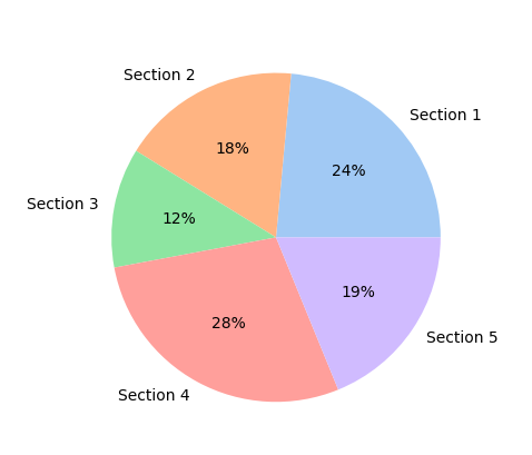
The succeeding program demonstrates how to make a pie chart with the “pastel” color scheme:
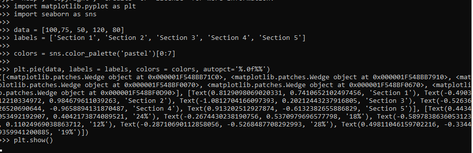
import seaborn as sns
data = [100,75, 50, 120, 80]
labels = ['Section 1', 'Section 2', 'Section 3', 'Section 4', 'Section 5']
colors = sns.color_palette('pastel')[0:7]
plt.pie(data, labels = labels, colors = colors, autopct='%.0f%%')
plt.show()
Here, we incorporate the required header files matplotlib.pyplot as plt and the seaborn as sns. Then we state the labels by using the term “Section”. We apply the color_palette() method to specify the color of the pie graph which we want to utilize. We provide the “pastel” as its argument. The Seaborn library contains the function of the color_palette(). The pie() function of the Matplotlib module is used. This function draws the pie chart. This method contains four different parameters. Now, we employ the show() function of matplotlib.pyplot library to represent the graph.
Example 2:
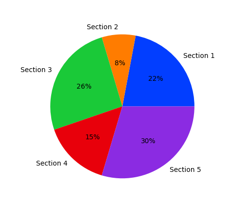
In this instance, we are going to see how we use the “bright” color combination to draw the pie chart.
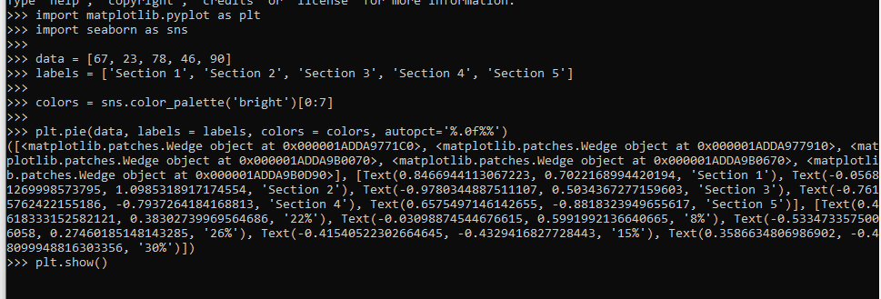
import seaborn as sns
data = [67, 23, 78, 46, 90]
labels = ['Section 1', 'Section 2', 'Section 3', 'Section 4', 'Section 5']
colors = sns.color_palette('bright')[0:7]
plt.pie(data, labels = labels, colors = colors, autopct='%.0f%%')
plt.show()
After integrating the matplotlib.pyplot and Seaborn libraries, we identify the data set. The number of individuals in each section is shown in this data collection. This data is saved in the variable named “data” as an array. The titles are then indicated, utilizing the keyword “Section”. The color palette() method is used to determine the shade of the resultant pie graph.
We assigned the value “bright”. To create the pie chart more appealing, we modify the color scheme to a brighter hue. The color palette() method is found in the Seaborn package. The Matplotlib library’s pie() function is applied. The pie chart is created by using the method. There have been several different attributes in this methodology. To depict the plot, we use the matplotlib.pyplot library’s show() method.
Example 3:
Let’s create a pie chart by including a new color scheme and then explode it. We will examine the additional functionality of the pie chart on how to make one with Matplotlib library and Seaborn library.
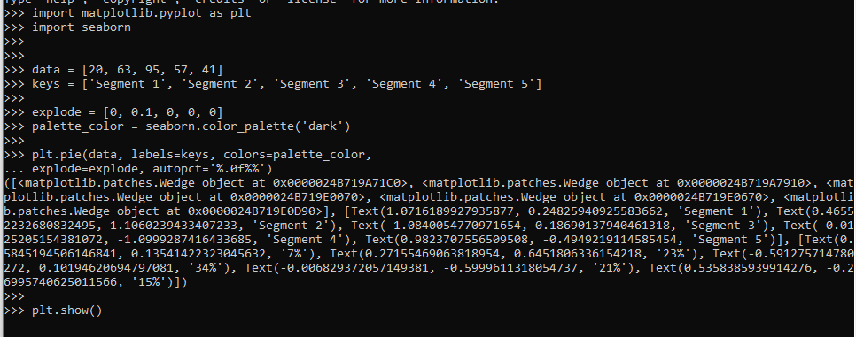
import seaborn
data = [20, 63, 95, 57, 41]
keys = ['Segment 1', 'Segment 2', 'Segment 3', 'Segment 4', 'Segment 5']
explode = [0, 0.1, 0 , 0, 0]
palette_color=seaborn.color_palette('dark')
plt.pie(data, labels = keys, colors = palette_color,
explode = explode, autopct = '%.0f%%')
plt.show()
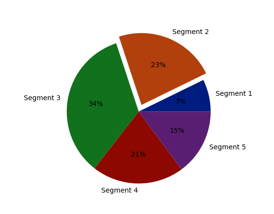
First of all, we import the matplotlib.pyplot and Seaborn header files. We declare two variables termed “data” and “keys”. The variable “data” is assigned to some random values. The variable “keys” is assigned to the tags for these values mentioned on the pie chart. We applied the “explode” attribute and has given it different values. We may depict the students in ‘Segment 2’ in a new way by applying the explode parameter to make it a distinctive slice. We set the exploding pie on the second segment.
Now, we utilize the color_palette() method of the Seaborn library. We call this function to indicate the color of the pie graph. It’s time to depict the data on the pie graph, so we use the pie() function of the plt library. The parameters of this function include data, labels, colors, explode, and ‘autopct’ as its arguments.
To ensure the effectiveness, we use the ‘autopct’ parameter to specify the proportion of the students within every slice. For illustrating the pie-graph, the plt.show() method is invoked.
Example 4:
In Seaborn, we’re going to make an innovative pie chart. We’ll modify the font scale to “2.5” and adjust the color scheme to “dark” because the font belongs to the “Arial” family.
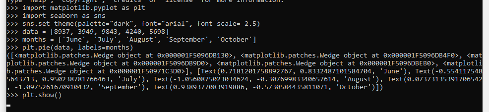
import seaborn as sns
sns.set_theme(palette="dark", font="arial", font_scale=2.5)
data = [8937, 3949, 9843, 4240, 5698]
months = ['June', 'July', 'August', 'September', 'October']
plt.pie(data, labels=months)
plt.show()
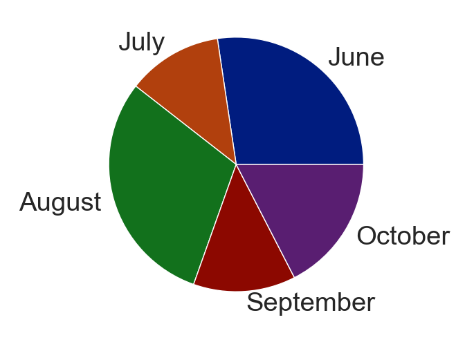
At the start of the program, we introduce the libraries. The matplotlib.pyplot library is imported as plt, and the Seaborn library is imported as sns. Here, we apply the set_theme() method to specify the different arguments such as the color of a palette, font, and font_scale of the data. These arguments require a float value and a string that represents a font size and style, respectively.
We take the data set of the sales of the electronic items in the different months. After indicating the total sales, we also define the names of the months. In the next step, we invoke the pie() function of the Matplotlib module to draw the pie chart. At the end, the plt.show() is used to display the pie chart.
Conclusion
In this article, we learned the numerous methodologies of creating a pie chart by using the Seaborn package. We also drew the pie charts by providing the bright and pastel color schemes. Although the Python visual analytics package Seaborn could not have a predefined method for making pie charts, we utilized the Matplotlib library’s methods to acquire a pie chart and then utilized the Seaborn library’s color palette parameter.