The analysis of variance refers to a specific parameter. It evaluates and illustrates relevant anomalies in the data, whereas the multiple regression evaluates the links between different variations and the intensity of that association. The Seaborn module’s jointplot() method computes a scatter graph containing distinct histograms at the plot’s upper edge and right sides. In this section, we will talk about how to draw jointplots.
Use the jointplot() Method
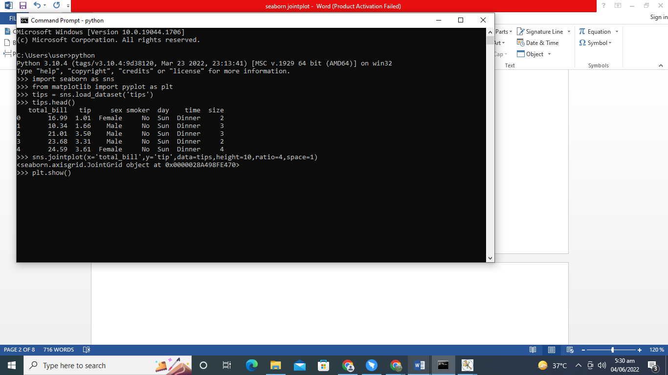
We will use the jointplot() method to create the jointplots. The graph in this step indicates a scatter graph having dual histograms at the map’s edges. The graph shows that the fields “total bill” and “tip” appear to have a positive association. As one parameter’s value increases, so will another.
Even though the marks on the chart are dispersed, the correlation value seems modest. The relative histograms are straight because most entries are confined to the left half of dispersion. However, the right half is broader.
import matplotlib.pyplot as plt
tips = sns.load_dataset('tips')
sns.jointplot( x='total_bill', y='tip', data=tips, height=10, ratio=4, space=1)
plt.show()
At the start of the program, we introduced Seaborn and matplotlib.pyplot libraries. The Seaborn will be imported as SNS, and matplolib.pyplot will be imported as plt. Next, we will retrieve the data of “tips” by using the function load_dataset(). The Seaborn module holds this function. The head() function is being called. We have applied the jointplot() method of the Seaborn library. This function is utilized to draw the jointplots. We have provided the captions of both axes, data set, the height of the plot, ratio, and space as the parameters of the jointplot() method. In the end, the show() function of matplotlib.pyplot will be employed to depict the graph.
Draw a Jointplot Having a Color Scheme
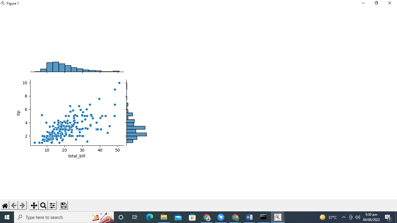
By specifying the “hue” argument to “smoker”, the variables for smokers will be shown in distinct hues in this example. Look at how readily the two components of the “smoker” are being separated. Density plots are presented across both borders, rather than histograms, to illustrate the data representation for the multiple categories of the color parameter independently.
import matplotlib.pyplot as plt
tips = sns.load_dataset('tips')
sns.jointplot( x='total_bill', y='tip', data=tips, hue='smoker')
plt.show()
We incorporated the Seaborn and matplotlib.pyplot libraries at the beginning of the program. The SNS will be used to import the Seaborn, and similarly, plt will be used to import matplotlib.pyplot. Next, we’ll use the method load dataset to get the data for the “tips” variable. This is a method of the Seaborn package. The head() method will be applied. The Seaborn library’s jointplot() function has been used. The jointplots are drawn while using this method. As arguments of the function jointplot(), we have provided titles for both the x and y-axis, data frame, and hue. The “hue” parameter determines the plot’s color tone. Finally, with the help of the matplotlib.pyplot’s show() method, the chart will be displayed.
Draw a Regression Line
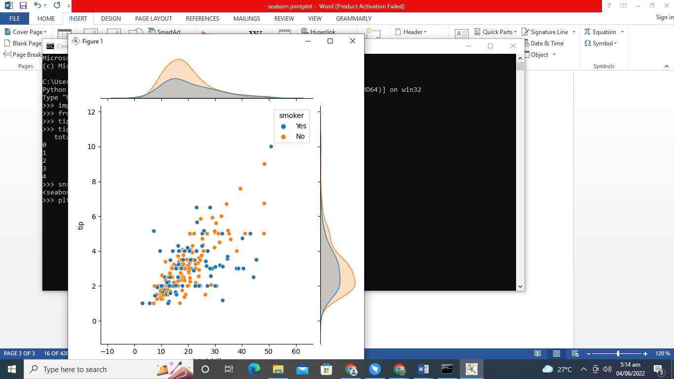
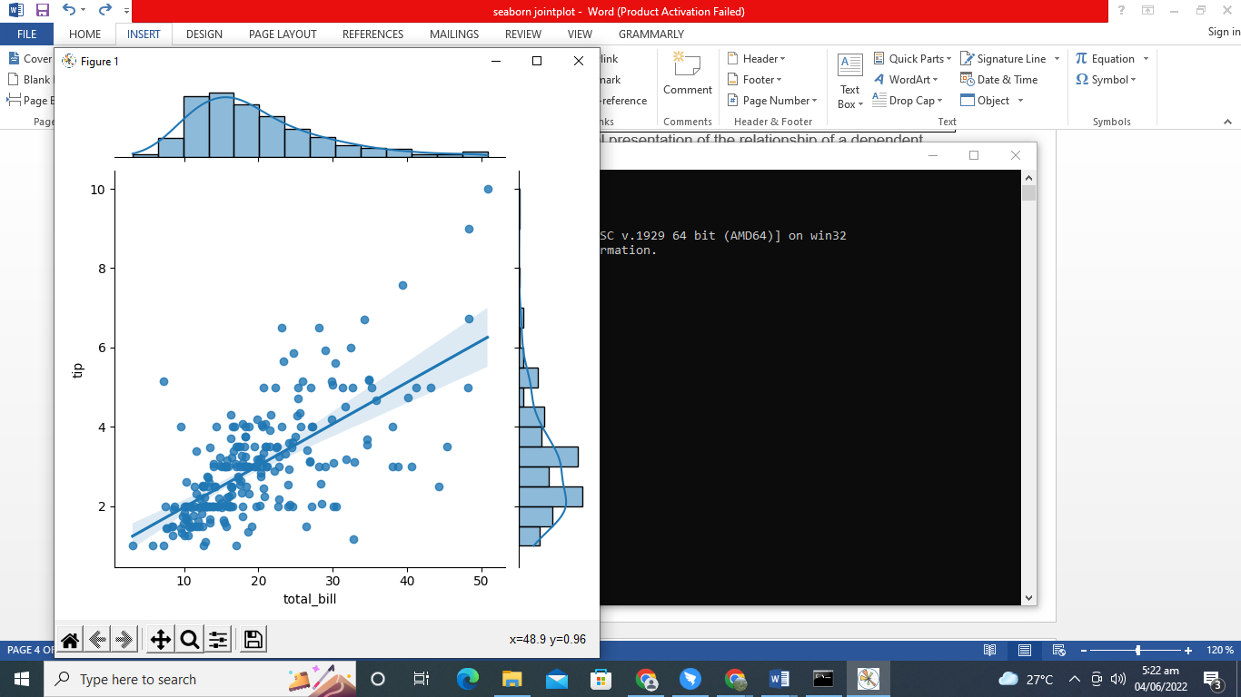
A slope of the line depicts the relationship among different variables. The curve has been drawn. Thus, it would be as near as possible to most data sets. The regression line is calculated using numerical methods, and we can use this expression to determine the variables. When the argument “kind” is assigned to “reg”, the jointplot() method is invoked. A regression line is created on the graph. The regression line is being used to indicate various performance measures.
import matplotlib.pyplot as plt
tips = sns.load_dataset('tips')
sns.jointplot( x='total_bill', y='tip', data=tips, kind='reg')
plt.show()
First, we imported the required header files: Seaborn as SNS and matplotlib.pyplot as plt. Let’s load the inbuilt data set of tips with the help of load_dataset(). This function is associated with the Seaborn package. We have used the head() method. Next, we will draw the jointplots by employing the jointplot() method of the Seaborn library. This function contains different parameters, which include the title of the x-axis as “total_bill”, the y-axis as “tip”, data of tips, and kind.
We have set the value of the argument “kind” as “reg” to draw the regression line on the graph. We now call the show() function to illustrate the resultant graph.
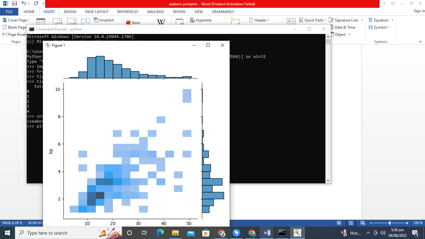
Draw 2D Histogram
The “kind” argument in the previous program would be specified as “hist”, and the jointplot depicts a 2D histogram. The frequency analysis for two consecutive nominal variables is used in a 2D histogram. The length of the lines in a 1D histogram reflects the total. In a 2D histogram, each bar in the graph shows an interim and includes the cumulative probability of occurrence of the entries in both categories. The primary chart is constituted of square segments that have been colored in a spectrum.
import matplotlib.pyplot as plt
tips = sns.load_dataset('tips')
sns.jointplot( x='total_bill', y='tip', data=tips, kind='hist')
plt.show()
After introducing the libraries Seaborn and matplotlib.pyplot with the support of the load_dataset(), we would load the built-in data points of tips. The Seaborn module is linked to this method. The head() function was utilized.
Next, we’ll use the jointplot() function of the Seaborn package to create jointplots. This method has several parameters, including the x-axis label of “total bill”, y-axis label of “tip”, data of tips, and kind. To draw a two-dimensional histogram, we define the value of the parameter “kind” to “hist”. We’ve used the show() method to visualize the final chart.
Conclusion
We have discussed several approaches to draw the jointplots with the help of the Seaborn package. By providing numerical value to the appropriate arguments to the joinplot() method, we may change the dimension of the chart, the proportion of axes, the coordinates’ altitude, and the spacing between the x and y-axis. On the jointplots, we may modify the graph’s layout and add the regression line.