“We will go over using the Seaborn Bar Plot in your machine learning science projects in this article. We will look at the structure of Seaborn’s sns.barplot() function and see some examples of how to use it to make bar plots multiple columns in various ways by modifying its parameters.
A bar plot is among the most prominent graphs for representing the quantitative grouping of statistics by rectangular blocks for several categories. The link between different data variables is depicted using a multiple bar graph. Each data value is represented by a different column in the graph. The multiple bar plots are essentially used to compare various things. The sns.barplot() function plots a bar graph with each bar representing aggregate data for each group. It calculates the mean for every group by default. This indicates that the size of each bar corresponds to the category’s mean.
The term “multi-bar plot” refers to a plot with multiple bars. Grouped Bar plot is another name for it. In seaborn, a grouped barplot is useful when dealing with several category variables. Grouped bar plots are simple to create with Python’s Seaborn charting package.”
Syntax of the Barplot in Seaborn
Syntax:
Each parameter’s description given to the barplot method is as follows.
x,y, and hue: The function’s arguments are stored in this variable.
data: The seaborn dataset or dataframe created that will be used to plot the bar plot is passed here.
order, hue_order: The plotting of categorical variables should be done in this order.
estimator: The category bin is determined using this statistical function.
orient: We can choose whether the plot should be vertical or horizontal here.
color: This option determines the color of all elements.
palette: The colors used in plots are determined by this option.
ax: This is where the visualization is plotted on the axes.
Example 1
We can make multiple columns of the barplot by using the seaborn function group bar. The groupby() method in Pandas is used to divide data into groups depending on specified criteria.
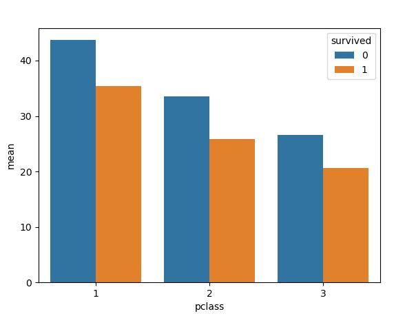
In the following example script, we have included the matplotlib library and seaborn module for plotting multiple columns using barplot. Now, we have to create the data for plotting. For this, we have inserted the data of the titanic dataset from seaborn. The sample dataset titanic is then loaded inside the load_dataset constructor.
Then, we have invoked the groupby function where the pclass and survived columns are passed from the titanic function. Also, we have applied aggregation of the column age from the titanic dataset. This function will group these columns. Inside the barplot function, we have set the pclass to the x parameter, mean to the y parameter, and hue set to the survived column.
import seaborn as sb
df = sb.load_dataset(' titanic')
df = df.groupby(['pclass', 'survived']).agg(mean=("age", 'mean'))
df = df.reset_index()
sb.barplot(x="pclass",
y="mean",
hue="survived",
data=df)
plt.show()
The barplot with multiple columns is visualized as follows:
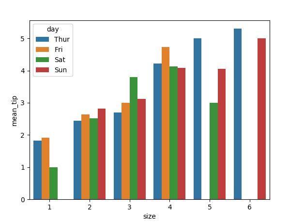
Example 2
In the above bar plot, we have two columns grouped to generate a bar plot. We can take more than two columns to group together. Firstly, the modules are added to the seaborn script to construct plots. After that, the sample dataset tips are called inside the seaborn function load_dataset.
Then, we have a groupby function in the variable df to which the size and day of the columns are given for grouping. Also, the aggregation method is used in this variable. The column tip is assigned to the aggregation function, which returns the mean of the column tip. Then, we have a barplot function inside which we have x and y parameters and set the size and mean_tip to these categorial parameters.
Here, we have introduced another optional parameter hue which is set with the day column. The plt.show is used to show the bar plot figure.
import seaborn as sns
df = sns.load_dataset('tips')
df = df.groupby(['size’, ‘day']).agg(mean_tip=("tip", 'mean'))
df = df.reset_index()
sns.barplot(x="size",
y=mean_tip,
hue="day",
data=df)
plt.show()
Here, we have shown the barplot multiple column visualization of the tip’s dataset.
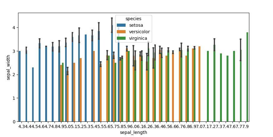
Example 3
As we have used the groupby function to show the barplot multiple columns. Just specify the three parameters x, y, and hue to generate the bar plot in multiple columns. So, let’s begin with adding the python modules for plotting the multiple bars of the plot. The sample dataset iris is utilized here for plotting. Then, we simply called the barplot and passed three columns from the iris to the x,y, and hue options, respectively.
import seaborn as sns
df_titanic = sns.load_dataset("iris")
sns.barplot(x="sepal_length", y="sepal_width", hue="species", ci="sd", capsize=0.09, data=df_titanic)
plt.show()
The multiple column barplot is rendered inside the figure as follows:
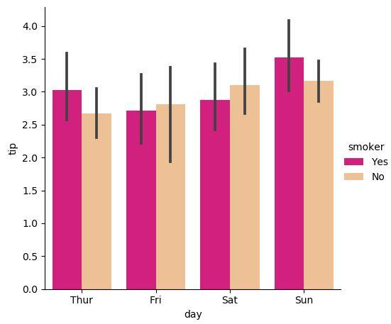
Example 4
Now, we will generate the multiple columns by using the seaborn catplot. In the following example, we have inserted the sample dataset tips from the seaborn in the function load_dataset. We have passed the x,y, and hue attributes to the catplot function. The x input has set with the day column, the y input takes the tip column, and the hue input is set with the smoker. To the catplot function, we have set the kind parameter to bar. This will plot the bar plot here. The palette is also set for the barplot.
import seaborn as sns
tips = sns.load_dataset("tips")
bar = sns.catplot(x="day", y="tip",
hue="smoker",
data=tips, kind="bar", palette="Accent_r" );
plt.show()
The bar plot multiple columns are rendered here from the catplot function.
Conclusion
We examined the “seaborn bar plot multiple columns” in this Python tutorial and looked at the syntax of the bar plot. We have also discussed the parameters which are passed inside the barplot function. The seaborn library provided us with several examples here of how to make bar plots with multiple columns by using the groupby function. We also learned how to use seaborn’s catplot() function to create several bar plots.