Topic of Contents:
Let’s see how to create a scatter plot using the pandas.DataFrame.plot.scatter and matplotlib.pyplot.scatter.
Using Pandas.DataFrame.Plot.Scatter
In the scatter plot, the coordinates of each point are defined by two DataFrame columns. It can be represented by the filled circles at each point (2D view).
Syntax:
Let’s see the syntax of this function and parameters that are passed to it:
Parameters:
- The “x” and “y” take the DataFrame columns.
- The “s” represents the size of the point. We can set the same size to all the scalars. In this case, we need to assign the integer that represents the size of the point. If you want a different size for each point, you need to pass the size of each point in a list and assign it to this parameter.
- The “c” represents the color of the point. We can set the same color to all the scalars. In this case, we need to assign the color string or color code that represents the color. If you want a different color for each point, you need to pass the color for each point in a list and assign it to this parameter.
- “Alpha” provides you with transparency to the colors. It is used along with the “c” parameter.
Example 1: “X” and “Y” Parameters
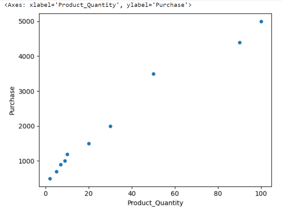
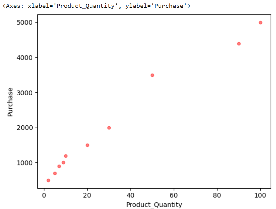
Let’s create a DataFrame (day1_Data) with two columns – “Product_Quantity” and “Purchase”. Plot the scatter by assigning the first column to “x” and the second column to “y”.
# Products DataFrame
day1_Data = pandas.DataFrame({'Product_Quantity': [2,10,5,7,9,20,30,50,90,100],
'Purchase': [500,1200,700,900,1000,1500,2000,3500,4400,5000]})
# Create scatterplot for day1_Data
day1_Data.plot.scatter(x='Product_Quantity', y='Purchase')
Output:
Now, you can see the relation between these two columns.
Example 2: “S” Parameter
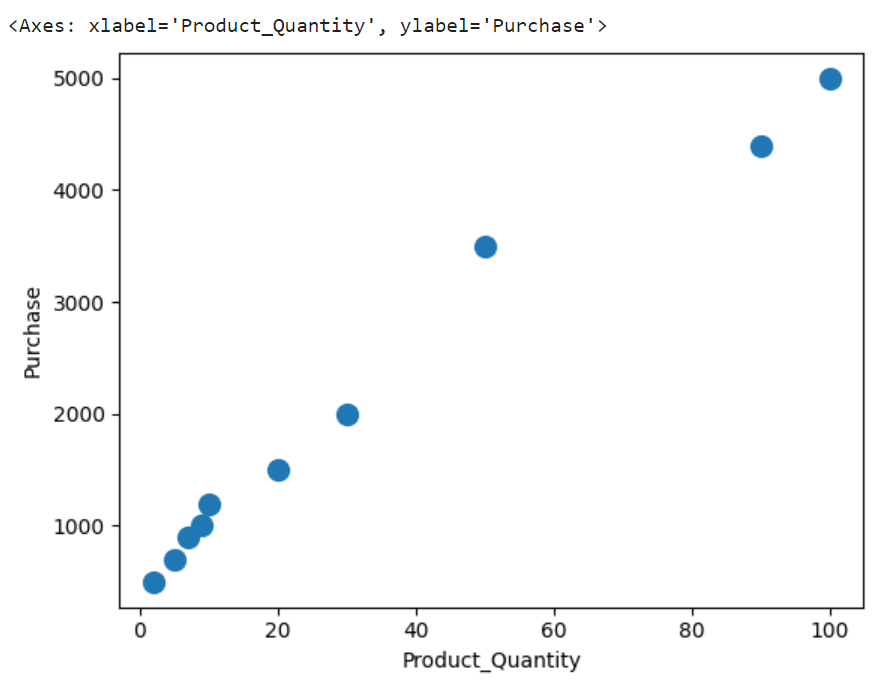
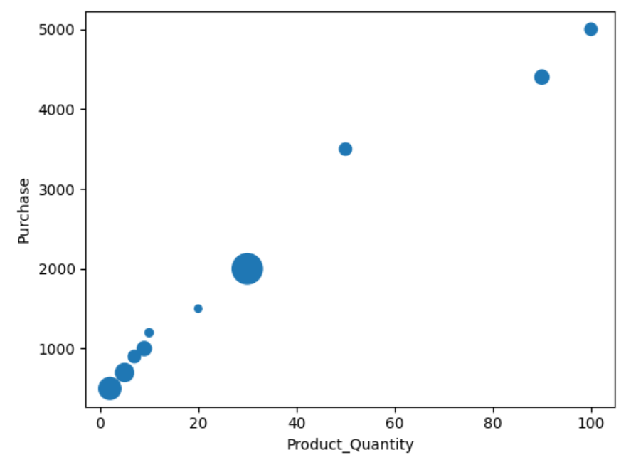
Utilize the previous DataFrame and plot the scatter with the point size as 100. Similarly, use the same parameter and pass different sizes for all 10 points.
# Products DataFrame
day1_Data = pandas.DataFrame({'Product_Quantity': [2,10,5,7,9,20,30,50,90,100],
'Purchase': [500,1200,700,900,1000,1500,2000,3500,4400,5000]})
# Create scatterplot for day1_Data - points with same size
day1_Data.plot.scatter(x='Product_Quantity', y='Purchase',s=100)
# Create scatterplot for day1_Data - points with different size
day1_Data.plot.scatter(x='Product_Quantity', y='Purchase',s=[220,30,150,68,90,23,415,67,91,67])
Output:
The size of all the points in the first scatter plot are the same and are different in the second scatter plot.
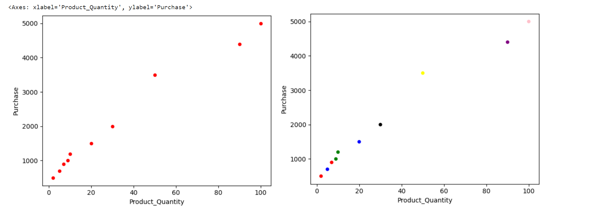
Example 3: “C” Parameter
- Plot the scatter with all red color points.
- Plot the scatter with different color points.
# Products DataFrame
day1_Data = pandas.DataFrame({'Product_Quantity': [2,10,5,7,9,20,30,50,90,100],
'Purchase': [500,1200,700,900,1000,1500,2000,3500,4400,5000]})
# All points are red
day1_Data.plot.scatter(x='Product_Quantity', y='Purchase',c='red')
# Some points are different in color
day1_Data.plot.scatter(x='Product_Quantity', y='Purchase',c=['red','green','blue','red','green','blue','black','yellow','purple','pink'])
Output:
The color of points is the same in the first scatter plot and the color of some points are different in the second scatter plot.
Example 4: “Alpha” Parameter
Let’s specify the alpha parameter to the function which is set to 0.5.
# Products DataFrame
day1_Data = pandas.DataFrame({'Product_Quantity': [2,10,5,7,9,20,30,50,90,100],
'Purchase': [500,1200,700,900,1000,1500,2000,3500,4400,5000]})
# Create scatterplot for day1_Data
day1_Data.plot.scatter(x='Product_Quantity', y='Purchase',c='red',alpha=0.5)
Output:
You will observe the transparency in the points.
Using Matplotlib.Pyplot.Scatter
In this scenario, we use the matplotlib.pyplot module to create the scatter plot. All the parameters that are passed to the pandas.DataFrame.plot.scatter function can be passed to this function. Apart from this, this function can accept the following parameters:
Syntax:
Let’s see the syntax of this function and the parameters that are passed to it:
Parameters:
- The “marker” is used to emphasize each point.
- The “cmap” is an instance of the colormap name which is used to map the scalar data to the colors.
- The “vmin” and “vmax” are the minimum data values which define the data range in which the color map covers.
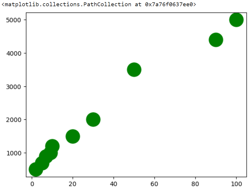
Example 1:
Let’s create a DataFrame (day1_Data) with two columns – “Product_Quantity” and “Purchase”. Plot the scatter by assigning the first column to “x” and the second column to “y”.
import matplotlib
# Products DataFrame
day1_Data = pandas.DataFrame({'Product_Quantity': [2,10,5,7,9,20,30,50,90,100],
'Purchase': [500,1200,700,900,1000,1500,2000,3500,4400,5000]})
# Create scatterplot for day1_Data using matplotlib
matplotlib.pyplot.scatter(day1_Data.Product_Quantity, day1_Data.Purchase,s=500,color="green")
Output:
Now, you can see the relation between these two columns.
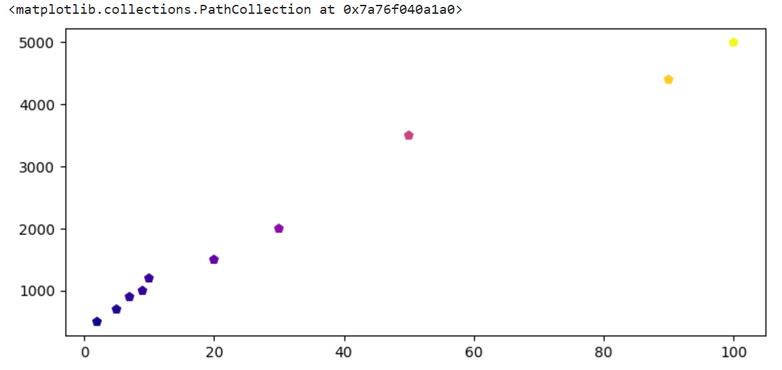
Example 2:
Let’s set the “plasma” colormap by assigning “c” with the “Product_Quantity”. Also, set the market style to “p” (Pentagon).
import matplotlib
# Products DataFrame
day1_Data = pandas.DataFrame({'Product_Quantity': [2,10,5,7,9,20,30,50,90,100],
'Purchase': [500,1200,700,900,1000,1500,2000,3500,4400,5000]})
matplotlib.pyplot.scatter(day1_Data.Product_Quantity, day1_Data.Purchase, c=day1_Data.Product_Quantity, cmap="plasma",marker="p")
Output:
You can see the color mapping to all the points and the market is of type pentagon.
Conclusion
We learned how to create a scatter plot using the pandas.DataFrame.plot.scatter and matplotlib.pyplot.scatter functions. In each function, most of the parameters are discussed with examples. The same DataFrame is utilized in this entire guide for better understanding. The advantage of creating a scatter plot is to view the relation between two variables (DataFrame columns). This can be extended to Machine Learning Applications.