Use of Axes.twinx() method:
In this step, we see how to utilize the twinx() function. This method creates double axes which share the x-axis.
import numpy as np
def GFG1(temp):
return (6. / 10.) * (temp - 40)
def GFG2(ax1):
y1, y2 = ax1.get_ylim()
ax_twin .set_ylim(GFG1(y1), GFG1(y2))
ax_twin .figure.canvas.draw()
fig, ax1 = plt.subplots()
ax_twin = ax1.twinx()
ax1.callbacks.connect("ylim_changed", GFG2)
ax1.plot(np.linspace(-60, 100, 200))
ax1.set_xlim(50, 150)
ax1.set_ylabel('Y-AXIS')
ax_twin .set_ylabel('Y-AXIS')
fig.suptitle('Figure\n\n', fontweight ="bold")
plt.show()
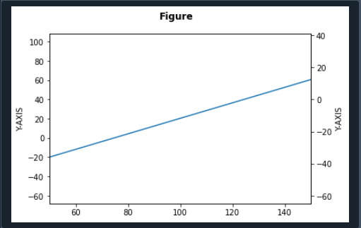
The first step before writing the program is to introduce matplotlib.pyplot as plt and NumPy as np. We define the object and call the function that returns the temperature value. We also define GFG2, and it contains one object.
We call the function get_ylim() to specify the limit of the y-axis. We provide ‘GFG1’ and ‘GFG2’ arguments to the function set_ylim(). We declare a new object ax_twin.figure.canvas.draw.
Now plt.subplots() function is applied to create the graph. A new function ax_twin() function. It is used to make identical axes that share the x-axis. We specified the linespace of the graph by using the function np.linspace() of the NumPy library.
Further, we set the limits of the x-axis by calling the set_xlim() method. We have to set the labels of both sides of the y-axis by applying the set_label() method. We utilize the fig.suptitle() function to define the title of the graph. The fontweight parameter is provided for this function.
The function plt.show() is called in the termination of the code to represent the graph.
Insert additional y-axis in Matplotlib:
We could utilize the twinx() method to generate a second y-axis.
fig, bx = plt.subplots()
bx.plot([2, 4, 6, 8, 10], [1, 3, 9, 11, 1], color='green')
bx1 = bx.twinx()
bx1.plot([22, 32, 42, 52, 5], [10, 12, 14, 16, 18], color='orange')
fig.tight_layout()
plt.show()
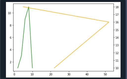
We import the required library matplotlib.pyplot as plt. We take two variables, ‘fig’ and ‘bx.’ We utilize plt.subplots() functions where no rows and columns are set to 1. In addition to this, we call the bx.plot() function to draw the first line of the graph. This function contains two arrays having data sets of x-axis and y-axis separately.
We also passed the line’s colour as an argument to this function. Next, we apply the bx.twinx() method to generate a twin of axes having a mutual X-axis. To draw another line on the graph, we utilize the bx1.plot () function. Here we declare two arrays. These arrays consist of data points of the x-axis and y-axis for the second line.
We defined the color for the second line of the graph by providing color parameters to the function plot(). We draw the second line on bx1. Now the function fig.tight_layout() is defined so that we have to set the spacing between the lines. We utilize the plt.show() function to display the graph.
Matplotlib twin y-axes:
In this subheading, we’ll explore using matplotlib in Python to create a figure with twin y-axes. We are going to create a unique plot containing different variables scales as we require a simple analysis. The twinx() method in matplotlib is being used to make double axes. Let’s look at an instance in which dual y-axes are formed:
import numpy as np
x = np.arange(5, 20, 1.5)
d1 = np.sin(x)
d2 = np.cos(x)
fig, cx1 = plt.subplots()
cx1.set_xlabel('X')
cx1.set_ylabel('Y1', color = 'black')
cx1.plot(x, d1, color = 'black')
cx1.tick_params(axis ='y', labelcolor = 'black')
dx2 = cx1.twinx()
dx2.set_ylabel('Y2', color = 'magenta')
dx2.plot(x, d2, color = 'magenta')
dx2.tick_params(axis ='y', labelcolor = 'magenta')
plt.show()
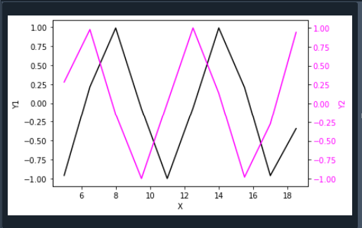
We integrate the libraries matplotlib.pyplot as plt and NumPy as np at the beginning of the code. We used the arrange() function to specify the data points. We create two variables to store the data sets. To create the graph we utilize the plt.subplots() function. Here we also specified the title of the x-axis and y-axis by calling set_xlabel() and set_ylabel() functions.
We can set the color of the label of the y-axis by passing the ‘color’ parameter. We apply the cx1.set() function to pass the data sets of the y-axis. Similarly, we can adjust the color of these data points. The function tick_params() is used to plot the line. It includes the color of the line. Furthermore, we draw the datasets among the x-axis and second y-axis with the help of the plot() function.
Now the twinx() function is applied to generate a double y-axis. Now we set the label and color of the y-axis of the second line. So we call the dx2.set_ylabel() function. The color of the data points of the second line of the y-axis is defined by the dx2.plot() method. We employ the plt.show() function in the last to show the plot.
Matplotlib dual y-axes with the same data:
Here we’ll discuss how to apply the plot() function with the twinx() function to make twin y-axes and visualize them with identical data: import matplotlib.pyplot as plt.
a = np.arange(300)
b = np.sin(a)
fig, cx1 = plt.subplots()
cx1.plot(a, b)
cx1.set_xlabel('X')
cx1.set_ylabel('Y1')
dx2 = cx1.twinx()
dx2.set_ylabel('Y2')
plt.show()
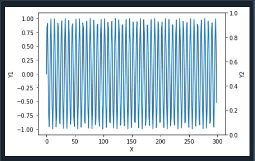
After including the libraries, we must define the data sets using NumPy() and sin() methods. We define an object and then employ the subplots() function to draw a graph. In addition to this, the labels of the x-axis and one y-axis are specified by using the function set_label().
We create dual axes, so we call the twinx() method. Apart from this, we define the label of another y-axis, and at the end of the program, we display the graph using the plt.show() method.
Conclusion:
In this tutorial, we discussed the matplotlib twinx() method with their examples. This function creates a dual y-axis that shares a similar x-axis. We employ this function by utilizing different approaches.


