One or more vector graphics representing the occupied portions are formed due to this. The ‘where’ argument could be used to cover particular sections only. Corners integrate the provided vertices immediately by default. Matplotlib is a graphing package for Python language with NumPy, and it is the Python quantitative mathematical enhanced version.
In this article, we will show you how to fill the Matplotlib gradient with a different color scheme using the Matplotlib fill _between() technique.
Matplotlib fill_between() function and color:
The fill_between() method is utilized to shade the space or portion between two horizontal or vertical lines. The lines are specified by some defined coordinates, which create one or more polygonal shapes representing the graph’s filled region.
In this scenario, we will explore how to insert colors into the specified portion of the figure.
import numpy as np
def fill_example():
plt.title('Figure')
x_array = np.linspace(0, 20*np.pi, 200)
print('x_array: ', x_array)
print('len(x_array): ', len(x_array))
y_array = np.sin(x_array)
print('y_array: ', y_array)
plt.plot(x_array, y_array)
plt.fill(x_array, y_array, 'g')
plt.show()
if __name__ == '__main__':
fill_example()
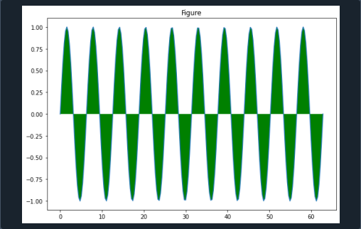
In this example, we will import the NumPy library and matplotlib.pyplot library. Next, we define the fill_example() function. We specified the label of the plot by using the plt.title() method. Here we give the ‘Figure’ tag to the plot. We declare a dataset for x_array.
Furthermore, we create numerous elements, and those elements are stored in that array. We employ the print() function to print the array. The len() function is provided as a parameter to the print() method on the next line. We have to set the values of the array of the y-axis.
Similarly, we also call the print() function for y_array. We provide these two arrays to the ply.plot() function for displaying the curves. This function holds three parameters. Here we specified the color we wanted to be filled in the curve. Hence we are given a ‘g’ color which represents green curves.
The function plt.fill() is called to obtain the arguments list. After calling plt.show() function, the graph is displayed.
We get the graph with the tag ‘Figure’ in the center by running the code as mentioned above.
Matplotlib fill_between() applied on two lines:
In this step, we will notice how to utilize Python to fill the region of a graph with the shade of our desire through matplotlib. We must provide a color parameter to the fill_between() method and specify the tint to accomplish this. Here we also use the parameter ‘alpha.’
import numpy as np
x = np.arange(0,20,0.5)
b1 = 5 - 3*x
b2 = 4 - 0.8*x
b3 = 0.1 -x
b4 = np.minimum(b1, b2)
plt.ylim(0, 4)
plt.plot(x, b1,
x, b2,
x, b3)
plt.fill_between(x, b2, b4, color='red',
alpha = 1.0)
plt.show()
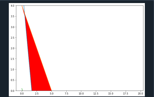
At the start of the code, we integrate matplotlib.pyplot and NumPy packages. We declare the ‘x’ variable and specify different values. For this purpose, we call the arrange() function of the NumPy library.
Now we have to define the points to demonstrate the lines on the graph. We indicate the upper edge of the shading by calling the np.minimum() function. In addition to this, we set the values for the y-limit. This is also done by the function plt.ylim().
Now we utilize the plt. plot() function to draw the lines. It holds different parameters. In the end, we decide the lines in which we want the shading or filling. So to accomplish this, we define the plt.fill_between() method, and the color we want to be filled is ‘red’ in this case.
Therefore, we passed color as a parameter of this function. We also specified the size of the shaded portion by passing the ‘alpha’ argument to the function plt.fill_between(). To visualize the figure we utilize plt.show() functionality.
Matplotlib fill_between () function using log scale:
Here we are going to learn the process of filling the portion under the slope by logarithmic scale. To make a logarithmic scale, we have to change the axes’ measurement to log.
import numpy as np
a = np.linspace(-3, 3, 50)
b = np.sin(a)
plt.plot(a, b)
plt.fill_between(a, b)
plt.xscale('log')
plt.yscale('log')
plt.show()
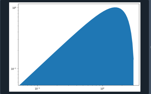
The most important part of the code is to include the libraries. Every library has its purpose. Matplotlib.pyplot is imported for graphic visualizations, and NumPy library is imported for mathematics and working with datasets. In the next step, we define data dimensions by using the NumPy library.
So for this, we make two separate variables. The np.linspace() function is called to declare data points of the x-axis. We utilize the plt.plot() function to draw the data sets of the x-axis and y-axis. Now fill_between() method is called to fill the portion among the curvatures in the graph. Moreover, for developing a logarithmic scale, we have to first apply the plt.scale (‘log’) function for the dataset of the x-axis. And then, we apply the same function to the dataset of the y-axis.
By executing this step, we could define the scale for both axes. In the end, we call the plt.show() function to present the graph.
Conclusion:
In this article, we have gone through different methods with their examples of filling the graph region in between the lines. We use the fill_between() function for this purpose. We examined how to shade the portion of the graph by utilizing a logarithmic scale. Similarly, we see how to fill the portion between two lines by using alpha. And further, we see the method of specifying the color of the shaded portion of the graph.


