The text() feature could be used to insert text in any region just on Axes. Annotating a graph technique is a typically used scenario for a phrase, and the annotate() function provides additional features that create annotations simple.
There are two factors to take into consideration in an annotation: the place to be evaluated, which is indicated by the variable xy, and the position of the textual “xytext”.
We have delivered the concept associated with Matplotlib Annotate. Now, we will explore how this method operates and how it can accomplish our desired outcome in this portion. We are going to start with a simple illustration and make our way up to some more complex ones.
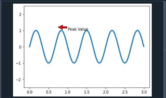
Sine Waveform
Our purpose is to produce the sine waveform in this instance. There are various parameters linked with the annotate() function, including text: The text that we intend to annotate is indicated by this argument. Xy: This argument contains the annotated Points X and Y. XYText: it is an additional argument that specifies where the title should be aligned on either X and Y axes. XYCOORDS: the string data is considered in this argument. ARROWPROPS: This argument has the form “dict” and is also a complementary value. It is configured to none by default.
import numpy as pp
fig, ppool = plt.subplots()
t = pp.arange(0.0, 3.0, 0.002)
s = pp.sin(3 * pp.pi * t)
line = ppool.plot(t, s, lw=3)
ppool.annotate('Peak Value', xy=(.75, 1.2),
xytext=(1, 1),arrowprops=dict(facecolor='red',
shrink=2.20),xycoords="data",)
ppool.set_ylim(-2.5, 2.5)
plt.show()
We first had to integrate the NumPy and matplotlib libraries. Now, we utilize Numpy’s arrange method to sort the data. So, the method effectively creates a valuation that falls within the provided range.
Hence after that, we applied the 2*pi*t formula. Meanwhile, we will move on to our annotation section. The place that the arrow requires to indicate is XY in this case. We also get arrow attributes, which include all of the information about how the arrowhead should appear. Furthermore, we set the y-axis-limit. We have finally figured everything out.
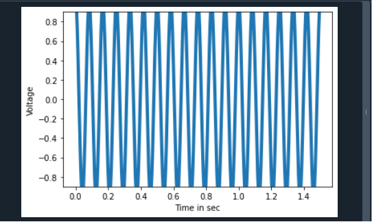
Cosine Signal to Full-wave Converter
Our objective in this instance is to display the result of a full-wave converter for the cosine receiver. The peak-to-peak ratio is -0.9 to 0.9 in this situation. The specified cosine signal has a bandwidth of 6 Hz. Aside from the aforementioned items, we have included a plt tag here. What it accomplishes is that it enables us to identify the four axes here too.
import numpy as pp
fig, ppool = plt.subplots()
t = pp.arange(0.0, 1.5, 0.002)
s = pp.cos(4 * pp.pi * 6 * t)
line = ppool.plot(t, s, lw=4)
ppool.annotate('Peak Values', xy=(2, 2),
xytext=(1, 1),arrowprops = dict(facecolor ='red',
shrink = 0.2),xycoords="data",)
plt.xlabel("Time in sec")
plt.ylabel("Voltage")
ppool.set_ylim(-0.9, 0.9)
plt.show()
Check out the output in the affixed screenshot.
Annotate Scatter Graph
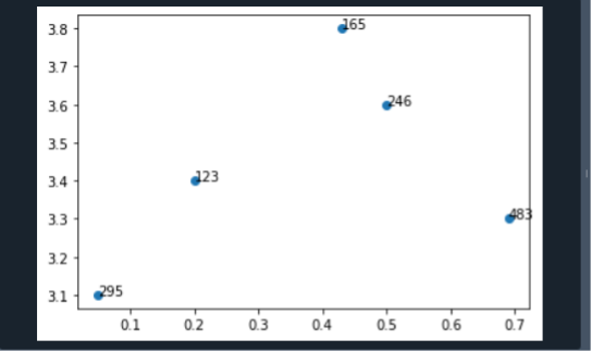
Let’s consider the example of how we can be utilizing this approach to annotate a scatter graph.
y = [3.1, 3.4, 3.6, 3.8, 3.301]
x = [0.05, 0.2, 0.5, 0.43, 0.69]
n = [295, 123, 246, 165, 483]
fig, ax = plt.subplots()
ax.scatter(x, y)
for i, txt in enumerate(n):
ax.annotate(txt, (x[i], y[i]))
plt.show()
To visualize the scatter graph, we have to follow the procedure. We started by defining the dimensions on the x and y axes. The mathematical notation has now been assigned to every point. The for loop was then utilized to obtain the annotation data for every point effectively.
Transforms and Text Position
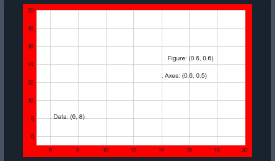
It is sometimes better to append the text to a specific location on the axis or graphic, regardless of the content. It is accomplished in Matplotlib by adjusting the transform. Any visual presentation framework requires a method for converting coordinates.
A data item must be displayed sometimes in the way at a specific position on the graph, which must therefore be shown in pixels in the image. These coordinate modifications are quite simple, and Matplotlib offers a good variety of technologies for executing them effectively. Let’s consider the instance of utilizing such transforms to display text in different spots:
import matplotlib as mpl
plt.style.use('seaborn-whitegrid')
import numpy as np
fig, ax = plt.subplots(facecolor='red')
ax.axis([5, 20, 5, 20])
ax.text(6, 8, ". Data: (6, 8)", transform=ax.transData)
ax.text(0.6, 0.5, ". Axes: (0.6, 0.5)", transform=ax.transAxes)
ax.text(0.6, 0.6, ". Figure: (0.6, 0.6)", transform=fig.transFigure);
The text is positioned to the left and above the provided dimensions by default. The “.” just at the start of every line represents the estimated coordinate point. In this instance, there seem to be three pre-defined adjustments that we can employ. The data parameters linked with the axis respectively, titles are provided by the transData parameters.
The transAxes parameters are a fraction of the axes’ area and indicate the position from its edge of the axes. The transFigure parameters are identical, but they give the location as a substantial portion of the visual size, starting from either the left edge corner of the frame.
Conclusion
The Matplotlib Annotate has been discussed in this article. We have also examined its specified requirements and also explained a few instances to enable us fully understand them. For every instance, we modified the syntax and evaluated the results. And at last, we could state that the Matplotlib Annotate method is being utilized to annotate Matplotlib plots.
Matplotlib annotations are not shown due to an error. When operating with this method, we may find the error. The most collective cause is an error that occurred in the code. Amongst the most prevalent errors is that the annotation text is placed far above the coordinates in the statement. Because of the size difference, we may not be able to view the annotation at times.


