So, in this article we are going to see details about the following topics:
- Adding text on the graph
- Adding labels to the matplotlib graphs
- Text annotation (matplotlib.pyplot.annotate()) for the line graph
- Text annotation (matplotlib.pyplot.annotate()) for the bar graph
- Text annotation (matplotlib.pyplot.annotate()) for the scatter plot graph
- Legend function
1. Adding text on the graph
We can also add text on the graph so that we don’t have to point important information while presenting something. If we include the text on particular data, this will also look more professional or informative.
The syntax is:
import matplotlib.pyplot as plt
import numpy as np
plt.clf()
# using some dummy data for this example
x_value = np.arange(0,15,1)
print("x_value",x_value)
y_value = np.random.normal(loc=2.0, scale=0.9, size=15)
print("y_value",y_value)
plt.plot(x_value,y_value)
# default text will be left-aligned
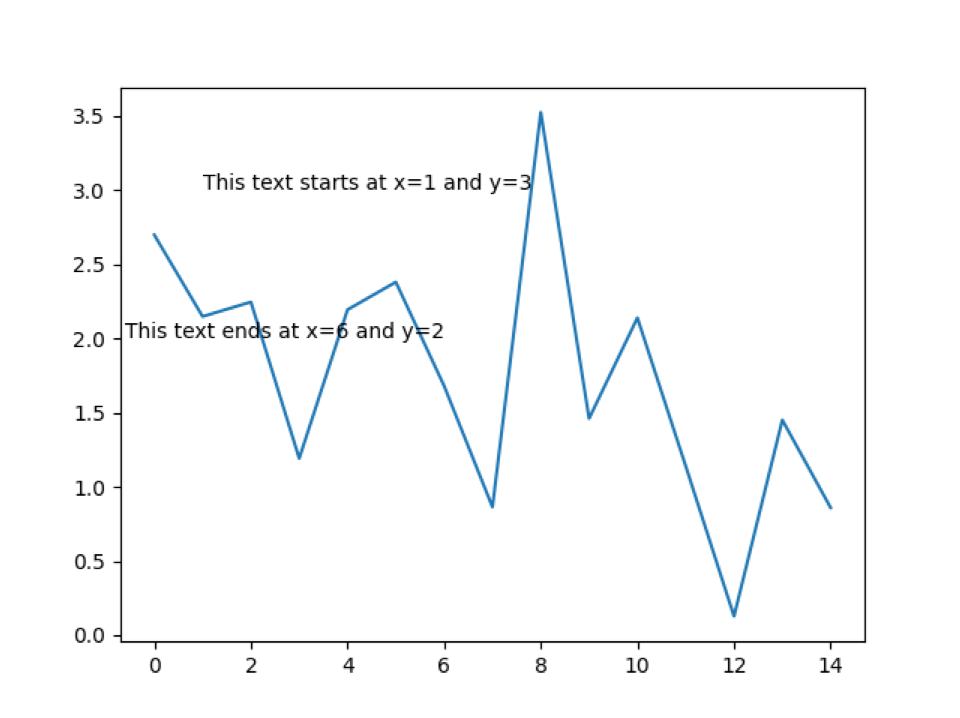
plt.text(1,3,'This text starts at x=1 and y=3')
# this text will be right-aligned
plt.text(6,2,'This text ends at x=6 and y=2',horizontalalignment='right')
plt.show()
Line 2 to 3: We import all the necessary packages for this program.
Line 5: We call the method clf(). This function helps to draw something on the previous graph itself. It will not close the window of the graph so that two different items we can draw on the same graph.
Line 7 to 11: We just created some random values for the x_values and y_values.
Line 12: We pass those created random x and y values into the plot function to draw the graph.
Line 15 to 20: Our graph is now ready and has to add some text. So we first add the text, which starts from x=1,y=3 (1, 3). By default, the text will be left-aligned so that the above text starts from the point (1, 3).
In the next line, we add another text whose starting point is x=6 and y=2. But this time, we mentioned their horizontalalignment=’right’, so the text endpoint is (6, 2).
Output: python addingTextOnGraph.py
y_value [1.70365904 3.73967715 1.11413564 2.82135022 2.87735691 1.98391073
1.75867938 3.01109059 2.6281119 1.89008119 1.58300606 1.3142607
1.01428062 0.84672494 0.07056874]
2. Adding labels to the matplotlib graphs
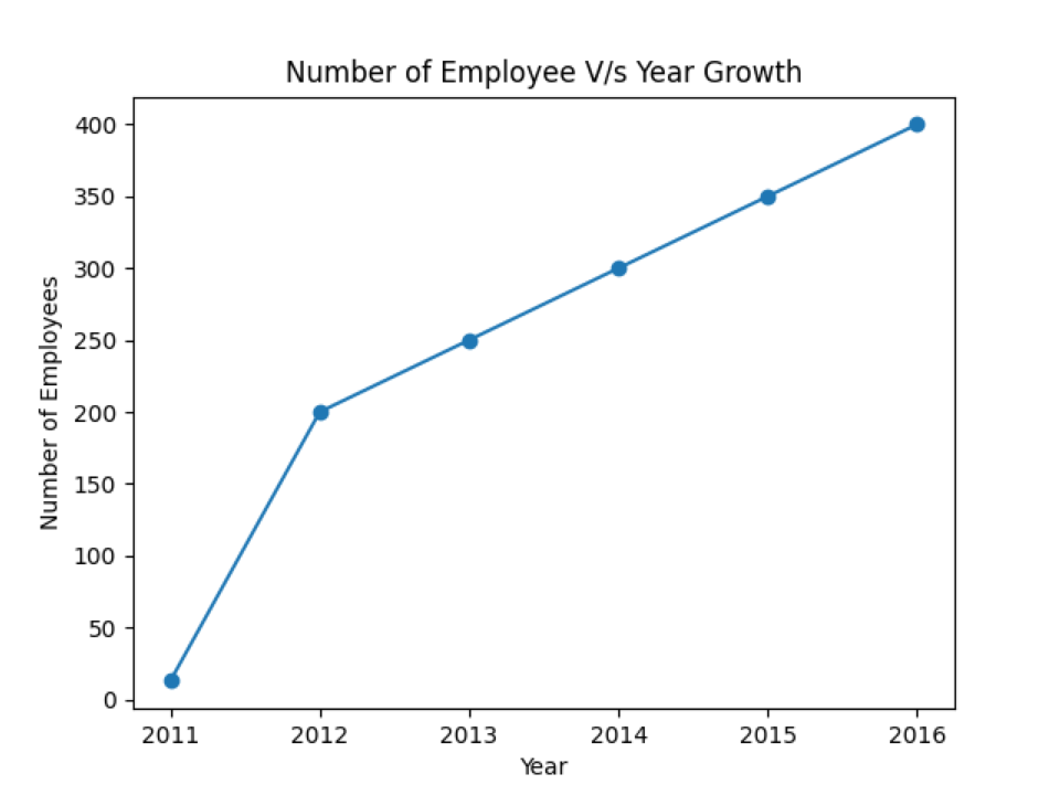
In this example, we are going to add the labels’ names on the graph. In the previous example, if we see the graph plot, it’s difficult to understand what the graph is trying to say because there is no information about x-axis or y-axis data. And we are also not able to see where the actual data resides in the plot. So, we are going to add markers to see the data points on the plot along with the labels.
# import the required library
import matplotlib.pyplot as plt
# X and Y data
numberofemp = [13, 200, 250, 300, 350, 400]
year = [2011, 2012, 2013, 2014, 2015, 2016]
# plot a line chart
plt.plot(year, numberofemp,marker="o")
# set label name of x-axis title
plt.xlabel("Year")
# set label name of x-axis title
plt.ylabel("Number of Employees")
# set label name of chart title
plt.title("Number of Employee V/s Year Growth")
plt.show()
Line 4 to 8: We import the required library and create two lists for X and Y. The list numberoftemp represents the X-axis and the list year represents the Y-axis.
Line 11: We pass those X and Y parameters to the plot function and add one more parameter in the plot function marker. The marker will be used to display the data points on the graph. There is a number of markers available to support.
Line 13 to 19: We set the label names along the x-axis, y-axis, and the chart’s title name.
Output: python addlabels.py
3. Text annotation (matplotlib.pyplot.annotate()) for the line graph
Text annotation is another function in the matplotlib that helps to annotate the data points.
# import the required packages
import matplotlib.pyplot as plt
import numpy as np
# import the clf () method to draw another graph on the same graph window
plt.clf()
# dummy dataset from numpy
x_values = np.arange(0,10,1)
y_values = np.random.normal(loc=2, scale=0.2, size=10)
plt.plot(x_values,y_values,marker='D', mfc='green', mec='yellow',ms='7')
#joins the x and y values
for x,y in zip(x_values,y_values):
label = "{:.3f}".format(y)
plt.annotate(label, # this is the value which we want to label (text)
(x,y), # x and y is the points location where we have to label
textcoords="offset points",
xytext=(0,10), # this for the distance between the points
# and the text label
ha='center',
arrowprops=dict(arrowstyle="->", color='green'))
plt.show()
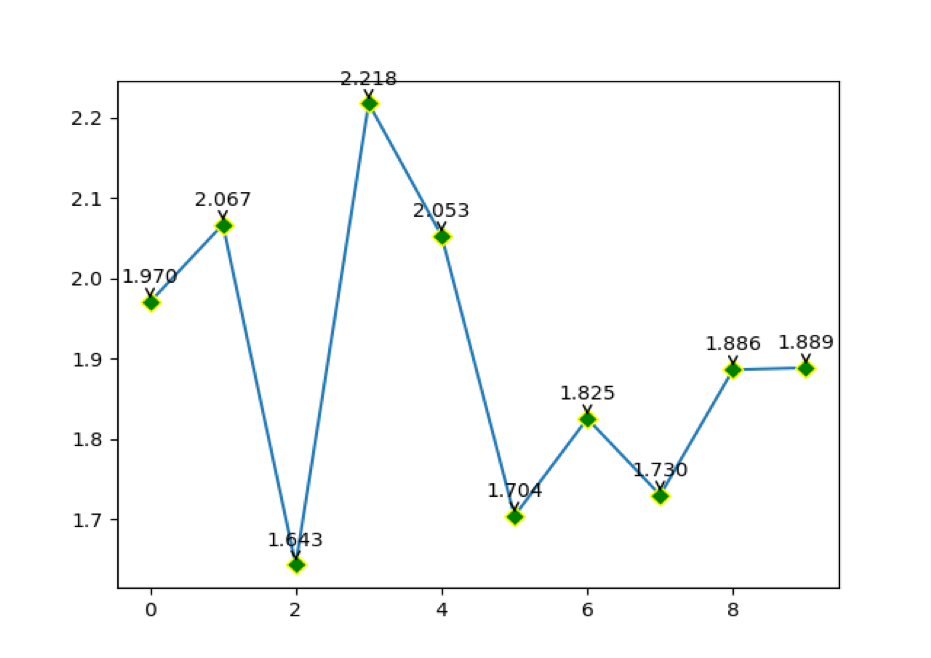
Line 14: We pass the parameter marker=’D’, mfc (markerfacecolor) green colour, mec (markeredgecolor) yellow, and ms (markersize). The mec (markeredgecolor) is a colour that comes outside of the data point.
Line 19: We are formatting the value of y.
As shown below:
actual value of y = 2.0689824848029414
After the format, the value of y is 2.069 (rounded to 3 decimal points)
Line 21 to 29: We pass all the required parameters into the annotate function, which is the, (x, y). xytext is for the distance between the points and the label. The arrowprops is another parameter that is used for the graph to show a more professional way. And at last, we plot the graph which is shown below.
Output: python datapoints_labels_on_line_graph.py
4. Text annotation (matplotlib.pyplot.annotate()) for the bar graph
We can also add text annotation to the bar graph of the matplotlib.
# import the required packages
import matplotlib.pyplot as plt
import numpy as np
# import the clf () method to draw another graph on the same graph window
plt.clf()
# dummy dataset from numpy
x_values = np.arange(0,10,1)
y_values = np.random.normal(loc=2, scale=0.5, size=10)
plt.bar(x_values,y_values)
# zip joins x and y coordinates in pairs
for x,y in zip(x_values,y_values):
label = "{:.3f}".format(y)
plt.annotate(label, # this is the value which we want to label (text)
(x,y), # x and y is the points location where we have to label
textcoords="offset points",
xytext=(0,10), # this for the distance between the points
# and the text label
ha='center',
arrowprops=dict(arrowstyle="->", color='black'))
plt.show()
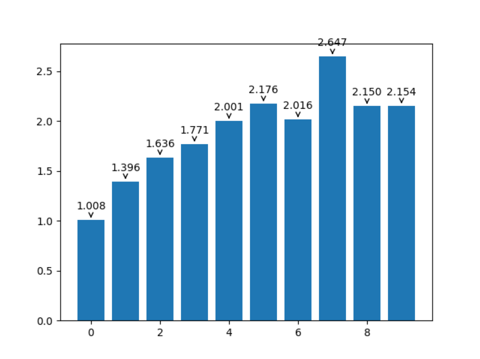
The above annotation code is the same as line graph annotation. The change we did at line 14.
Line 14: This is the line where we did change. Now, we are calling the bar function and passing the x and y data into that.
Output: python annotation_bar_graph.py
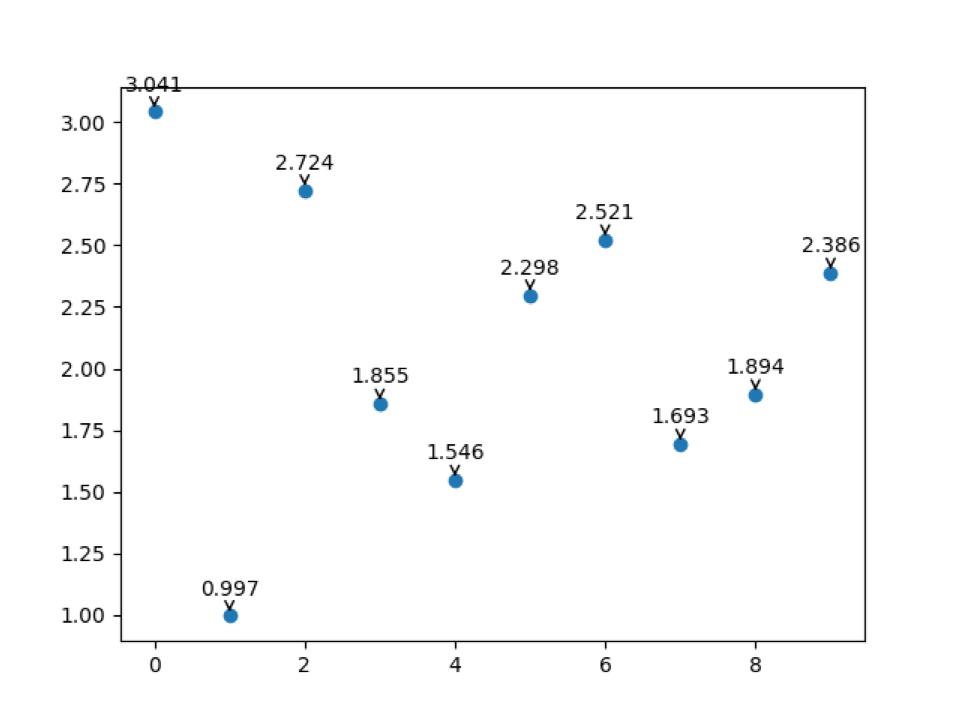
5. Text annotation (matplotlib.pyplot.annotate()) for the scatter plot graph
We can also add text annotation to the scatter plot graph of the matplotlib.
# import the required packages
import matplotlib.pyplot as plt
import numpy as np
# import the clf () method to draw another graph on the same graph window
plt.clf()
# dummy dataset from numpy
x_values = np.arange(0,10,1)
y_values = np.random.normal(loc=2, scale=0.5, size=10)
plt.scatter(x_values,y_values)
# zip joins x and y coordinates in pairs
for x,y in zip(x_values,y_values):
label = "{:.3f}".format(y)
plt.annotate(label, # this is the value which we want to label (text)
(x,y), # x and y is the points location where we have to label
textcoords="offset points",
xytext=(0,10), # this for the distance between the points
# and the text label
ha='center',
arrowprops=dict(arrowstyle="->", color='black'))
plt.show()
The above annotation code is the same as line graph annotation. The change we did at line 14.
Line 14: This is the line where we did change. Now, we are calling the scatter function and passing the x and y data into that.
Output: python annotation_scatter_plot.py
6. Legend (Label)
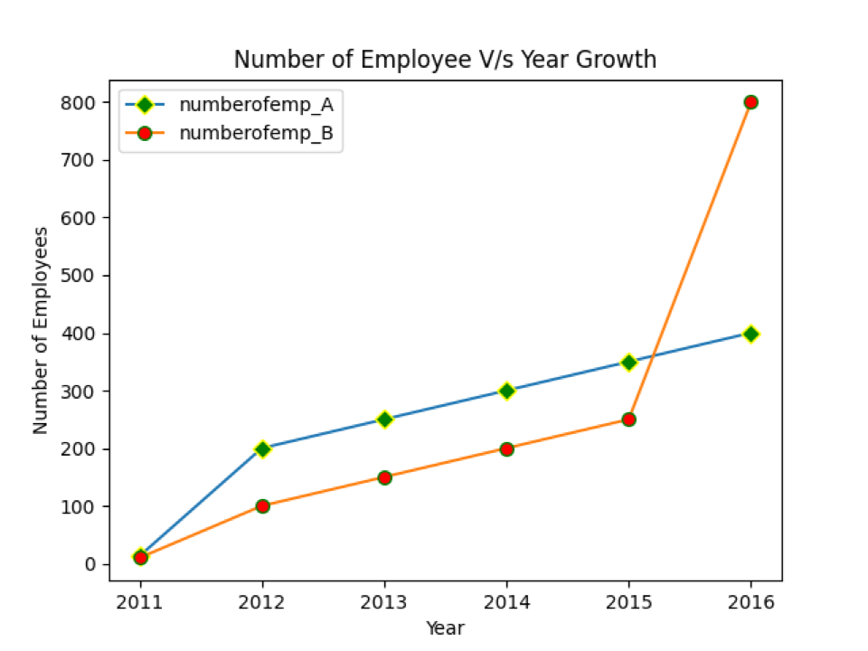
When we have different categories dataset and want to plot on the same graph, we need some notation to differentiate which category belongs to which category. That can be solved using the legend as shown below.
# import the required library
import matplotlib.pyplot as plt
# X and Y data
numberofemp_A = [13, 200, 250, 300, 350, 400]
numberofemp_B = [10, 100, 150, 200, 250, 800]
year = [2011, 2012, 2013, 2014, 2015, 2016]
# plot a line chart
plt.plot(year, numberofemp_A, marker='D', mfc='green', mec='yellow',ms='7')
plt.plot(year, numberofemp_B, marker='o', mfc='red', mec='green',ms='7')
# set label name of x-axis title
plt.xlabel("Year")
# set label name of x-axis title
plt.ylabel("Number of Employees")
# set label name of chart title
plt.title("Number of Employee V/s Year Growth")
plt.legend(['numberofemp_A','numberofemp_B'])
plt.show()
Line 7 to 8: We created two data lists numberofemp_A and numberofemp_B, for the x-axis. But both A and B have the same y-axis values. So in this graph, we share the x-axis only because the scale of the y-axis for both A and B is the same.
Line 12 to 13: We just added one more plot function with some different parameters.
Line 16 to 22: We added labels for the graph.
Line 24: We created the legend for these two categories so that two different categories on the same graph can be easily differentiated.
Output: python using_legand_labels.py
Conclusion
In this article, we have seen different methods which we can use for the labels graph. We have also seen how to annotate the text data on the graph, making the graph more professional. Then we have seen the legend function to differentiate different categories on the same graph.

