In Data Visualization, we use graphs and charts to represent data. The visual form of data makes it easy for data scientists and everybody to analyze data and draw the results.
The histogram is one of the elegant ways to represent distributed continuous or discrete data. And in this Python tutorial, we will see how we can analyze data in Python using Histogram.
So, let’s get started!
What is a Histogram?
Before we jump to the main section of this article and represent data on histograms using Python and show the relationship between histogram and data, let us discuss a brief overview of the histogram.
A histogram is a graphical representation of distributed numerical data in which we generally represent the intervals in the X-axis and the frequency of numerical data in Y-Axis. The graphical representation of a histogram looks similar to the bar graph. Still, in Histogram, we deal with intervals, and here the main objective is to find the outlines by dividing the frequencies into a series of intervals or bins.
Difference Between Bar Graph and Histogram
Due to the similar representation, often students confuse histogram with the bar chart. The main difference between a histogram and a bar chart is that a histogram represents data over intervals, whereas a bar is used to compare two or more categories.
The histograms are used when we want to check where the most frequencies are clustered, and we want an outline for that area. On the other hand, bar charts are simply used to show the difference in categories.
Plot Histogram in Python
Many Python data visualization libraries can plot histograms based on numerical data or arrays. Among all the data visualization libraries, matplotlib is the most popular one, and many other libraries use it to visualize data.
Now let’s use the Python numpy and matplotlib library to generate random frequencies and plot histograms in Python.
For a starter, we will plot a histogram by generating a random array of 1000 elements and see how to plot a histogram using an array.
import matplotlib.pyplot as plt #pip install matplotlib
#generate a random numpy array with 1000 elements
data = np.random.randn(1000)
#plot the data as histogram
plt.hist(data,edgecolor="black", bins =10)
#histogram title
plt.title("Histogram for 1000 elements")
#histogram x axis label
plt.xlabel("Values")
#histogram y axis label
plt.ylabel("Frequencies")
#display histogram
plt.show()
Output
The above output shows that among the 1000 random elements, the majority elements value lie between -1 to 1. That’s the main objective of a histogram; it shows the majority and minority of data distribution. As the histogram bins are more clustered between -1 to 1 values, more elements are between these two interval values.
Note: Both numpy and matplotlib are Python third-party packages; they can be installed using the Python pip install command.
Real-World Example with Python Histogram
Now let’s represent a histogram with a more realistic data set and analyze it.
We will be plotting a histogram using the titanic.csv file that you can download from this link.
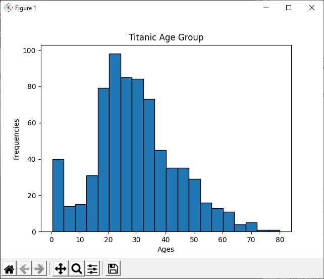
The titanic.csv file contains the data set of titanic passengers. We will wrangel the tatanic.csv file using Python panda’s library and plot the histogram for the age of different passengers, then analyze the histogram result.
import matplotlib.pyplot as plt
#read the csv file
df = pd.read_csv('titanic.csv')
#remove the Not a Number values from age
df=df.dropna(subset=['Age'])
#get all passangers age data
ages = df['Age']
plt.hist(ages,edgecolor="black", bins =20)
#histogram title
plt.title("Titanic Age Group")
#histogram x axis label
plt.xlabel("Ages")
#histogram y axis label
plt.ylabel("Frequencies")
#display histogram
plt.show()
Output
Analyze the Histogram
In the above Python code, we display the age group of all the titanic passengers using the histogram. By looking at the histogram, we can easily tell that out of 891 passengers, most of their ages lie between 20 to 30 years. Which means there were many youngsters in the titanic ship.
Conclusion
Histogram is one of the best graphical representations when we want to analyze the distributed data sets. It uses the interval and their frequency to tell the majority and minority of data distribution. Statisticians and data scientists mostly use histograms to analyze the distribution of values.


