Plots can be inserted anywhere in the graphic using axes. A graph can have several axes, but an axes element must have been in a single graphic. In the situation of 3D, the dimensions include two-axis items along with three-axis items. Axes component refers to the visual region that includes the data structure.
Axes are a functional and basic element for building sub-plots. Axes allow us to draw at any point in the image, allowing us to create sub-plots dynamically. Any defined figure can have several axes, but an Axes item would only include being in a single graph. The Axes in two-dimension include two axis items, while the Axes in three-dimension hold 3 axis items.
We only have to execute the add axes() technique to insert an Axes element to the graphic. The axes item is provided by the add axes() technique, which introduces axes at the location rect [left, bottom, length, altitude], where most of these attributes are probabilities of image length and width.
The axes specify the set of points and produce the majority of the visual components: Coordinate axes, Ticks, Line2D, Annotation, Polyline, and so on. Axes allow visualizing at any point in the Graph. As a result, it suggests the chance of sub-plots. In the Matplotlib library, it is a state-based integration (Pyplot module).
Axes() Function
The main purpose of this method is to construct an axis item using a parameter. The parameter primarily consists of a list of multiple elements [left, bottom, breadth, and altitude]. Let’s have a look at the axes () method in further detail.
fig = plt.figure()
ax = plt.axes([0.3, 0.3, 1.0, 1.0])
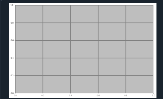
In this instance, we create an object of the graph and axes object. Axes ([0.3, 0.3, 1.0, 1.1]) according to the above program, in which the first ‘0.3’ shows the spacing between both the left side axis and the graph frame’s boundary, which is 30 percent of the overall dimension of the image display.
The other ‘0.3’ denotes the spacing between both the bottom side axes and the image terminal’s boundary, which is also 30 percent of the entire elevation of the image frame. Furthermore, the very first ‘1.0’ signifies that the dimension’s breadth is 100 percent from left to right, and the next ‘1.0’ denotes that the axis altitude is 100 percent from bottom to top.
Add_axes() Function
If there is a requirement, we would additionally utilize the add_axes() function to include the axes item to the graphic. This function will return the axes item and insert axes at [left, bottom, breadth, altitude], in which all of the values are fractions of the graphic length and width.
fig = plt.figure()
ax = fig.add_axes([0.5, 0.5, 0.5, 0.5])
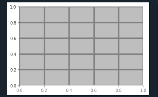
Hereafter creating the graphic objects in this program, we will add axes elements to that defined graphic object. After executing this code, we get this type of outcome.
Ax.legend() Function
The legend() technique of the axes module is being used to add a legend to the graph representation. There are three arguments for this feature: The argument labels can be used to specify a string pattern, and it is mostly used to manage a Line2D succession.
The location of the defined legend is specified by the loc argument, which could be either an integer or a string.
fig = plt.figure()
ax = plt.axes([0.3, 0.3, 0.5, 0.5])
ax.legend(labels = ('label1', 'label2'),
loc = 'lower right')
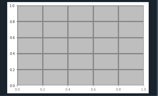
For specifying the legend by loc argument, we utilize the Axes.legend() method in this case. We set the labels for the defined axes. By this function, we can detect the items for the legend. We give a label to the existing objects of the graph. Moreover, we explicitly state the objects for the legends.
Ax.plotb() Function
It’s the axis class’s most basic function for visualizing data of one array vs the other as arcs or points. An additional format string parameter can be passed to this function, which will be used to set the hue, layout, and length of the line and indicator.
import numpy as np
X = np.linspace(-np.pi, np.pi, 25)
C = np.cos(X)
S = np.sin(X)
ax = plt.axes([0.5, 0.5, 0.5, 0.5])
ax1 = ax.plot(X, C, 'gH--')
ax2 = ax.plot(X, S, 'y+-.')
ax.legend(labels = ('Cosine Function', 'Sine Function'),loc = 'right')
ax.set_title("figure")
plt.show()
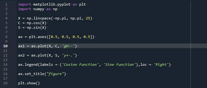
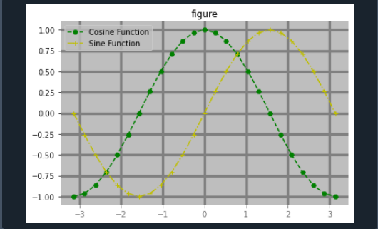
There are three arguments in the Ax.plot() method: The x-axis is represented by the first variable, ‘X.’ The y-axis is indicated by the next argument, ‘Y.’ CLM indicates hue, lining, and indicator, and is the third and last attribute. Let’s look at an example of the technique we just discussed:
The line in the output of this technique can be shown in several other ways i.e., dots (‘:’), dash (‘—’), plain (‘-‘), and so many more styles.
Conclusion
We’ve gone over the Matplotlib Axes class as well as how to implement it along with program instances and outputs in this article. We also talked over the several functions of this module and when to use them effectively. The data space is represented by the axes item, which is a segment of the illustration. Axes elements can be identified in numerous Figures, but each Axes element could only be found in one Graph. Two (or multiple in the situation of 3D) Coordinate objects are contained in the Axes. The Axes module and its associated operations are the most specific way of interacting with the OO interaction. On the other hand, we could also insert the axes item to the graph by calling the add_axes () technique.


