This write-up will describe the Bootstrap container-fluid class.
What is the Bootstrap “container-fluid” Class?
The “container-fluid” class in Bootstrap is utilized to provide a full-width container. It has the following CSS predefined properties:
width: 100%;
padding-right: 15px;
padding-left: 15px;
margin-right: auto;
margin-left: auto;
}
The explanation of the above-mentioned CSS properties are described below:
- “width” property has a value of “100%” which indicates the elements will have the full width.
- “padding-right” property is set with the value of “15px”, which adds some space at the right side of the element’s content.
- “padding-left” is set with the value “15px” and adds the space at the left of the element’s content.
- “margin-right” and “margin-left” properties are set with the value “auto”, which adjusts the element in the center.
How to Use the Bootstrap “container-fluid” Class?
Let’s implement the following examples to see how the “container-fluid” class affects the Bootstrap navigation bar’s layout:
- Navbar without the “container-fluid” Class
- Navbar with the “container-fluid” Class
Example 1: Navbar Without the “container-fluid” Class
Let’s create a navigation bar by following the steps:
- First, add the “<nav>” element with the “navbar”, “navbar-expand-sm”, “navbar-light”, and “bg-light” classes.
- Inside the “<nav>” tag, add the “<a>” tag with the class “navbar-brand” to specify the logo.
- Then, add the “<button>” element with the class “navbar-toggler”. Add the “data-toggle” and “data-target” attributes and then include the toggler icon within the “<span>” tag.
- The “data-target” attribute is assigned the “id” value, which must be the same as the “id” of the navbar.
- Then, add the “<div>” element, which contains the navbar contents.
- The items of the navbar are specified using the “navbar-bar” class.
- Then, the items are adjusted using the “nav-item” class within the “<a>” tag.
HTML
<a class="navbar-brand" href="#">Linuxhint</a>
<button class="navbar-toggler" data-toggle="collapse" data-target="#navigationBar">
<span class="navbar-toggler-icon"></span>
</button>
<div class="collapse navbar-collapse" id="navigationBar">
<div class="navbar-nav">
<a class="nav-item nav-link active" href="#">Home</a>
<a class="nav-item nav-link" href="#">About us</a>
<a class="nav-item nav-link" href="#">Contact</a>
</div>
</div>
</nav>
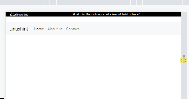
Without the “container-fluid” class, the navbar looks like this:
Example 2: Navbar With the “container-fluid” Class
Add the “container-fluid” class within the “<div>” element and add the navigation bar, implemented in the previous example, inside this “<div>” element:
<nav class="navbar navbar-expand-sm navbar-light bg-light">
<a class="navbar-brand" href="#">Linuxhint</a>
<button class="navbar-toggler" data-toggle="collapse" data-target="#navigationBar">
<span class="navbar-toggler-icon"></span>
</button>
<div class="collapse navbar-collapse" id="navigationBar">
<div class="navbar-nav">
<a class="nav-item nav-link active" href="#">Home</a>
<a class="nav-item nav-link" href="#">About us</a>
<a class="nav-item nav-link" href="#">Contact</a>
</div>
</div>
</nav>
</div>
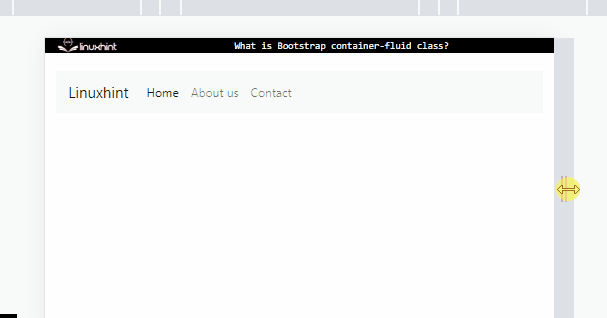
Output
You have successfully learned about the Bootstrap “container-fluid” class.
Conclusion
The “container-fluid” class in Bootstrap provides full width containers for the components. This class has the predefined CSS “width” property with the value “100%”. To create the navbar with responsive, full width, assign the “container-fluid” class to the “<nav>” tag. This write-up has explained the Bootstrap “container-fluid” class with the help of an example.