A card in Bootstrap 5 is referred to as a container or a box that wraps content inside it. It can consist of a header, some content, and a footer. It can be styled by adding colors, or images to it. These Bootstrap cards are considered as a replacement for old panels, thumbnails, or wells. How these cards are created and styled in various ways has been discussed in this article.
How to create a card using Bootstrap 5
For the purpose of creating a simple card, make a div container and assign it the .card class and nest a div inside the first div and assign it the .card-body class and place the content of the card inside this div.
HTML
The code stated above will create a very simple card.
Output
The output displays a basic card.
How to add a header and footer in a card
As mentioned already a card can consist of a header and a footer. Therefore, to make these entities use the .card-header, and the .card-footer classes.
HTML
In the above code, to make the header of the card we are assigning a div container the .card-header class, then to place some content we are making the body of the card by using the .card-body class, and lastly to generate a footer the .card-footer class is used.
Output
The card shown above has a header, body, and footer.
How to create colorful cards
To provide background colors to the cards simply use any of the background color classes which are .bg-primary, .bg-secondary, .bg-danger, .bg-warning, .bg-success, .bg-info, .bg-muted, .bg-light, .bg-dark.
HTML
<div class="card-body">Card 1</div>
</div>
<div class="card bg-danger">
<div class="card-body">Card 2</div>
</div>
<div class="card bg-success">
<div class="card-body">Card 3</div>
</div>
<div class="card bg-warning">
<div class="card-body">Card 4</div>
</div>
<div class="card bg-info">
<div class="card-body">Card 5</div>
</div>
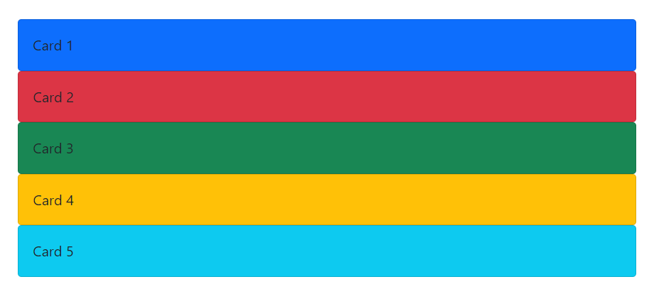
There are a total of 5 cards being generated in the above code and each has been given a different color. Note that the background color classes are being assigned to the div that has the .card class.
Output
Colorful cards were generated successfully.
How to add title, text, and links to a card
If you are generating cards that convey certain information and you wish to add some title, text, and links to that card then follow the code provided below.
HTML
To add a title the .card-title class was assigned to a heading element (any heading element h1-h6 can be used), to include some text the .card-text class was assigned to a <p> element and a link was also added and was make hoverable along with a blue color by using the .card-link class.
Output
An informative card was generated successfully.
How to add images to a card
If you wish to add images to your cards along with some text and links then follow the example below.
HTML
To place the image inside the card use the .card-img-top class inside the <img> tag and then just like in the previous section we are making a card body and placing a title, a text, and a link inside the card body. Note that the image has been placed outside the card body to make it span the entire width that has been provided to the div container having the class .card.
Output
However, if you wish to place your title, text, and link above the image then use the .card-img-bottom class. Like we have shown in the code snippet below.
HTML
The above code will generate a card with the image placed at the bottom and the title, text, and link placed above that image.
Output
The .card-img-bottom class is working properly.
How to create card image overlay
Apart from placing your content above and below the image you can also place it on the image and this procedure is referred to as card image overlay.
HTML
The code is the same as in the previous sections with a slight difference that to place the content over the image we are using the .card-img-overlay class instead of the .card-body class.
Output
A card image overlay was created successfully.
Conclusion
For the purpose of styling a card you can add a header and footer to it using the .card-header, and .card-footer class, whereas, all of the available background color classes can be used to create colorful cards. Moreover, use the .card-title, .card-text, .card-link classes to add a title, text, and links to a card. To further make your cards interesting you can add images using the .card-img-top, or .card-img-bottom classes. Lastly, you can also create a card image overlay using the .card-img-overlay class.


