Heatmaps are colored graphs that visualize datasets in a two-dimensional way. To show diverse details, the color maps utilize tone, intensity, or brightness to induce variability. This color palette provides the public with visual signals about the amplitude of quantitative values. So the human brain perceives pictures better than figures, text, or other written information; heatmaps seem to be about substituting numbers with hues.
As humans are auditory learners, it makes much more sense to represent the data in any format. Heatmaps are visual representations of data that are simple to interpret. Heatmaps could depict themes, variations, and even aberrations and illustrate the saturation or brightness of variables. Relationships among the variables can be depicted using heatmaps.
On both dimensions, all elements are displayed. Heatmaps do not have their functionality in Matplotlib, so that we could make them with the imshow method. A specific hue expresses every element of a matrix in a Matplotlib heatmap. We will go over the matplotlib heatmap in this article.
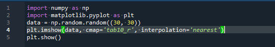
Use matplotlib’s imshow function to create a simple heatmap:
The imshow function in Python can create a heatmap in matplotlib. Both a randomized dataset and a defined dataset can be used. After that, we apply the imshow function, passing the data, the value of colormap, and the interpolation technique (this method helps in improving the image quality if used).
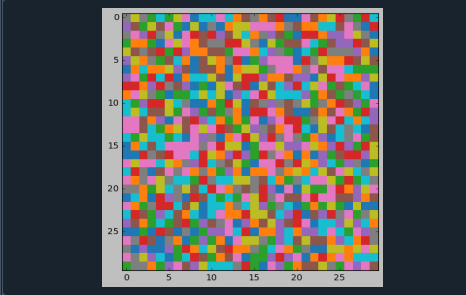
For good contrast against the panel hue, the inscriptions will be colored differently based on a limit. Then, we switch off the adjacent axial spines and divide the clusters with a grid. The output for the above-attached code can be comprehended in the underneath screenshot.
Heatmap with 2D Histogram using imshow:
A heatmap is a color scheme matrix visualization of rectangular data. It accepts a 2D array. A ndarray can be created from that data. Because it may illustrate the relationship between several variables, this is a useful approach to visualize datasets.
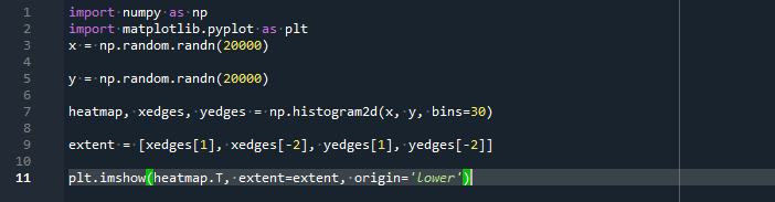
Here we will create a 2-D histogram using numpy and matplotlib’s imshow method. We will select a random dataset first, then send it to the numpy library’s histogram2d method. Afterward, the complete heatmap visual interface is displayed using the imshow method. The output for the above-attached code can be comprehended in the underneath screenshot.
This heatmap graph is built on a numpy-generated random number.
Use Matplotlib to add a Colorbar to a Heatmap:
Colorbar is a simple scale that assists us in comprehending which color corresponds to which value. Matplotlib also has a direct function for applying a color bar to the plot.
The pcolormesh method would be used in the third instance of this article. Numpy’s meshgrid and linspace methods are required to create this form of a heatmap. Now next phase would be to use basic mathematical operations to determine the plot’s upper and lower limits.
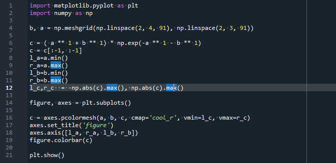
For visualizing heatmaps with the pcolormesh method, we have to use the subplots technique. The dataset for the selected parameters provided in the pcolormesh method is created with numpy’s linspace module.
A random dataset is being used in the heatmap colored graph here. It employs a multiple color map (cmap) this time, using the ‘Blues’ scheme, which is made up entirely of blue colors. The output for the above-attached code can be comprehended in the underneath screenshot.
We utilize a heatmap to observe the association between multiple element sets. The Matplotlib Heatmap with Colorbar is shown in this graph.
Labeled Heatmap:
We would like to write a code to generate a specific heatmap for multiple datasets and/or dimensions in this step. We build a method that accepts the dataset and the row and column names as an argument and parameters for modifying the plot.
In addition to the aforementioned, we would like to add a colorbar and set the captions just above the heatmap rather than below it.
This instance demonstrates how to create annotated heatmaps with the imshow method. The heatmap data graph is the same; however, the visual style changes. The dataset for the heatmap is provided as an array, and we can draw an annotated heatmap using the subplots and imshow methods.
The Matplotlib Library is first imported. We will begin by describing specific data. A 2D list or array defining the values to specific color is required. So we’ll initialize the lists or arrays of categories, with the set of items in each matching the values all along corresponding axes.
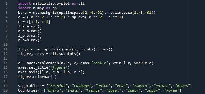
We are going to initialize two arrays here. The names of vegetables are represented in one array, and the names of countries are represented in the second array.
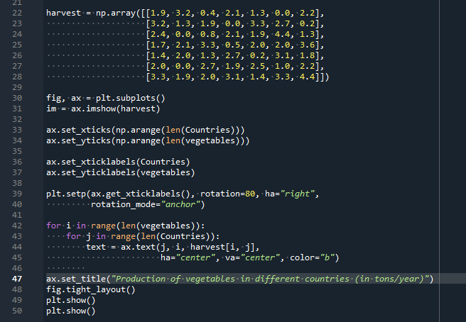
The heatmap is an imshow graph with labels corresponding to the classifications we now have. Furthermore, using a for loop, we can identify the x- and y-axes. At last, we could mark the data by putting a Text in every cell that displays the cell’s value. The output for the above-attached code can be comprehended in the underneath screenshot.
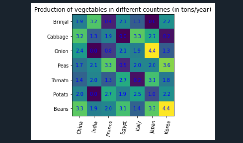
This output depicts the production of various vegetables in various countries.
Conclusion:
A heatmap is a visually appealing tool for determining data brightness. It uses a variety of colors and patterns to express the content. In this matplotlib heatmap article, we have shown you how to make a heatmap using matplotlib. Different functions that assist in the creation of heatmaps are explained. The functions imshow and pcolormesh are also introduced.
Heatmaps can be used to analyze and visualize data effectively. We must utilize the imshow method with the cmap and interpolated arguments to make heatmaps utilizing matplotlib. Data scientists frequently use heatmaps to examine the relationship among various aspects of data.