In order to change the state of the checkbox from unchecked to checked, the user would have to interact with it.
This manual will guide you about the HTML checkbox, its states, and syntax and demonstrate a practical example related to adding a checkbox in HTML.
What are the States of checkbox in HTML?
The checkbox has three possible states:
- true: This state indicates that the checkbox is checked.
- false: This state indicates that the checkbox is not checked.
- mixed: Whether the checkbox is checked or not is undefined.
Syntax
In HTML, the <input> tag is used to add input elements. For a checkbox, set the input type as “checkbox”.
Syntax
Let’s move to the practical example, in which we will create a checkbox. So, let’s start.
Example: Adding a checkbox in HTML
In the HTML, we will create a container and assign the class name as “div”. Inside the <center> tag, we will add a heading using the <h1>. After that, create a sub-div to add checkboxes and labels.
Here, we will use the <label> tag to set the label of the checkbox and the <input> tag to add the input element. Next, set the input type as “checkbox” After closing the tag of </label>, we will add the break tag <br> tag to set the checkbox in the next line of the display screen. Here, we have added add four checkboxes:
<div class="div">
<center>
<h1> Input Type "checkbox"</h1>
</center>
<div>
<label>The Countries you want to visit:</label><br>
<input type="checkbox" />
<label>Spain</label> <br>
<input type="checkbox" />
<label>Turkey</label> <br>
<input type="checkbox" />
<label>Japan</label> <br>
<input type="checkbox" />
<label>China</label>
</div><strong> </strong>
</div>
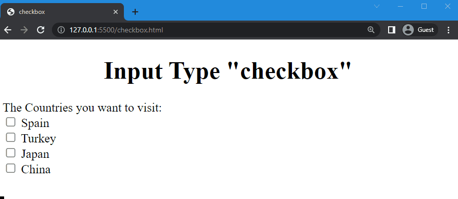
You can see that the input type checkbox created successfully:
You can also style the “checkbox” by following the below-given syntax.
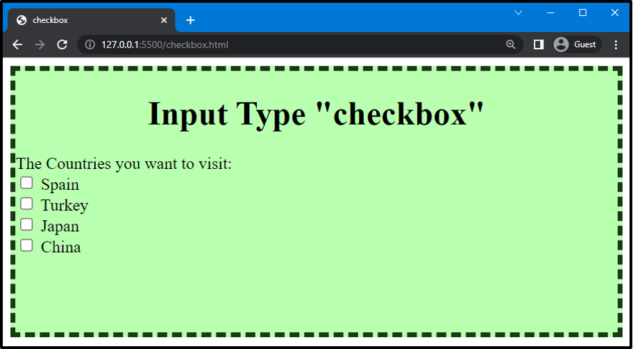
Step 1: Style div
Here, we will use “.div” to access the created container in HTML and set its height as “250px”. Next, Use the “background-color” property to set the background color of the div and assign the value of the color as “rgb(185, 255, 176)”. Then, style the div by using the “border” property to set the border around the div. The width of the border is “5px” style as “dashed” and color as “rgb(24, 58, 20)”.
CSS
height: 250px;
background: rgb(185, 255, 176);
border: 5px dashed rgb(24, 58, 20);
}
It can be seen that the container is styles successfully:
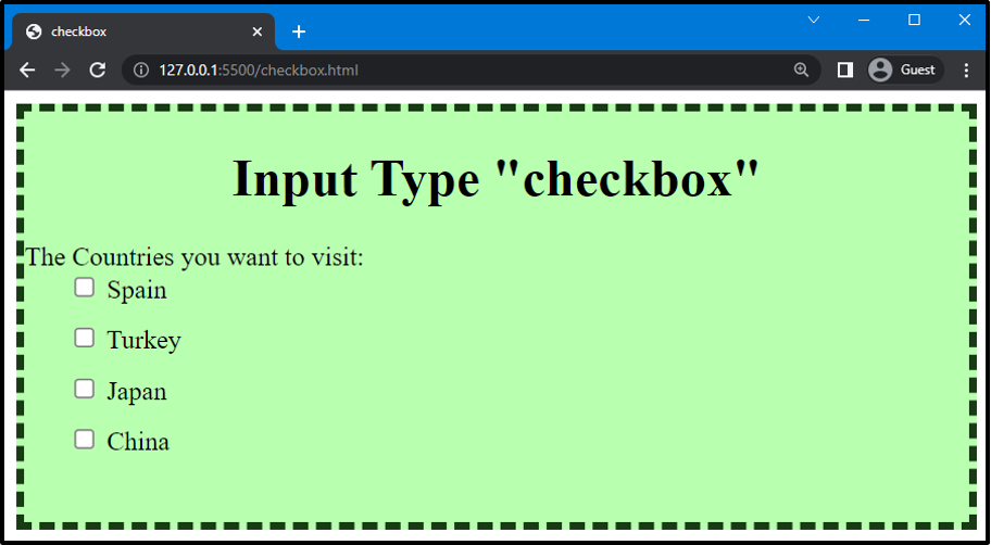
Step 2: Style checkbox
Now, we will use “input” to access the input created in HTML. Next, use the “margin-left” property to set the margin from the left side of the checkbox and set the value as “30px”. For setting bottom margin, use the “margin-bottom” property and set the value as “15px”:
margin-left: 30px;
margin-bottom: 15px;
}
The below-given image signifies that the added margin property value is successfully applied to the checkboxes:
That’s it! We have explained in detail about the input type “checkbox”.
Conclusion
A “checkbox” is an input type element of HTML that allows the user to choose between two or more possible options. It permits the user to choose multiple values from a predefined list. A checkbox has three states: true, false, and mixed. In this guide, we have explained the input type checkbox in detail and provided an example related to adding an input field and styling it.