This write-up will illustrate the use of Bootstrap cards by covering the following aspects:
- How to Create a Simple Card?
- How to Create a Card Header and Footer?
- How to Create a Card with Content?
- How to Create a Card with an Image?
- How to Create a Button on a Card?
- How to Style the Card?
- How to Create a Card with Image Overlays?
- How to Create List Groups on Card?
- How to Create a Navigation bar on Card?
How to Create a Simple Card?
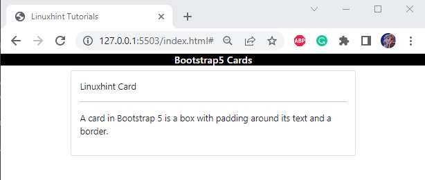
The “card” class with the “card-body” is utilized to make a simple card.
Let’s go over the example to gain a better understanding.
Example
In the HTML file, follow the steps to create a simple card:
- Add a “<div>” element and assign it a class “container”. This is a basic building block that contains padding and alignment to the content within a specific device.
- Then, assign it a class “card” utilized to create a basic card.
- To specify the content within the card, create a div with the class “card-body” that contains the necessary data of the card:
Output
How to Create a Card Header and Footer?
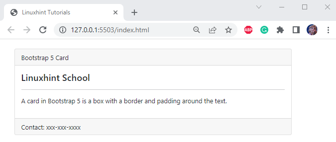
The “card-header” and the “card-footer” classes are utilized to set out the card header and footer. To do so:
- Set the <div> element with the class “container” and “m-4”.
- Adjust the div with the class “card”.
- Set down the card heading by utilizing the class “card-header”.
- The card information is placed using the “card-footer” class on the footer of the card:
<div class="card">
<div class="card-header">
Bootstrap 5 Card
</div>
<div class="card-body">
<h4>Linuxhint School</h4>
<hr>
<p>A card in Bootstrap 5 is a box with a border and padding around the text.</p>
</div>
<div class="card-footer">
Contact: xxx-xxx-xxxx
</div>
</div>
</div>
Output
How to Create a Card With Content?
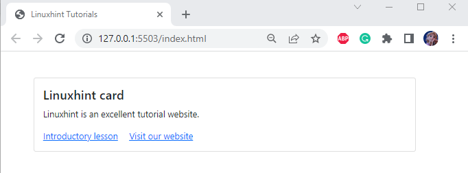
You can add content to the card by utilizing the “card-body” extendable content container. Below mentioned classes must be included within this class:
- “card-title” adjusts the title on the card.
- “card-text” describes the text with the styling properties on the page.
- “card-link” associates a link of another source on the page:
<div class="card">
<div class="card-body">
<h4 class="card-title">Linuxhint card</h4>
<p class="card-text">Linuxhint is an excellent tutorial website.</p>
<a href="#" class="card-link">Introductory lesson</a>
<a href="#" class="card-link">Visit our website</a>
</div>
</div>
</div>
Output
How to Create a Card With an Image?
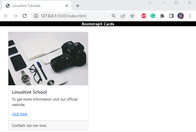
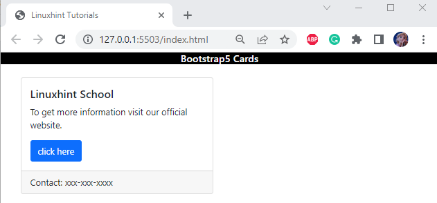
The most popular way to design a card is to add an image to the card. To do so, the Bootstrap “card-img-top” class is utilized as follows:
<div class="card col-6">
<img class="card-img-top" src="/images/tech.jpg" alt="card">
<div class="card-body">
<h5 class="card-title"> Linuxhint School </h5>
<p class="card-text">To get more information visit our official website.</p>
<a href="#" class="card-link"> click here</a>
</div>
<div class="card-footer">
Contact: xxx-xxx-xxxx
</div>
</div>
</div>
Output
How to Create a Button on a Card?
The button element can be added to the card. For this purpose, implement the “btn” class within the <a> element. The “btn-primary” indicates the main action in a group of buttons and adds additional visual weight to it:
<div class="card col-6">
<div class="card-body">
<h5 class="card-title"> Linuxhint School </h5>
<p class="card-text"> To get more information visit our official website. </p>
<a href="#" class="btn btn-primary card-link"> click here</a>
</div>
<div class="card-footer">
Contact: xxx-xxx-xxxx
</div>
</div>
</div>
Output
How to Style the Card?
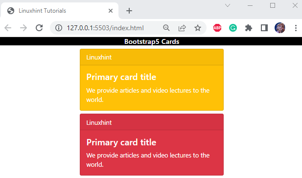
To style the Bootstrap cards container, many classes can be utilized like this:
<div class="card-header">Linuxhint</div>
<div class="card-body">
<h4 class="card-title">Primary card title</h4>
<p class="card-text">We provide articles and video lectures to the world.</p>
</div>
</div>
<div class="card text-white bg-danger m-auto" style="max-width: 23rem;">
<div class="card-header">Linuxhint</div>
<div class="card-body">
<h4 class="card-title">Primary card title</h4>
<p class="card-text">We provide articles and video lectures to the world.</p>
</div>
</div>
Output
How to Create a Card with Image Overlays?
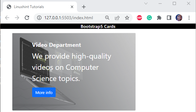
The “card-img-overlay” class adjusts the image as a background. To utilize it, firstly, set the card image by utilizing the “<img>” tag. Moreover, the width of the image is set as “100%”:
<div class="card" style="width: 500px;">
<img class="card-img-bottom" src="/images/computer.jpg" alt="image" style="width: 100%; opacity: 0.8;">
<div class="card-img-overlay mx-5">
<div class="card-body">
<h4 class="card-title" style="color: whitesmoke; font-weight: bold;">Video Department </h4>
<p class="card-text" style="color: white; font-size: 30px;">We provide high quality videos on Computer Science topics.</p>
<a href="#" class="btn btn-primary">More info</a>
</div>
</div>
</div>
</div>
Output
How to Create List Groups on Card?
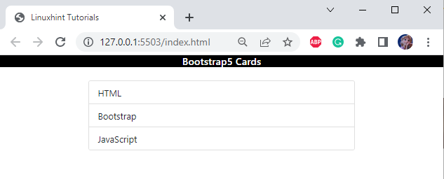
To identify the group items on a card, implement the div “container” class. Then, add a “div” container along with the class “card”.
To create a list, apply the “<ul>” and “<li>” tags with appropriate classes:
Following is the description of the above-used Bootstrap classes:
- To create list groups, the Bootstrap “list-group” class can be applied. It helps to specify a list of content for the card.
- By adding the “list-group-flush”, you can display the edge-to-edge list group items in a parent container, i.e., cards. To do so, it removes the rounded corners and borders.
- The “list-group-items” defines the list items.
Output
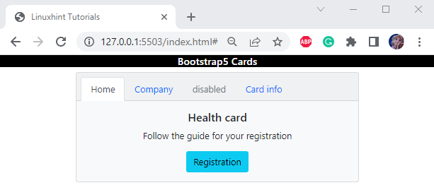
How to Create a Navigation bar on Card?
You can also add a navigation bar to the cards as well. More specifically, a proper, well-aligned navigation bar is created using several classes:
<div class="card-header">
<ul class="nav nav-tabs card-header-tabs">
<li class="nav-item">
<a class="nav-link active" href="#">Home</a>
</li>
<li class="nav-item">
<a class="nav-link" href="#">Company</a>
</li>
<li class="nav-item">
<a class="nav-link disabled" href="#">disabled</a>
</li>
<li class="nav-item">
<a class="nav-link " href="#">Card info</a>
</li>
</ul>
</div>
<div class="card-body">
<h5 class="card-title">Health card</h5>
<p class="card-text">Follow the guide for your registration</p>
<a href="#" class="btn btn-info">Registration</a>
</div>
</div>
Here:
- “nav nav-tabs” class is utilized to create navigation tabs.
- “card-header-tabs” class helps to style the tabs in the card header.
- “nav-item” provides styling to the navigation items.
- “nav-link” is used to establish the link of other navigation blocks.
Output
That was all about using the Bootstrap classes to create well-formatted cards.
Conclusion
Bootstrap 5 utilizes numerous classes to style and create the cards. These classes help to adjust information in a structured format. Some of the classes are “card-title”, “card-text”, “card-header”, “card-footer”, and many more. These classes offer functionalities, such as specifying the title, text, header, and card footer. This article has demonstrated how to use Bootstrap 5 cards with different functionalities.

