This post will discuss what gutter spaces are and how they can be removed for a specific div in Bootstrap.
What is Gutter Space in Bootstrap?
The gutters are the spaces or gaps between the columns produced by horizontal padding. They are used to support responsive content alignment and spaces in the Bootstrap grid system.
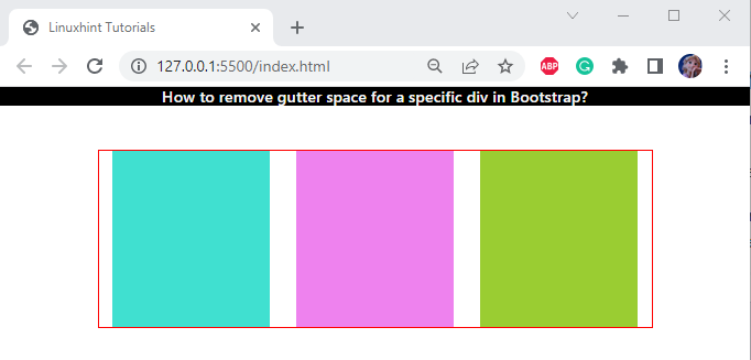
Below given image shows a row with a red border around it. Within the row, three equal-sized div elements of equal grid columns exist. Although the columns are equal, there are still gutter spaces between them:
How to Remove Gutter Space for a Specific div in Bootstrap?
In Bootstrap, the class “no-gutters” is utilized to eliminate the gutter spaces of any div.
For this purpose:
- Add a “<div>” tag along with the class “main-div”.
- Then, adjust a row section by adding another “<div>” element with the class “row”. As we have to remove the spaces from the row, specify a class “no-gutters” within it.
- To divide the grid row into three equal columns, utilize the class “col-4”.
- Within each column’s “<div>” container, adjust the “<div>” elements with classes “column-1”, “column-2”, and “column-3”, respectively:
CSS
In the CSS section, the classes mentioned in the HTML page are styled with several styling properties.
Style “main-div” class
width: 600px;
margin: 50px auto;
}
The “.main-div” is mentioned to access the div element having class “main-div”. The following properties are applied to this class:
- “width” defines the element’s width.
- “margin” sets the spacing around the element.
Style “row” class
border: 1px solid red;
}
The Bootstrap “row” class is added with the “border” property. This will wrap the grid row in a specified width, style, and color border.
The three classes “column-1”, “column-2”, and “column-3” are assigned the CSS “background-color” and “height” properties to make them prominent.
Style “column-1” class
background-color: turquoise;
height: 200px;
}
Style “column-2” class
background-color: violet;
height: 200px;
}
Style “column-3” class
background-color: yellowgreen;
height: 200px;
}
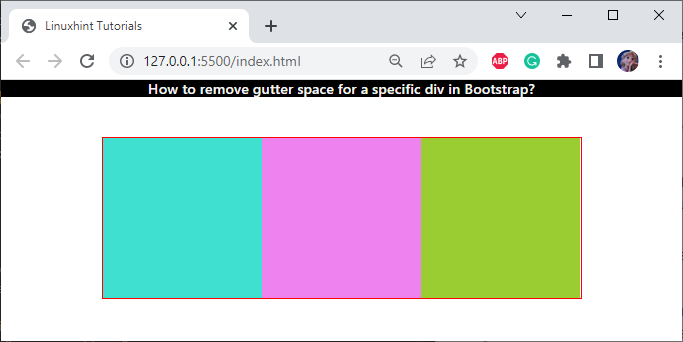
It can be observed that the “<div>” container with the class “row” has been successfully adjusted with no gutter space between them:
We have taught you how to remove gutter space for a specific div in Bootstrap.
Conclusion
To remove gutter spaces for a specific div, the class “no-gutters” can be used. For this purpose, add the “<div>” element along with the “row no-gutters” class. This post has provided a comprehensive guide on gutter spaces and how they can be eliminated for a specific div in Bootstrap.


