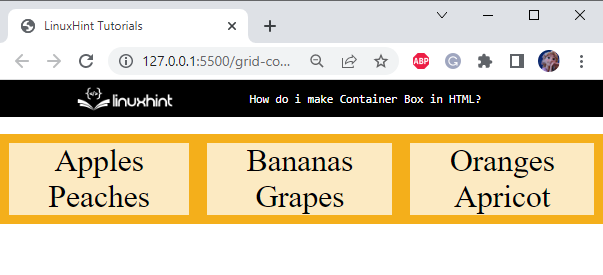
The outcomes of this blog are:
- Method 1: How to Create Container Box in HTML Using the <div> Tag?
- Method 2: How to Create Container Box in HTML Using the “grid” Container?
- How to Justify the Content of a Container Box in HTML?
Method 1: How to Create Container Box in HTML Using the <div> Tag?
In HTML, first, create a “<div>” with the name “box”. Then, add a <p> tag inside it to include some content to the page:
In the CSS section, apply styling properties to the HTML elements to decorate them.
Style box div
margin: auto;
width: 200px;
height: 200px;
padding: 10px;
border: 5px solid crimson;
}
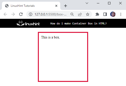
The “.box” is used to access the div box. Below is the explanation of the properties applied to it:
- “margin” with the value set as “auto”, is used to give equal space to the div.
- “width” property sets the element’s width to “200px”.
- “height” property sets the element’s height to “200px”.
- “padding” property is given a value of “10px”, which adds 10px space around the div’s content.
- “border” is “5px solid crimson”, where 5px indicates the width of the border, solid is the type of border, such as groove, dashed, dotted, and more, and then crimson shows the color of the border.
Output
Now, let’s move to the next method.
Method 2: How to Create Container Box in HTML Using the “grid” Container?
The element works as a container when its “display” property is set as “inline-grid” or “grid”. The grid containers comprise rows and columns that contain grid items.
Let’s go through the following examples to demonstrate how to make a grid container.
Example 1: Create Container Box in HTML Using “display: grid” Property
The “display” property with the value “grid” is utilized to provide the layout of the web page in columns and rows. This property helps us design the layout without using position and float properties.
To do so, first, create a <div> with the class name “container”. Inside this <div> add several more divs with some content:
Let’s turn the display of the HTML container div as a grid with CSS.
Style container div
display: grid;
grid-template-columns: auto auto auto;
background-color: #40966c;
padding: 10px;
gap:20px;
}
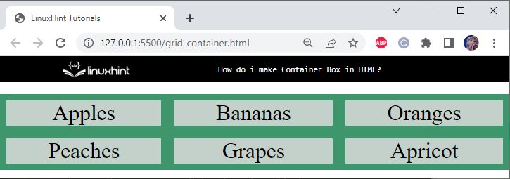
The container div is applied with the following properties:
- “display” property is assigned the value “grid”.
- “grid-template-columns” as “auto auto auto”, which specifies that there should be three columns in the grid.
- “background-color” property is set as “#40966c”.
- “padding” as “10px” specifies 10px space around the div’s content.
- “gap” is set as “20px” to specify the space between the columns.
We will see the behavior of the gap property in the further section.
Style div Elements of container div
background-color: #c4d1cb;
text-align: center;
padding: 20px auto;
font-size: 35px;
}
The “.container>div” is used to represent that we want to style the div element, which is the child of container div. More specifically, the “>” sign is known as the child selector.
Below are the properties applied to the container div:
- “background-color” property specifies the color of the element’s background.
- “text-align” is set as “center” to center align the div’s contents.
- “padding” is specified as “20px auto”, where 20px is the space at the top-bottom, and auto indicates the equal space from left-right sides.
- “font-size” property value set as “35px” as the font size.
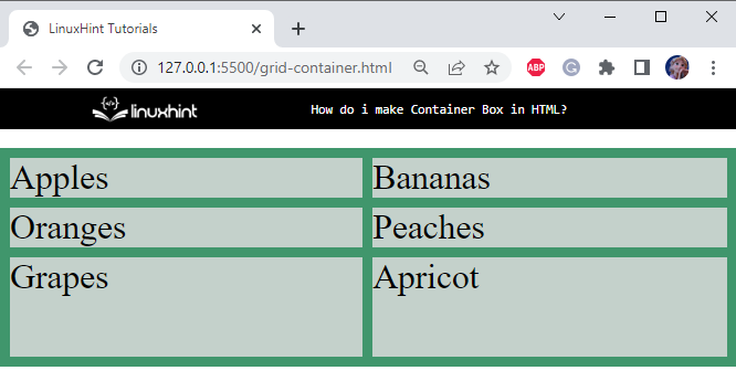
Below is the corresponding output of the above-mentioned code:
Example 2: Create Container Box in HTML Using “display: inline-grid” Property
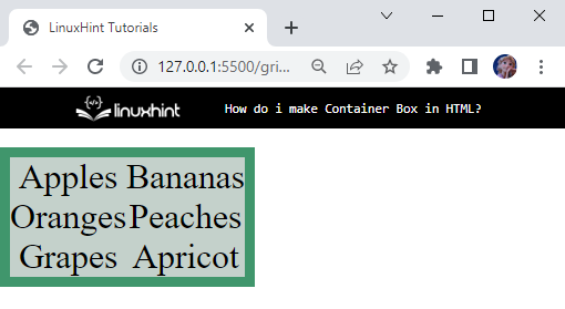
The “display” property with the value “inline-grid” creates an inline-level container box.
CSS
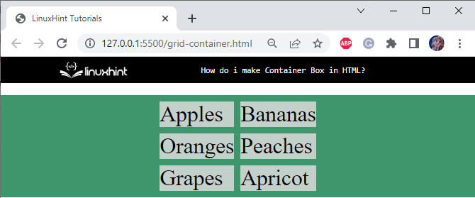
The display property of the above-mentioned div container is set to inline-grid:
Output
Example 3: Create Container Box in HTML Using “grid-template-columns” Property
The “grid-template-columns” property defines the column width of the container, and its relevant number of columns:
This will result in three columns with equal size. However, you can define column width according to your preference:
Example 4: Create Container Box in HTML Using “grid-template-rows” Property
This property defines the height and number of the rows of the container:
The above syntax will result in two rows having equal heights and the third as “100px”:
So far, we have discussed how to add rows and columns to our grid container. In the next section, we demonstrate the example to justify the contents of the container.
How to Justify the Content of a Container Box in HTML?
The “justify-content” property can be utilized for aligning the whole grid inside the container. To make this property work, the grid’s total width must be less than the container’s width.
This property has several values that are listed below:
- start
- end
- space-evenly
- space-around
- space-between
- center
The description of the above-given values will be discussed practically.
Example 1: Center Justify the Content of a Container Box in HTML
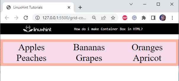
In the CSS section, set the “display” property as “grid” and then add the property “justify-content” and assign the value “center”:
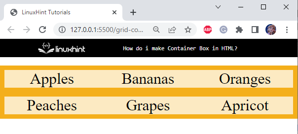
It can be observed that the contents of the grid have been successfully center aligned:
Example 2: Customize Overall Gaps of a Container Box in HTML
You can customize the grid gaps using the “gap” property as follows:
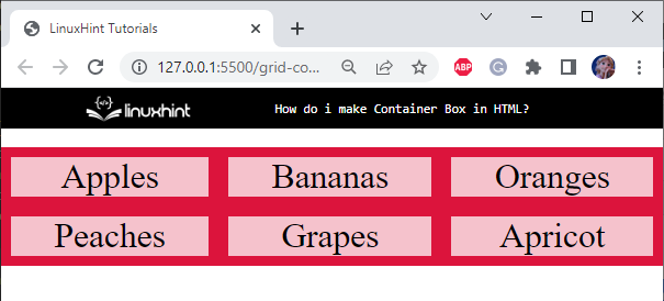
It can be seen that the gaps of 20px are successfully added to the grid container:
Example 3: Customize Row Gaps of a Container Box in HTML
The “row-gap” property is used to specifically insert space between the rows. In the example, we will set the gaps between the container rows as “20px”:
Output
Example 4: Customize Columns Gaps of a Container Box in HTML
We can also customize the gaps between the columns. To attain this, we utilize the property “column-gap”.
Now, assign the “column-gap” property’s value as “20px”:
Observe the generated gap between the columns:
This is how we can create container boxes in HTML and customize their spaces.
Conclusion
Containers are boxes that contain some content inside them. The <div> element can be utilized to make a container box by setting its width and height properties. In CSS, utilizing the “grid” can also perform the same operation. This blog discussed the method for creating a container box in HTML.

