In MATLAB, when it comes to visualizing data with colors, two commonly used components are colorbar and colormap. While they both play a role in enhancing the understanding and interpretation of data through color representation, there are distinct differences between them. Understanding these differences is crucial for effectively utilizing these features in MATLAB to create visually compelling and informative plots.
In this article, we will explore the differences between colorbar and colormap, their specific functions, and how they contribute to the overall visualization of data.
Difference Between colorbar and colormap in MATLAB
In this section, we will discuss colorbar and colormap in MATLAB, understand their roles, and highlight the key differences between them.
What is a colorbar in MATLAB?
Colorbar provides a visual scale that relates the colors in a plot to their corresponding data values. It acts as a reference guide, allowing viewers to understand the mapping between colors and data ranges. The colorbar typically appears as a vertical or horizontal scale alongside a plot or image. It displays a gradient of colors and a corresponding scale indicating the values associated with each color. By referring to the colorbar, users can interpret the colors in the plot and relate them to specific data ranges or values.
What is a colormap in MATLAB?
Colormap is a fundamental concept in MATLAB that involves assigning a range of colors to different data values or levels. It acts as a lookup table, associating scalar values with specific colors. The colormap allows us to visually represent the distribution of data, helping us identify patterns, variations, and trends. MATLAB provides a set of built-in colormaps, including popular ones like jet, hot, cool, and gray. Each colormap has its own unique color scheme, enabling us to create visually appealing plots.
Difference Between colorbar and Colormap in MATLAB
Colormap primarily determines how data values are mapped to colors in a plot. It assigns colors to specific data levels or values, thus helping in creating a visual representation of the data distribution. Colormap is primarily used with functions such as imagesc, contourf, and surf to represent data in plots.
Colorbar serves as a visual aid, providing a scale that connects the colors in a plot to their corresponding data values. It acts as a reference guide for viewers, facilitating the understanding of the colormap used in the plot. Colorbar is commonly used with functions like imagesc and contourf to display the color scale alongside the plot, allowing users to interpret the data values associated with each color.
Colormap enhances the visual representation of data by assigning colors to different data values. It helps us identify patterns, variations, and gradients in the data. Colorbar plays a vital role in interpreting the colors present in a plot by associating them with specific data values. By referring to the colorbar scale, we can determine the corresponding values for different colors in the plot.
Example of Using Colorbar and Colormap in MATLAB
The following examples illustrate the difference between colorbar and colormap in MATLAB.
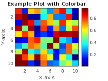
x = 1:10;
y = 1:10;
z = rand(10);
% Create a figure and plot the data
figure;
imagesc(x, y, z);
% Apply a colormap
colormap('jet');
% Add colorbar
colorbar;
% Add labels and title
xlabel('X-axis');
ylabel('Y-axis');
title('Example Plot with Colorbar');
We start by creating some sample data that consists of three variables: x, y, and z. The rand(10) function generates random values for z in a 10×10 grid.
To visualize the data, we use the imagesc function that takes the variables x, y, and z as input and plots the data on the figure to enhance the visual representation, we apply a colormap to the plot, and we use the ‘jet’ colormap in this example that maps the lowest values to blue and the highest values to red.
Other options you can use with colormap function are given below:
-
- parula
- turbo
- hsv
- cool
- hot
- grey
- bone
- winter
- autumn
- summer
- spring
- sky
- copper
- pink
- flag
- prism
- lines
To provide a reference for the colors used in the plot, we add a colorbar that adds a vertical scale alongside the plot, indicating the mapping between colors and data values.
By running this code, a plot will be generated that displays the data using colors based on the assigned colormap. The colorbar on the side of the plot allows you to interpret the colors and understand their relationship to the data values.
Conclusion
The use of colormaps and colorbars in MATLAB enhances data visualization by assigning colors to different values and providing a reference scale. The colormap maps scalar values to colors, while the colorbar provides a visual guide. By applying these functions in MATLAB, we can effectively analyze and interpret patterns and variations in data plots.