This article will discuss the procedure of using CSS border-radius property to create boxes with rounded corners.
How to Create Boxes in HTML?
To create two boxes, add two class div elements with the names “box-1” and “box-2”, and add <h1> element with the heading in each of the div elements as follows:
Now, apply CSS styles to the HTML elements.
Style h1 Element
padding: 50px;
}
The <h1> element is provided with the padding property as “50px” to create the specified extra space within the heading.
Style box-1 and box-2 div Elements
#box-2 {
margin: 1px auto;
width: 250px;
height: 120px;
background-color: chocolate;
font-size: 10px;
color: ghostwhite;
}
The CSS properties that are applied to the box-1 and box-2 div are described below:
- “width” property sets the width property to 250px.
- “height” property is utilized for the setting of the height of the element to 250px.
- “background-color” property is utilized to specify the element’s background color.
- “font-size” property is utilized for the setting of the element’s font size.
- “color” property is utilized for the setting of the font color.
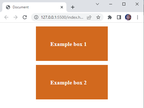
By providing the above-mentioned code, the created boxes will be shown as follows:
It can be observed that boxes are created, but their corners are still pointed. The below section will explain the use of the border-radius property to make boxes with rounded corners.
What is CSS border-radius Property?
The CSS “border-radius” property is utilized to define the element’s radius. This property may consist of one to four values. These values are explained below.
Syntax- One Value
One value syntax refers to the radius of all four corners of the box.
Syntax3- Two Values
[ / top-left&bottom-right top-right&bottom-left];
Two values syntax specify the radius as the first value indicates the radius on the top-left and bottom-right corners, and the second value specifies the radius on the top-right and bottom-left corners.
Syntax- Three Values
[ / top-left top-right&bottom-left bottom-right];
Three values syntax specifies the first value represents the top-left corner, the second value indicates the top-right and bottom-left corners and the third value applies to the bottom-right corner.
Syntax- Four Values
[ / top-left top-right bottom-right bottom-left];
Four values syntax specifies the first value is applied to the top-left corner, the second value applies to the top-right corner, the third value applies to the bottom-right corner, and the fourth value applies to the bottom-left corner.
How to Create Rounded Corner Boxes Using CSS?
The below code section explains how we can create round corner boxes.
Style box-1
background-color: rgb(255, 183, 0);
border-radius: 100px 2px 100px 1px;
}
The box-1 div element is applied with properties that are described below:
- “background-color” property is utilized to set the element’s background color.
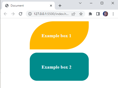
- “border-radius” with the value set as “100px 2px 100px 1px” where 100px indicates top-left corner, 2px indicates top-right corner, 100px indicates bottom-right corner, and 1px indicates the bottom-left corner.
Style box-2
background-color: darkcyan;
border-radius: 30px;
}
The properties that are applied to the box-2 div element are described below:
- “background-color” property sets the color of the box-2 div element with the “darkcyan” color.
- “border-radius” property with the value set as “30px” sets the box radius to 30px from all four corners.
So, to change the box’s corners, the values of the border-radius property can be set accordingly. By providing the above CSS styling properties to the box-1 and box-2 div elements, the result will look like this:
We have successfully learned the border-radius property to make the round corners of single or multiple boxes.
Conclusion
To create a better design for our web page, different shapes can be utilized, such as circles, squares, rectangles, and more can be created with CSS. The boxes with rounded corners can be created in CSS by utilizing the CSS “border-radius” property. This article demonstrated the use of CSS border-radius to create boxes with rounded corners with examples.


