In bootstrap 5, Nav Bar is used to connect and link all the web pages related to a website and a user can move between pages easily. Navigation bar is a very important component of a website that contains a brand logo, page names and their links, and a search box according to user requirements.
This article give you a detail knowledge about
- Creating a navbar
- Navbar with dropdown menu
- Navbar with Inline Form
- Collapsible Navbar
- Changing Navbar Colors
How to create a navbar
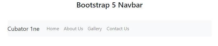
To create a navbar use, .navbar class and to align the menu in a row use .navbar-expand-xxl/lg/md/sm. In order to choose between light or dark mood use .navbar-light/dark and to give a background color to a navbar use .bg-light.
Code:
<h3 class="py-3 text-center">Bootstrap 5 Navbar</h3>
<div class="row py-3">
<div class="col">
<nav class="navbar navbar-expand-md navbar-light bg-light">
<a href="#" class="navbar-brand">Cubator 1ne</a>
<ul class="navbar-nav">
<li class="nav-item"><a href="" class="nav-link">Home</a></li>
<li class="nav-item"><a href="" class="nav-link">About Us</a></li>
<li class="nav-item"><a href="" class="nav-link">Gallery</a></li>
<li class="nav-item"><a href="" class="nav-link">Contact Us</a></li>
</ul>
</nav>
</div>
</div>
</div>
</div>
This is how you create a navbar in bootstrap 5.
Navbar with dropdown menu
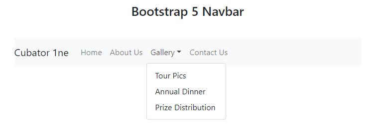
To create a navbar with dropdown menu use .dropdown class with .nav-item class in <li> tag, take a <div> tag with .dropdown-menu class, and wrap it around anchor tag <a> with the class .dropdown-item. To show the dropdown menu use .dropdown-toggle class with .nav-link class and also use data-bs-toggle=”dropdown” attribute on the <a> tag which contains .nav-link class.
Code
<a href="#" class="navbar-brand">Cubator 1ne</a>
<ul class="navbar-nav mr-auto">
<li class="nav-item"><a href="" class="nav-link">Home</a></li>
<li class="nav-item"><a href="" class="nav-link">About Us</a></li>
<li class="nav-item dropdown">
<a href="" class="nav-link dropdown-toggle" data-bs-toggle="dropdown">Gallery</a>
<div class="dropdown-menu">
<a href="" class="dropdown-item">Tour Pics</a>
<a href="" class="dropdown-item">Annual Dinner</a>
<a href="" class="dropdown-item">Prize Distribution</a>
</div>
</li>
<li class="nav-item"><a href="" class="nav-link">Contact Us</a></li>
</ul>
</nav>
This is how a navbar with a dropdown menu is created.
Navbar with inline form
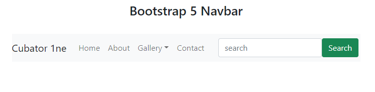
To create a navbar with inline form, use <form> tag with the class .inline-form and wrap it around an <input> tag with the class .form-control and add a button using a <button> tag with the class .btn,btn-success, right after the </ul> closing tag.
<a href="#" class="navbar-brand">Cubator 1ne</a>
<ul class="navbar-nav">
<li class="nav-item"><a href="" class="nav-link">Home</a></li>
<li class="nav-item"><a href="" class="nav-link">About</a></li>
<li class="nav-item dropdown">
<a href="" class="nav-link dropdown-toggle" data-bs-toggle="dropdown">Gallery</a>
<div class="dropdown-menu">
<a href="" class="dropdown-item">Tour Pics</a>
<a href="" class="dropdown-item">Annual Dinner</a>
<a href="" class="dropdown-item">Prize Distribution</a>
</div>
</li>
<li class="nav-item"><a href="" class="nav-link">Contact</a></li>
</ul>
<form class="form-inline d-flex flex-nowrap">
<input type="search" class="form-control" placeholder="search">
<button class="btn btn-outline-success">Search</button>
</form>
</nav>
This is how you create a navbar with inline form.
Collapsible Navbar
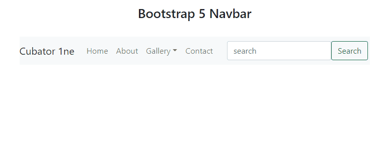
To create a collapsible navbar, use a <div> with the .collapse and .navbar-collapse classes. Give a unique id=”” to the div and then wrap the div around your <ul> and <form> tags. To enable collapsible navbar, create a <button> tag above .collapse div with the .navbar-toggler class and also give data-bs-target=“collapse” and data-bs-target=“#id”. Inside this <button> tag create a <span> tag with the class .navbar-toggler-icon to create a three lines icon button.
<a href="#" class="navbar-brand">Cubator 1ne</a>
<button class="navbar-toggler" data-bs-toggle="collapse" data-bs-target="#mnav">
<span class="navbar-toggler-icon"></span>
</button>
<div class="collapse navbar-collapse" id="mnav">
<ul class="navbar-nav">
<li class="nav-item"><a href="" class="nav-link">Home</a></li>
<li class="nav-item"><a href="" class="nav-link">About</a></li>
<li class="nav-item dropdown">
<a href="" class="nav-link dropdown-toggle" data-bs-toggle="dropdown">Gallery</a>
<div class="dropdown-menu">
<a href="" class="dropdown-item">Tour Pics</a>
<a href="" class="dropdown-item">Annual Dinner</a>
<a href="" class="dropdown-item">Prize Distribution</a>
</div>
</li>
<li class="nav-item"><a href="" class="nav-link">Contact</a></li>
</ul>
<form class="form-inline d-flex flex-nowrap">
<input type="search" class="form-control" placeholder="search">
<button class="btn btn-outline-success">Search</button>
</form>
</div>
</nav>
This is how you create a collapsible navbar.
Change Navbar Color
To change the color of the navbar use following classes
- bg-light
- bg-primary
- bg-success
- bg-warning
- bg-info
- bg-danger
or use inline <style> tag with background:#color; attribute.
Conclusion
To create a navbar use, .navbar, .navbar-expand-xxl/lg/md/sm, .navbar-light/dark, bg-light/primary/success/warning/info/danger class with <nav> tag. For brand logo or name add <a> tag with the class .navbar-brand inside <nav> tag, for menu add <ul> tag with the class .navbar-nav inside <nav> tag as well, for menu list-items add <li> tag with the class .nav-item inside <ul> tag and for adding links of the page to nav items use, <a> tag with the class .nav-link inside <li> tag. In this way a basic navbar is created and in above article every important thing about navbar is discussed in detail.