Let’s begin.
What are Containers
As already mentioned, containers are considered to be the most fundamental layout of Bootstrap 5. These entities wrap elements inside of them along with certain padding and margin. Moreover, these are essential for building a grid layout.
There are a total of three container types in Bootstrap 5 which we have enlisted below.
Let’s discuss them in detail.
Containers with fixed-width
You can create a responsive container with fixed-width using the .container class. This width will change depending upon the type of device and the screen size. Now let’s explore this type of container with an example.
Example
Here we are wrapping some content using the container with fixed-width.
HTML
<script src="https://cdn.jsdelivr.net/npm/[email protected]/dist/js/bootstrap.bundle.min.js"></script>
Here we are first of all including Bootstrap 5 by adding CDN for CSS, and JavaScript in the tag of our HTML file.
HTML
Now we are creating a div container and assigned it the class container. Then we have nested one <h1>, and three <p> elements in that div container.
Output
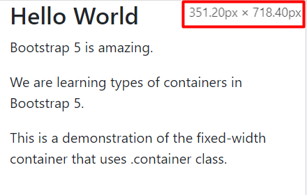
We are going to show the output at random screen sizes. For instance, the output at 699px and above is shown below.
At 351px and less.
The .container class was implemented successfully.
Containers with full width
For the purpose of creating containers with full width use the .container-fluid class. The width of the container will be 100% no matter what the screen size is. The example presented below demonstrates a full-width container.
HTML
Here we are using .container-fluid class to create a div element and nest a heading, and some paragraphs inside that div.
Output
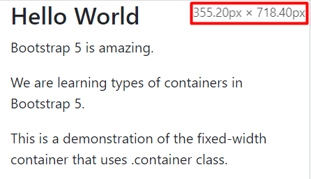
We will show the output at random screen sizes. The first output is for screen width 700px and above.
At 355px and below.
The .container-fluid class is working properly.
Containers with responsive breakpoints
You can also create containers that will retain 100% width until a breakpoint is specified. This means that the width will begin to change after that particular breakpoint. For a better understanding we have demonstrated an example here.
Example
Here we have demonstrated all the breakpoints mentioned above.
Example
Here we have demonstrated all the breakpoints mentioned above.
[cce_html width="100%" height="100%" escaped="true" theme="blackboard" nowrap="0"]
<div class="container-sm border mt-3">Small</div>
<div class="container-md border my-3">Medium</div>
<div class="container-lg border my-3">Large</div>
<div class="container-xl border my-3">Extra Large</div>
<div class="container-xxl border my-3">Extra Extra Large</div>
In the above code, we have created five div containers and each has been assigned a particular class corresponding to a specific breakpoint.
Output
Breakpoints were successfully implemented.
Note: Visit the official website of Bootstrap 5 to check out the widths of various containers in Bootstrap 5 across certain breakpoints.
Conclusion
Containers are considered to be the most fundamental layout of Bootstrap 5 that are used to wrap elements inside of them along with certain padding and margin. Moreover, these are essential for building a grid layout. There are a total of three container types which are; containers with fixed-width, containers with full width, and container with responsive breakpoints. There are certain built-in classes that are associated with these containers. All of these container types are explained in the article along with suitable examples.


