This article tells you about
- Popover Creation Process
- Popover Positions
- Closing Popover
- Popover on hovering
How to Create Popovers
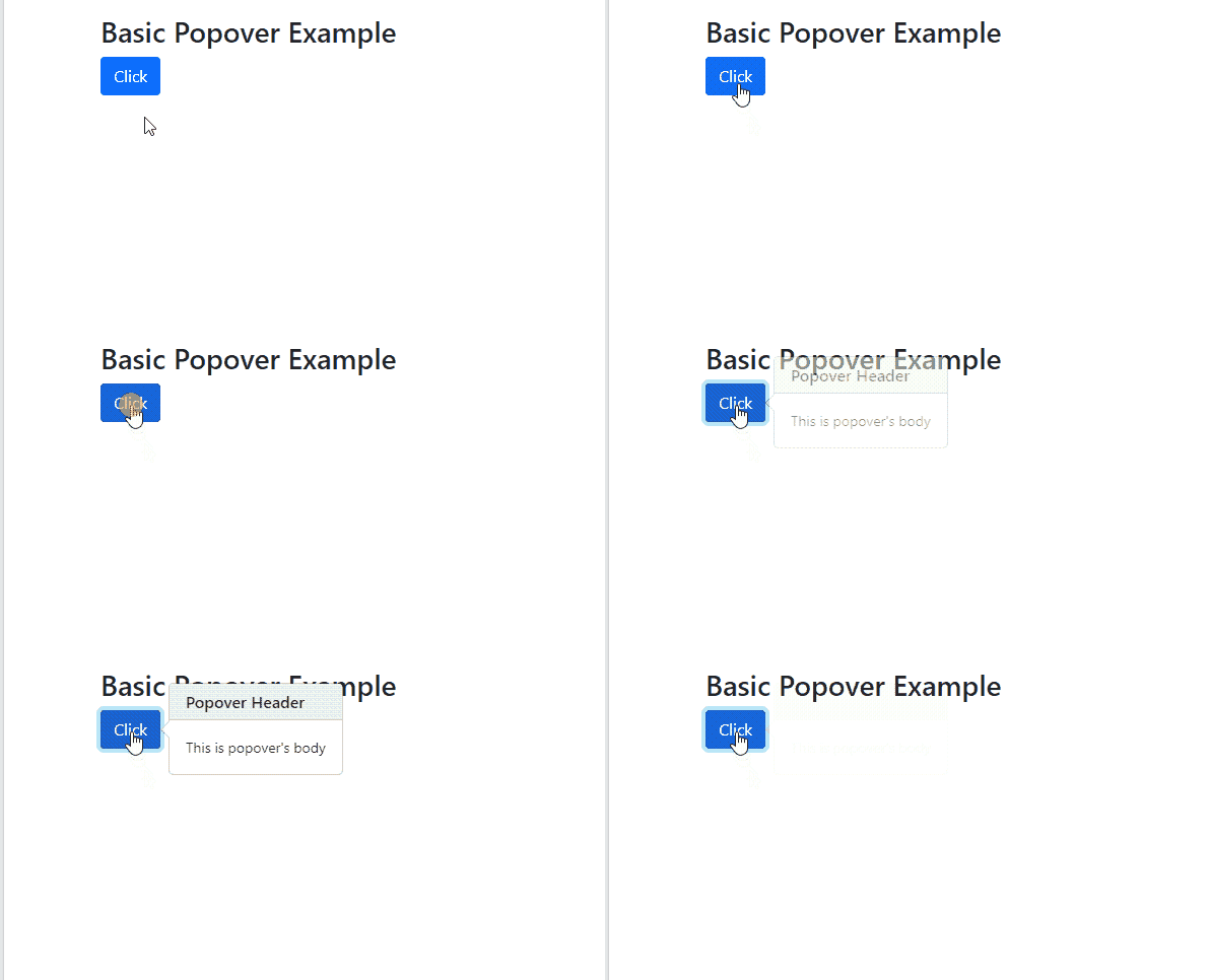
To create a popover, add data-bs-toggle=”popover” and title=”Popover header text goes here” for popover’s header section and data-bs-content=”Popover body text goes here” for popover’s body section.
Code
<div class="container" style="margin-top: 30px;">
<button type="button" class="btn btn-primary" data-bs-toggle="popover" title="Popover's Header" data-bs-content="This is popover's body" >Click</button>
</div>
<script>
$(document).ready(function(){
$('[data-bs-toggle="popover"]').popover();
});
</script>
</body>
This process creates and enables a basic popover.
Popover Positions
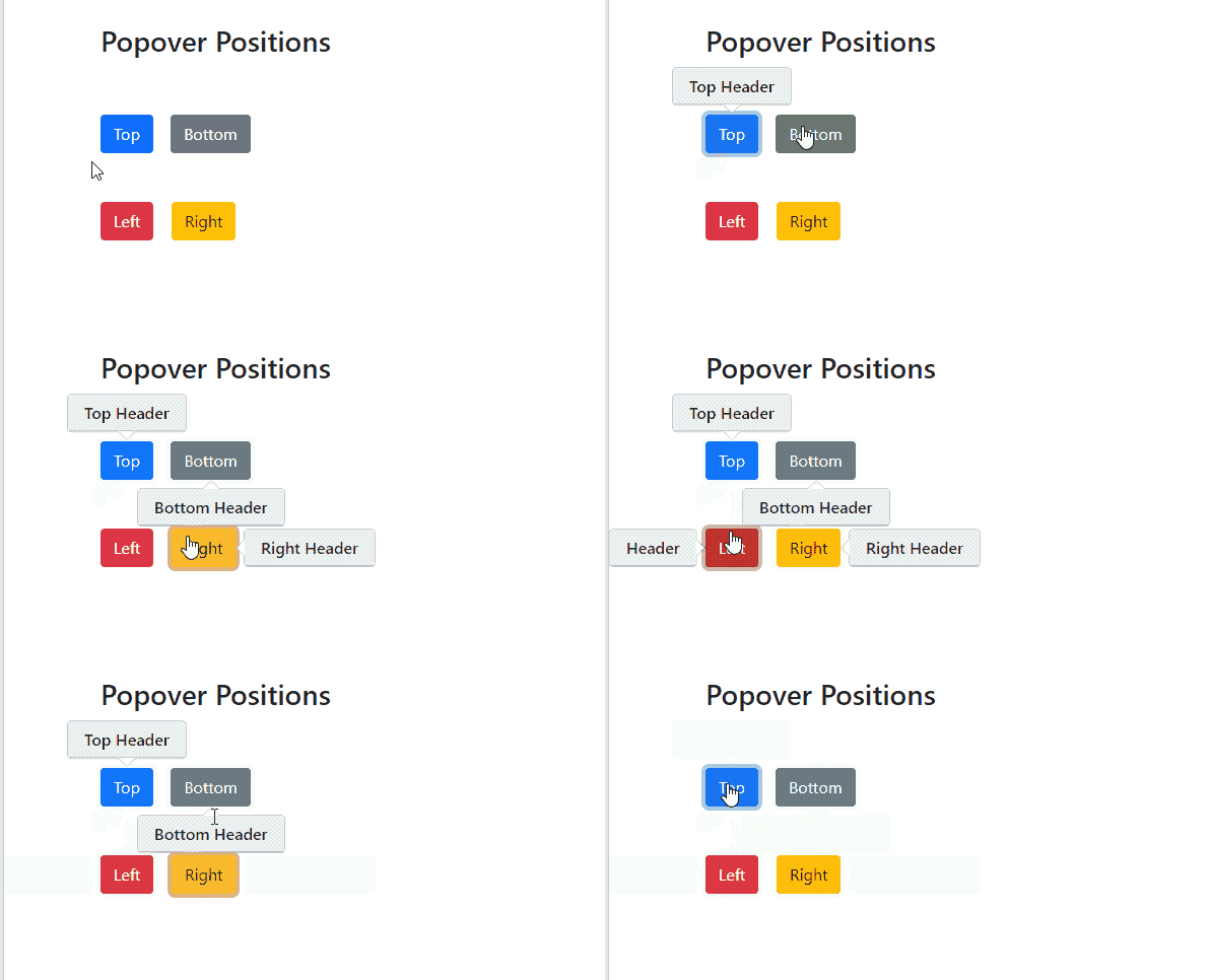
So popovers are also positioned just like tooltips, to position a popover use data-bs-placement=”top/bottom/right/left” attribute with data-bs-toggle, title and data-bs-content attributes.
Code
<h3>Popover Positions</h3>
<br><br>
<button type="button" class="btn btn-primary" data-bs-placement="top" data-bs-toggle="popover" title="Top Header" data-bs-content="" >Top</button>
<button type="button" class="btn btn-secondary" data-bs-placement="bottom" data-bs-toggle="popover" title="Bottom Header" data-bs-content="" >Buttom</button><br><br><br>
<button type="button" class="btn btn-danger" data-bs-placement="left" data-bs-toggle="popover" title="Left" data-bs-content="" >Left</button>
<button type="button" class="btn btn-warning" data-bs-placement="right" data-bs-toggle="popover" title="Right Header" data-bs-content="" >Right</button>
</div>
This is how popover positions are specified.
Closing Popovers
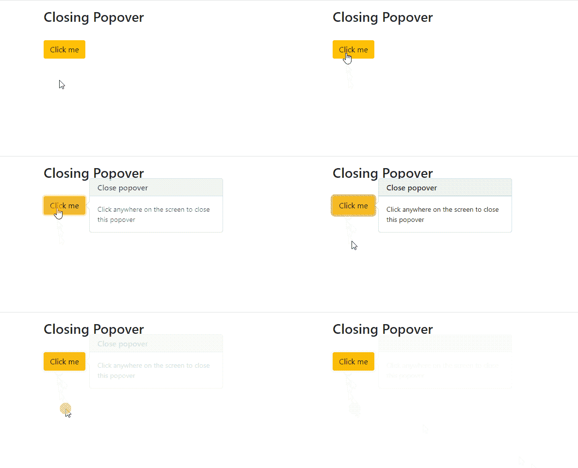
Popovers are closed only when you click the element or button again to which you click before to make it visible. However, if you want to close the popover by clicking anywhere on the screen, just add data-bs-trigger=”focus” attribute to your button or element.
Code
This process closes a popover when you click anywhere on the screen.
Popover on hover
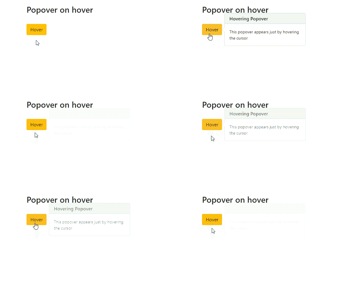
As we know popovers are only visible when clicking on a button or element, but if you want that popover to be visible just by hovering the cursor over the element or button just like the tooltip, then add the data-bs-trigger=” hover” attribute to your button or element.
Code
This is how popover appears on hovering.
Conclusion
Popover is created by adding the data-bs-toggle=“popover” attribute. Its header is created by adding Title=“Header Text” attribute and its body is created by adding the data-bs-content=“body text” attribute to your element or button. To enable popover to write a javascript code as written in the article. As popover is closed only by clicking on the element or button again, so for closing by clicking anywhere on the screen just add data-bs-trigger=“focus” attribute, and if you want to open popover by hovering the cursor only add attribute data-bs-trigger=“hover”.


