A website’s navigation bar consists of several menus linked to different website sections. More specifically, the navigation bar is a page header usually positioned at the website’s top. Using the Bootstrap framework, we can create a navigation bar with great ease. Bootstrap also offers several classes with predefined styles to adjust the navigation bar.
This article will guide you on the Bootstrap navigation bar by illustrating the below topics:
- How to Create a Simple Bootstrap Navigation Bar?
- How to Add a Drop-Down Menu to the Navigation Bar?
- How to Add Icons to the Navigation Bar?
- How to Align Navigation Menus?
- How to Create a Dark Navigation Bar?
- How to Fix the Position of the Navigation Bar?
- How to Make a Navigation Bar Collapsing?
How to Create a Simple Bootstrap Navigation Bar?
To create a simple navigation bar using the Bootstrap framework, follow the below steps:
- First, add the “<nav>” tag with the “.navbar” and “.navbar-default” classes.
- Add a “<div>” tag with the class “container-fluid” to add content to the navigation bar.
- To include a logo, create a “<div>” and assign it a class “navbar-header”.
- Within this div element, add a “<a>” tag to make the logo clickable, and set a class “navbar-brand” to it.
- After that, create a list of menus by utilizing the <ul> tag with the “nav” and “navbar-nav” classes.
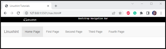
- Inside the <ul> tag, include the <li> tags to specify the items. Place the page names using the <a> tag to make them clickable:
<div class="container-fluid">
<div class="navbar-header">
<a class="navbar-brand" href="#">WebSiteName</a>
</div>
<ul class="nav navbar-nav">
<li class="active"><a href="#">Home Page</a></li>
<li><a href="#">First Page </a></li>
<li><a href="#">Second Page</a></li>
<li><a href="#">Third Page </a></li>
<li><a href="#">Fourth Page</a></li>
</ul>
</div>
</nav>
The description of the important Bootstrap classes utilized in the above code snippet is given below:
- “navbar” class has predefined styles to create a standard navigation bar.
- “navbar-default” is used to create a default navigation bar.
- “navbar-expand-lg” class is adjusted to provide color schemes classes and create a responsive collapsing.
- “container-fluid” provides a full-width container.
- “navbar-header”, an architectural class, allocated the area in pixels to the left of the navbar, which permits the logo to fill the whole space. It also provides responsiveness to the navbar-brand class having a logo and avoids overlapping the menu with the logo.
- “navbar-brand” places the logo image or text at the top of the navigation bar.
Output
How to Add a Drop Down Menu to the Navigation Bar?
You can add a drop-down menu to the navigation bar by utilizing the “dropdown” class.
Follow the steps to see how to adjust a drop-down menu in the navigation bar:
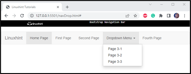
- Add <li> element to the list where you want to add a drop-down menu and assign it a class “dropdown”.
- To make the menu clickable, allocate the menu name within the <a> tag. Assign it a class “dropdown-toggle” and attributes “data-toggle” and “href” to add a link to it. Then, to append a caret symbol, mention a “caret” class.
- To list the menu items, specify the <ul> tag with the “dropdown-menu” class.
- Within this <ul> element, mention the list items by using the <li> elements. Each of them holds the <a> tag to set links to it:
<a class="dropdown-toggle" data-toggle="dropdown" href="#">Dropdown Menu
<span class="caret"></span></a>
<ul class="dropdown-menu">
<li><a href="#">Page 3-1</a></li>
<li><a href="#">Page 3-2</a></li>
<li><a href="#">Page 3-3</a></li>
</ul>
</li>
In the above code:
- “dropdown” class indicates the dropdown menu.
- “dropdown-toggle” helps to create an interactive dropdown on clicking the menu toggles.
- “caret” creates the arrow icon.
- “data-toggle” attribute is used to display a hide section on click.
Output
How to Add Icons to the Navigation Bar?
There are various glyph icons in Bootstrap that can be used free of cost. More specifically, we need an inline element, such as “<span>,” to embed icons in the navigation bar.
To do so, set the class attribute of the <span> element as “glyphicon”, add a space and then mention the “glyphicon-name” as the class name:
<li><a href="#"><span class="glyphicon glyphicon-search"></span> Search</a></li>
<li><a href="#"><span class="glyphicon glyphicon-log-in"></span> Login</a></li>
</ul>
Output
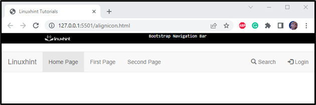
How to Align Navigation Menus?
Bootstrap offers several classes to set the alignment of navigation menus. For instance, the “.navbar-right” class adjusts the menu’s alignment to the right.
Example
Check out the example below that shows how to adjust the two list items to be aligned right:
<li><a href="#"><span class="glyphicon glyphicon-search"></span> Search</a></li>
<li><a href="#"><span class="glyphicon glyphicon-log-in"></span> Login</a></li>
</ul>
Output
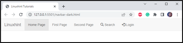
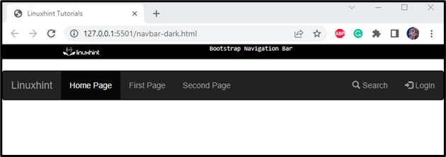
How to Create a Dark Navigation Bar?
The “navbar-inverse” class is utilized to convert the color of the navigation bar to dark as follows:
Output
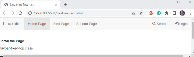
How to Fix the Position of the Navigation Bar?
Many Bootstrap position utilities can be allocated to set the position of the navigation bar. For instance, the “.navbar-fixed-top” fixes the navigation bar on the top of the page:
Output
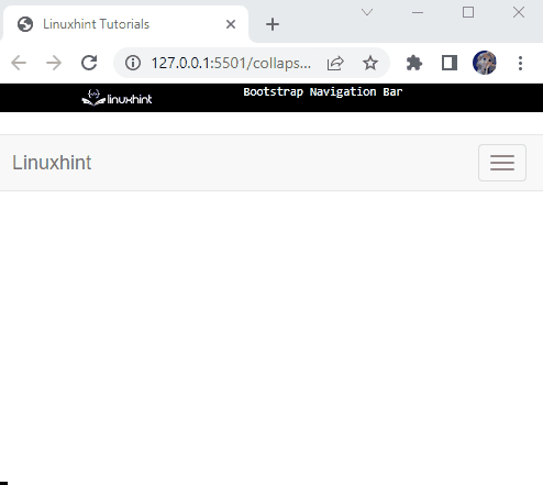
How to Make a Navigation Bar Collapsing?
As we know, the main aim of the Bootstrap framework is responsiveness. So, to set the navigation bar on small screen sizes, let’s add a button to expand the navigation bar on click.
To design a hamburger button, add three bar icons in the <span> element. The “icon-bar” class displays the bar icon. Then, set the attribute “data-toggle” with the “collapse” value. The “data-target” attribute is assigned the “#myNavbar” pointing to the id of the div:
<span class="icon-bar"></span>
<span class="icon-bar"></span>
<span class="icon-bar"></span>
</button>
Here:
- “navbar-toggle” extends the elements.
- “data-toggle” with the value “collapse” determines the collapsible element hidden or visible on click.
- “data-target” attribute selects the CSS selector to which the collapse operation is applied. The “#myNavbar” is the id of the div element.
Then, wrap the navigation menu items in a div element having id “myNavbar”:
In the above code snippet:
- “collapse” indicates the content that shows or hides.
- “navbar-collapse” signifies the navigation menu items in the mobile view.
The below-given output signifies that the navigation bar is collapsed in a button:
On small screens, such as on mobile, the navigation bar is displayed and visible when the button is clicked:
That’s it! You have learned about creating the Bootstrap navigation bar using different classes.
Conclusion
To create a Bootstrap navigation bar, first, utilize the HTML <ul> and <li> tags to make a list of menus along with the Bootstrap classes. Moreover, several Bootstrap classes are utilized to create a responsive navigation bar for our website, such as “.navbar”, “.navbar-expand-xl|lg|md|sm”, “.nav-brand”, and many more. This article has explained how to create a Bootstrap navigation bar having different features.