While creating forms in a web application, we require a variety of components, including input fields, radio buttons, checkboxes, and more. More specifically, several Bootstrap classes are utilized to adjust the size of these form components, like “form-control-*” and “input-group-*”. The “*” symbolizes the classes that define the size, where “lg” represents large and “sm” refers to small.
This post will guide:
- Method 1: How to specify input size using “form-control” class?
- Method 2: How to specify input size using “input-group” class?
- Method 3: How to specify input size using Width “w” class?
Method 1: How to Specify Input Size Using “form-control” Class?
The “form-control” class in Bootstrap is utilized to style textual form controls like “<textarea>”, “<input>”, and “<select>”. It provides general styling to the input elements, such as appearance, sizing, and more.
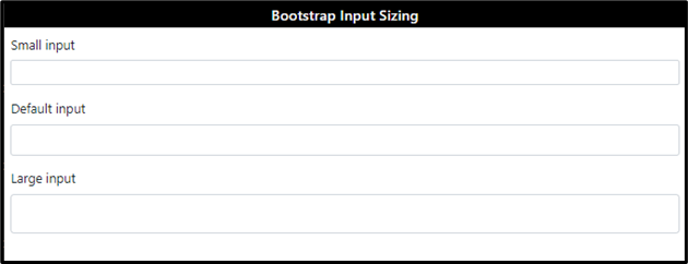
To adjust the sizing of the form controls, the “form-control-*” class is used. The asterisk “*” symbolizes the size class. Moreover, the “form-control-lg” indicates a large form-control, “form-control-sm” defines the small form-control, and without mentioning any class, the medium size will be applied to the input field.
Example
In this example, we will create three inputs specifying the “form-control” and different “form-control-*” classes:
<label for="inputsm">Small input</label>
<input class="form-control form-control-sm" id="inputsm" type="text">
</div>
<div class="form-group">
<label for="inputdefault">Default input</label>
<input class="form-control" id="inputdefault" type="text">
</div>
<div class="form-group">
<label for="inputlg">Large input</label>
<input class="form-control form-control-lg" id="inputlg" type="text">
</div>
Output
Method 2: How to Specify Input Size Using “input-group” Class?
The “input-group” class is utilized to provide general styling to the input groups. The input groups refer to the input fields having an icon, button, text, or more.
To adjust the size of the input group, the class “input-group-*” is utilized, where the asterisk “*” symbol indicates the size by specifying the “lg” for large, “sm” for small, otherwise medium.
Example
The below example represents the two input groups separated by a “<br>” tag. Each consists of an input field and a button:
<input type="text" class="form-control" placeholder="Username">
<button class="btn btn-primary">Submit</button>
</div>
<br>
<div class="input-group input-group-sm">
<input type="text" class="form-control" placeholder="Username">
<button class="btn btn-primary">Submit</button>
</div>
Output
Method 3: How to Specify Input Sizing Using Width “w” Class?
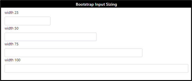
The width “w-*” class is utilized to adjust the width of the input fields as follows:
- “w-25” sets the input’s width to 25% of the parent.
- “w-50” sets the input’s width to 50% of the parent.
- “w-75” sets the input’s width to 75% of the parent.
- “w-100” sets the input’s width to 100% of the parent.
Example
In this example, the input fields are specified with the “form-control” and “w-*” classes:
<label for="ex1">width 25</label>
<input class="form-control w-25" id="ex1" type="text">
<label for="ex2">width 50</label>
<input class="form-control w-50" id="ex2" type="text">
<label for="ex3">width 75</label>
<input class="form-control w-75" id="ex3" type="text">
<label for="ex3">width 100</label>
<input class="form-control w-100" id="ex3" type="text">
</div>
Output
It can be observed that the specified width has been applied to the added input field.
Conclusion
To adjust the size of the textual input fields, the “form-control-*” class is utilized. To set the sizing of input groups, the “input-group-*” class is utilized. Whereas the “w-*” class is used to determine the width of the input fields. The asterisk “*” indicates the classes such as “lg”, “sm”, and any number, respectively. This post has explained how to adjust the size of the inputs in Bootstrap.


