This write-up will describe:
How to Resize an Image Using Bootstrap?
The “img-fluid” class is utilized to make the image responsive. Responsive images are those which automatically resize according to the screen sizes. The “img-fluid” class has predefined CSS properties “max-width” with the value “100%” and “height” with the value “auto”.
Check out the example to understand the stated concept.
HTML
Add the HTML “<img>” element with the “src”, “class”, and “alt” attributes, where:
- “src” attribute sets the image’s path.
- “class” is set with the “img-fluid” class to make it responsive.
- “alt” specifies the alternate text that will be displayed if the image is unable to load:
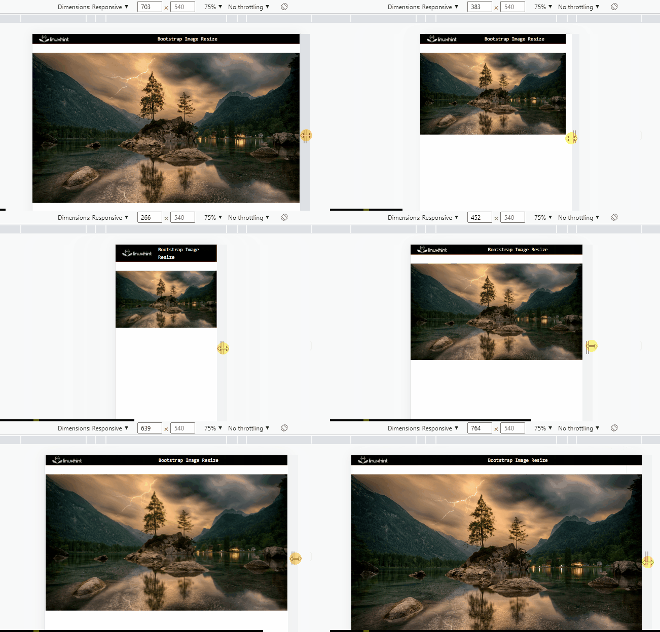
As you can see, the responsive image has been successfully created:
How to See Image Size on Different Screens?
On the web page, right-click and choose the “Inspect” option. As a result, the Developers Tool Window will open, from where you have to click on the “Toggle device toolbar” feature:
Then, click on the “Dimensions: Responsive” option. A drop-down menu will appear. Select the options and see how the image will look on that particular device:
This is how the images can be resized using Bootstrap.
Conclusion
The Bootstrap “img-fluid” class is utilized to make the images responsive. This class has a predefined CSS “max-width” property with the value “100%” and “height” with the value “auto”. To make the image resizable according to the screen sizes, first, add the image using the “<img>” element and associate the “img-fluid” class with it. This write-up has demonstrated how to make the image resize using Bootstrap.


