This write-up will explain how to make the top fixed navbar not stretch out of the container.
How to Make a Top Fixed Navbar?
The “fixed-top” class is utilized to make the navbar fixed at the top of the viewport. It has a predefined CSS “position” property with the value “fixed” with some other properties.
Example
Let’s implement the “fixed-top” class to the navbar and see its effect:
- First, add a “<nav>” element with the “navbar”, “navbar-expand-md”, “bg-light”, and “fixed-top” classes.
- Include the logo by using the “navbar-brand” class.
- Then, add the “<button>” element to create a button. This will display on the screen when the screen is reduced means all the items will be collapsed which is applied using the “data-toggle” attribute with the value “collapse”. On clicking the button, the navbar items will be displayed like a menu.
- Specify the “<div>” element with the “collapse” and “navbar-collapse” classes.
- Add the navbar items in the form of an unordered list.
- Then, make the search bar using the “<form>” element.
HTML
<a class="navbar-brand" href="#"> navbar</a>
<button class="navbar-toggler" type="button" data-toggle="collapse" data-target="#navbarCollapse">
<span class="navbar-toggler-icon"></span>
</button>
<div class="collapse navbar-collapse" id="navbarCollapse">
<ul class="navbar-nav mr-auto">
<li class="nav-item active"><a class="nav-link" href="#">Home</a></li>
<li class="nav-item"><a class="nav-link" href="#">Contact</a></li>
</ul>
<form class="form-inline mt-2 mt-md-0">
<input class="form-control mr-sm-2" type="text" placeholder="Search">
<button class="btn btn-outline-success my-2 my-sm-0" type="submit">Search</button>
</form>
</div>
</nav>
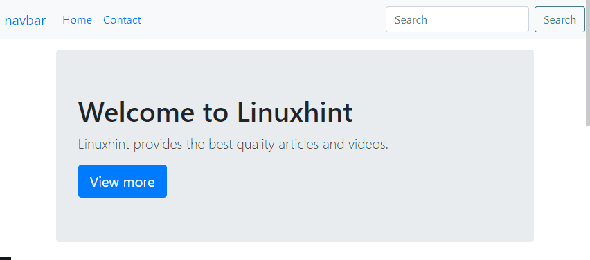
So far, we have created a navigation bar. Now, let’s add some content to the web page:
You can observe from the below GIF the navigation bar’s position is fixed at the viewport’s top:
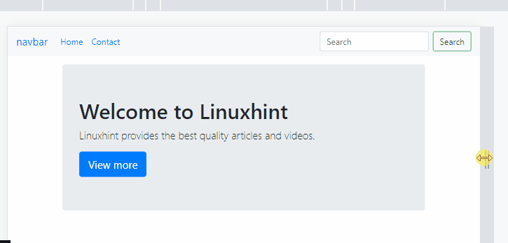
From the below GIF, it can be seen that, on increasing or decreasing the screen size, the navigation bar is stretching accordingly:
The below section will demonstrate how to make the top fixed navbar stay in the container and not stretch with the help of practical examples.
How to Make Top Fixed Navbar Not Stretch out of the Container?
Bootstrap’s “container” class offers a responsive fixed-width container. This class helps the navbar to stay in a container and avoids its stretching.
Example
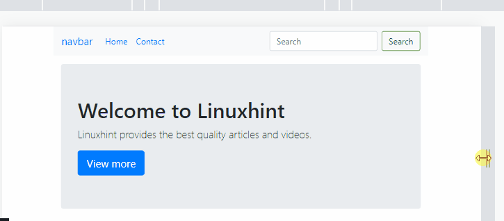
Assign the “container” class to the “<nav>” element:
The below GIF displays that the navbar is not stretching, and on increasing or decreasing the screen size, it stays in a container:
That was all about how to make the top fixed navbar stay in the container and not stretch.
Conclusion
To make the top fixed navbar, the Bootstrap “top-fixed” class is utilized. On scrolling the web page, the navbar will not be affected. However, on increasing or reducing the screen size, the navbar stretches accordingly. To avoid the navbar from stretching, assign the “container” class to the “<nav>” element. This write-up has demonstrated how to make the top fixed navbar not stretch out of the container.