Grid System
Bootstrap’s Grid system divides the page into 12 columns. As in the example below .col class is used to make columns and all the grid system is dependent on this .col class. This grid system is the best approach to stack the content horizontally and allow the page utilization to maximum.
Code
<div class="container mt-5">
<div class="row">
<div class="col aqua">.col</div>
<div class="col yellow">.col</div>
<div class="col orange">.col</div>
<div class="col blue">.col</div>
<div class="col skin">.col</div>
<div class="col pink">.col</div>
<div class="col aqua">.col</div>
<div class="col yellow">.col</div>
<div class="col orange">.col</div>
<div class="col blue">.col</div>
<div class="col pink">.col</div>
<div class="col skin">.col</div>
</div>
</div>
</body>
To make different layouts we use .row and .col class.
Col class without any size
If you didn’t specify the size of the columns, .col class automatically divides the row equally according to the number of divs with .col classes in it.
Code
In this example I only add three divs with the .col class without specifying the number of columns but the .col class automatically gives the merging of 4 columns to each div and covers 12 columns collectively.
Col class with size
If the columns sizes are specified, then .col class divides the row according to the specified size from 0-12.
Code
In this example I add three divs with .col class and specify the number of columns as 4, 6 and 2. Now these three columns still cover 12 columns space but now with different sizes. This helps a user to manage the content in a page and utilize it to maximum.
Example 2
This example is for the problem in which the size of the divs exceeds 12.
Code
Now in this example the first 2 divs already cover 10 columns in a row leaving the space for two more columns but the third div comes with the columns size 5 which results in moving the third div to the next row to cover 5 column space which leaves 2 columns space in the first row empty. So to avoid this kind of a problem, always make sure to divide columns in a way which covers 12 columns space collectively in a row.
Col class with breakpoints
.col class is also used with different breakpoints to control the content view on different screens.
- .col-xxl
- .col-xl
- .col-lg
- .col-md
- .col-sm
Code
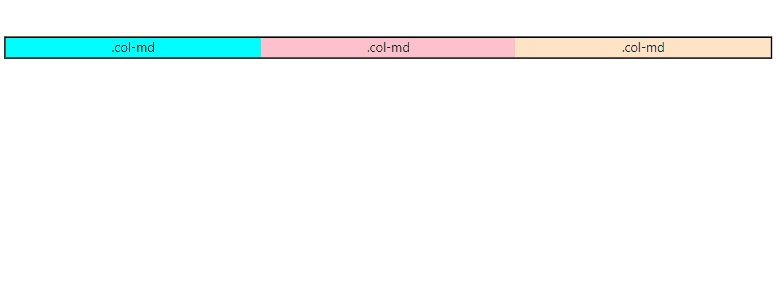
In above example three divs are created using .col-md class is act just like .col class but the difference between simple .col class and .col-md class is that .col class distribute columns equally to each div, then act same on every screen size but .col-md class also distribute columns equally among each div but it remain same only on xxl, xl, lg and md screen sizes but as soon as it goes below medium screen size all the divs cover whole 12 columns each which result in making three rows and stack them vertically.
Col class with breakpoints and sizes
.col class is also used with different breakpoints to control the content view on different screens, but to see these classes in action must specify their sizes too.
- .col-*
- .col-xxl-*
- .col-xl-*
- .col-lg-*
- .col-md-*
- .col-sm-*
Replace * with the number from 0-12.
Code
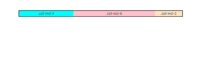
In above example I apply .col-md-* class on three divs with the size 4,6,2, as it shown that this class is applicable on double extra large(xxl), extra large(xl), large(lg) and medium(md) screen as soon as screen size goes below medium(md) screen all the divs resize them self and cover 12 columns each which result in 3 rows and each row is stacked vertically. This is how dynamic and flexible layouts are created.
Conclusion
To work in a bootstrap grid, use .row class and wrap it around .col class if you want to assign equal columns to each div but if you want to assign different number of columns to each div then use .col-{size} (0-12) to divs as your requirement. However, if you want to make more flexible and dynamic layout use .col class with breakpoints(xxl/xl/lg/md/sm), plus specify their sizes (0-12) too .col-{breakpoint}-{size}.


