This post will illustrate:
- How to Create a Card in Bootstrap?
- Cards Border Colors in Bootstrap
- How to Add Border Color to Cards in Bootstrap?
How to Create a Card in Bootstrap?
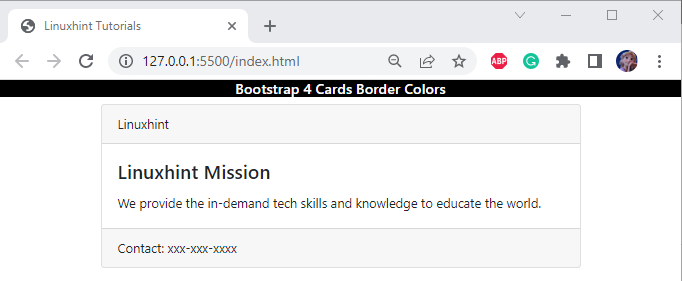
The Bootstrap “card” class can be used to create a card. You can specify the card heading, text, and components for the card by utilizing the classes, such as “card-title”, “card-body”, and “card-footer”:
<div class="card-header">Linuxhint</div>
<div class="card-body">
<h4 class="card-title">Linuxhint Mission</h4>
<p class="card-text">We provide the in-demand tech skills and knowledge to educate the world.</p>
</div>
<div class="card-footer">Contact: xxx-xxx-xxxx</div>
</div>
Output
Cards Border Colors in Bootstrap 4
Several Bootstrap classes are utilized to apply colorful borders around the card. Some of them are given below:
| Border classes | Description |
| border-warning | This class applies the yellow color to the border. |
| border-success | This class applies the green color to the border. |
| border-danger | This class applies the red color to the border. |
| border-light | This class applies the light gray color to the border. |
| border-info | This class applies the sky-blue color to the border. |
| border-primary | This class applies the blue color to the border. |
| border-dark | This class applies the dark gray color to the border. |
| border-secondary | This class applies the gray color to the border. |
How to Add Border Color to Cards?
For a better understanding, let’s add a “border-success” class within the “<div>” element having class “card” to see the effect.
Example 1: Adding Border Color to a Single Card in Bootstrap
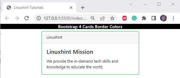
In this example, the “border-success” class is utilized to apply the green border around the card:
The given output verifies that the green border has been successfully applied around the card:
Check out the example below that represents other classes of border color applied to the cards.
Example 2: Adding Border Colors to Multiple Cards in Bootstrap
Here, we are adding border colors to multiple cards in Bootstrap with the help of the specified classes:
<div class="card-header">Linuxhint</div>
<div class="card-body">
<h4 class="card-title">Linuxhint Mission</h4>
<p class="card-text">We provide the in-demand tech skills and knowledge to educate the world.</p>
</div>
<div><br>
<div class="card border-primary m-auto" style="width: 600px;">
<div class="card-header">Linuxhint</div>
<div class="card-body">
<h4 class="card-title">Linuxhint Mission</h4>
<p class="card-text">We provide the in-demand tech skills and knowledge to educate the world.</p>
</div>
</div><br>
<div class="card border-danger m-auto" style="width: 600px;">
<div class="card-header">Linuxhint</div>
<div class="card-body">
<h4 class="card-title">Linuxhint Mission</h4>
<p class="card-text">We provide the in-demand tech skills and knowledge to educate the world.</p>
</div>
</div>
Output
Example 3: Adding Border Colors to Multiple Components of a Single Card in Bootstrap
Users can also apply border colors around other card components. For instance, we have applied the border color classes on the card, card header, and card footer:
<div class="card-header border-info">Linuxhint</div>
<div class="card-body">
<h4 class="card-title">Linuxhint Mission</h4>
<p class="card-text">We provide the in-demand tech skills and knowledge to educate the world.</p>
</div>
<div class="card-footer border-info">Contact: xxx-xxx-xxxx</div>
</div>
Output
That’s all about applying Card’s Border colors in Bootstrap 4.
Conclusion
The “card” class is utilized to create a card in Bootstrap. To add a border around the card, the “border” class with the color class is implemented, such as the “border-primary” class used for a blue border, “border-danger” for a red border, and many more. This blog has explained the card’s border colors in Bootstrap 4.


