This article is about flex classes in bootstrap 5 and following points are discussed in detailed
- Flexbox Containers
- Flexbox Directions
- Justify Content
- Align Items
- Wrapping Classes
- Align Self
Bootstrap 5 Flex Classes
D-flex
In bootstrap 5 flex containers are created by using the .d-flex class. d-flex class container expands to the full-width which means it expands to the width of the screen but the item in it expands according to their content.
Code
.d-*-flex is also used with breakpoints just replace the (*) symbol with xxl, xl, lg, md or sm. Using breakpoints makes this class responsive for other screens as well.
D-inline-flex
In bootstrap 5 flex containers are created by using the .d-inline-flex class. d-inline-flex class container expands according to the number of items and the content area items covered in it.
Code
.d-*-inline-flex is also used with breakpoints just replace the (*) symbol with xxl, xl, lg, md or sm. Using breakpoints makes this class responsive for other screens as well.
Flex Directions
Flex-row-reverse
.flex-row-reverse class is used to change the direction of the items in reverse. This flexbox class is only used with the .row class. This class will also be used with different breakpoints
Code
.flex-*-row-reverse is also used with breakpoints just replace the (*) symbol with xxl, xl, lg, md or sm. Using breakpoints makes this class responsive for other screens as well.
Flex-column
.flex-column class is used to convert rows into columns. This class is also used with the .row class.
Code
.flex-*-column is also used with breakpoints just replace the (*) symbol with xxl, xl, lg, md or sm. Using breakpoints makes this class responsive for other screens as well.
Flex-column-reverse
.flex-column-reverse class, convert rows into columns and also change the direction of the flex items in reverse. This class is also used with .row class.
Code
.flex-*-column-reverse is also used with breakpoints just replace the (*) symbol with xxl, xl, lg, md or sm. Using breakpoints makes this class responsive for other screens as well.
Flex-wrap
.flex-wrap class is used to wrap the items inside the container and with this class the overflow of the flex items is managed. By default items are wrapped but you can still use this class to wrap the items that
overflows the flex container.
Code
.flex-*-wrap is also used with breakpoints just replace the (*) symbol with xxl, xl, lg, md or sm. Using breakpoints makes this class responsive for other screens as well.
Flex-nowrap
.flex-nowrap class is used where you don’t want your flex items to be wrapped because by default flex items are wrapped inside the flex container due to its responsive behavior so you can use flex-nowrap class to unwrap your items.
Code
.flex-*-nowrap is also used with breakpoints just replace the (*) symbol with xxl, xl, lg, md or sm. Using breakpoints makes this class responsive for other screens as well.
Flex-wrap-reverse
.flex-wrap-reverse class is not only used to wrap flex items inside a container but also reverse their order.
Code
.flex-*-wrap-reverse is also used with breakpoints just replace the (*) symbol with xxl, xl, lg, md or sm. Using breakpoints makes this class responsive for other screens as well.
Flex-Fill
.flex-fill class is only used with the .col class without any breakpoint or width. Flex-fill class takes the 100% width of the container and forces the other flex items to divide the space equally. Flex-fill class can be applied on multiple flex-items and only on the flex items.
Code
.flex-*-fill is also used with breakpoints just replace the (*) symbol with xxl, xl, lg, md or sm. Using breakpoints makes this class responsive for other screens as well.
Justify Content
Justify-content classes are used to justify flex items in a row direction or in other words along the main axis.
Justify-content-start
.justify-content-start class, moves the flex items to the left side of the container. This class is only used with the .d-flex class.
Code
.justify-content-*-start is also used with breakpoints just replace the (*) symbol with xxl, xl, lg, md or sm. Using breakpoints makes this class responsive for other screens as well.
Justify-content-end
.justify-content-end class, moves the flex items to the right side of the container. This class is only used with the .d-flex class.
Code
.justify-content-*-end is also used with breakpoints just replace the (*) symbol with xxl, xl, lg, md or sm. Using breakpoints makes this class responsive for other screens as well.
Justify-content-center
.justify-content-center class, gather all the flex items in the center of the container. This class is only used with the .d-flex class.
Code
.justify-content-*-center is also used with breakpoints just replace the (*) symbol with xxl, xl, lg, md or sm. Using breakpoints makes this class responsive for other screens as well.
Justify-content-between
.justify-content-between class is used to place spaces between the flex items. This class places the first flex item at the start of the container and the last flex item at the end of the container and divides all the space equally between the remaining flex items .This class is only used with the .d-flex class.
Code
.justify-content-*-between is also used with breakpoints just replace the (*) symbol with xxl, xl, lg, md or sm. Using breakpoints makes this class responsive for other screens as well.
Justify-content-around
.justify-content-around class is used to divide space equally among all the flex-items. This class is only used with the .d-flex class.
Code
.justify-content-*-around is also used with breakpoints just replace the (*) symbol with xxl, xl, lg, md or sm. Using breakpoints makes this class responsive for other screens as well.
Align Content
Align content classes are used to align the content in column direction or in other words along the cross axis only. To align the flex items, use the .d-flex class with the .flex-wrap class.
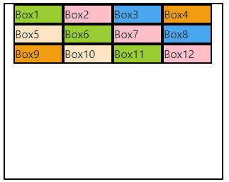
Align-items-start
.align-items-start class, align the flex items at the top of the container.
Code
<div class="row">
<div class="d-flex flex-wrap align-items-start mt-3 a">
<div class="w yellow" >Box1</div>
<div class="w pink" >Box2</div>
<div class="w blue" >Box3</div>
<div class="w orange" >Box4</div>
<div class="w skin" >Box5</div>
<div class="w yellow" >Box6</div>
<div class="w pink" >Box7</div>
<div class="w blue" >Box8</div>
<div class="w orange" >Box9</div>
<div class="w skin" >Box10</div>
<div class="w yellow" >Box11</div>
<div class="w pink" >Box12</div>
</div>
</div>
</div>
.align-items-*-start is also used with breakpoints just replace the (*) symbol with xxl, xl, lg, md or sm. Using breakpoints makes this class responsive for other screens as well.
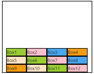
Align-items-end
.align-items-end class, align the flex items at the bottom of the container.
Code
<div class="row">
<div class="d-flex flex-wrap align-items-end mt-3 a">
<div class="w yellow" >Box1</div>
<div class="w pink" >Box2</div>
<div class="w blue" >Box3</div>
<div class="w orange" >Box4</div>
<div class="w skin" >Box5</div>
<div class="w yellow" >Box6</div>
<div class="w pink" >Box7</div>
<div class="w blue" >Box8</div>
<div class="w orange" >Box9</div>
<div class="w skin" >Box10</div>
<div class="w yellow" >Box11</div>
<div class="w pink" >Box12</div>
</div>
</div>
</div>
.align-items-*-end is also used with breakpoints just replace the (*) symbol with xxl, xl, lg, md or sm. Using breakpoints makes this class responsive for other screens as well.
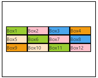
Align-items-center
.align-items-center class, vertically centered the flex items in a container.
Code
<div class="row">
<div class="d-flex flex-wrap align-items-center mt-3 a">
<div class="w yellow" >Box1</div>
<div class="w pink" >Box2</div>
<div class="w blue" >Box3</div>
<div class="w orange" >Box4</div>
<div class="w skin" >Box5</div>
<div class="w yellow" >Box6</div>
<div class="w pink" >Box7</div>
<div class="w blue" >Box8</div>
<div class="w orange" >Box9</div>
<div class="w skin" >Box10</div>
<div class="w yellow" >Box11</div>
<div class="w pink" >Box12</div>
</div>
</div>
</div>
.align-items-*-center is also used with breakpoints just replace the (*) symbol with xxl, xl, lg, md or sm. Using breakpoints makes this class responsive for other screens as well.
Align-items-baseline
.align-items-baseline class, align the content in the boxes according to the main axis due to which items of the container align automatically in the vertical direction.
Code
<div class="row">
<div class="d-flex flex-wrap align-items-baseline mt-3 a">
<div class="w yellow" >Box1</div>
<div class="w pink" >Box2</div>
<div class="w blue" >Box3</div>
<div class="w orange" >Box4</div>
<div class="w skin" >Box5</div>
<div class="w yellow" >Box6</div>
<div class="w pink" >Box7</div>
<div class="w blue" >Box8</div>
</div>
</div>
</div>
.align-items-*-baseline is also used with breakpoints just replace the (*) symbol with xxl, xl, lg, md or sm. Using breakpoints makes this class responsive for other screens as well.
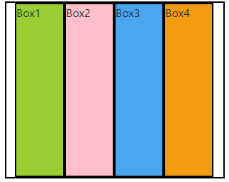
Align-items-stretch
.align-items-stretch class, expand the flex items vertically according to the height of the container.
Code
.align-items-*-stretch is also used with breakpoints just replace the (*) symbol with xxl, xl, lg, md or sm. Using breakpoints makes this class responsive for other screens as well.
Align Self
.align-self class is just like .align-items class but the difference between both classes is .align-items is applied on the flex container and it treat all the flex items with the same class that is used by flex container at that time but the .align-self class is applied on single flex item and it treat a single flex item.
Following are the .align-self classes that are used on flex items
- .align-self-start
- .align-self-end
- .align-self-center
- .align-self-baseline
- .align-self-stretch
.align-self-*-start/end/center/baseline/stretch is also used with breakpoints just replace the (*) symbol with xxl, xl, lg, md or sm. Using breakpoints makes these classes responsive for other screens as well.
Conclusion
Flexbox classes are used with d-flex class in bootstrap 5 to justify, align and manage the content either in rows or in columns. In above article flex containers classes, flex directions classes,wrapping classes, flex justifying classes to justify the items in a row, flex aligning classes to align the content in column and the classes for aligning the items itself are discussed in detail.


