Bootstrap is a well-liked front-end framework that simplifies the design and development of web-based applications. More specifically, the delete confirmation modal is a useful feature provided by Bootstrap. It can be used to prompt the user for confirmation before actually deleting something. This is a good way to avoid accidental deletions and to make the user aware of the consequences of their actions.
This write-up will describe how to create a delete confirmation modal in Bootstrap.
How to Create a Bootstrap Delete Confirmation Modal?
To create a delete confirmation modal in Bootstrap, try out the given instructions:
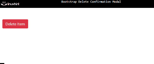
- First, create a button that will trigger the modal window. The “data-target” attribute is assigned the value “#deleteModal” which points to the id of the modal.
- Then, create a modal using the “modal” and “fade” classes.
- The “modal-dialog” class creates the dialog box.
- Then, add the “modal-content” class to specify content to the modal window. Within this class, including the class “modal-header”.
- The “modal-header” creates the header of the modal window. It contains the title and close button.
- Next, create the body section by specifying the class as “modal-body”. It comprises the note that will appear in the dialog box.
- Lastly, create the modal footer by adding the “modal-footer” class. This footer also contains two buttons.
Here is the HTML code of the discussed scenario:
<!-- Modal -->
<div class="modal fade" id="deleteModal">
<div class="modal-dialog">
<div class="modal-content">
<div class="modal-header">
<h5 class="modal-title" id="exampleModalLabel">Modal title</h5>
<button type="button" class="close" data-dismiss="modal" aria-label="Close">
<span aria-hidden="true">×</span>
</button>
</div>
<div class="modal-body">
<p>Are you sure you want to delete?</p>
</div>
<div class="modal-footer">
<button type="button" class="btn btn-secondary" id="close-modal">No</button>
<button type="button" class="btn btn-danger">Yes</button>
</div>
</div>
</div>
</div>
It can be observed that we have successfully created a Bootstrap delete confirmation modal:
This is how you can create a delete confirmation modal using Bootstrap.
Conclusion
To create a delete confirmation modal, first create a button using the classes “btn”, and “btn-danger” classes that trigger the modal window and add the attribute “data-target” with the value “id” of the modal. Then, create the modal window using the “modal” class and id. Then, specify the content of the modal using the “modal-content”, “modal-header”, “modal-body”, and “modal-footer” classes. This write-up has demonstrated how to create a delete confirmation modal in Bootstrap.