MATLAB App Designer is a visual development environment that allows us to create and design applications without the need for extensive coding. It provides drag-and-drop functionality, enabling users to quickly build interactive UIs. This article covers the key components in MATLAB that enable us to create sophisticated and intuitive applications.
MATLAB App Designer Components
To create a compelling user experience, we can utilize MATLAB’s extensive library of UI styling and customization options. These options enable us to match the application’s look and feel with its brand or adhere to specific design guidelines.
Following are some of the major categories inside the App Developer option in MATLAB:
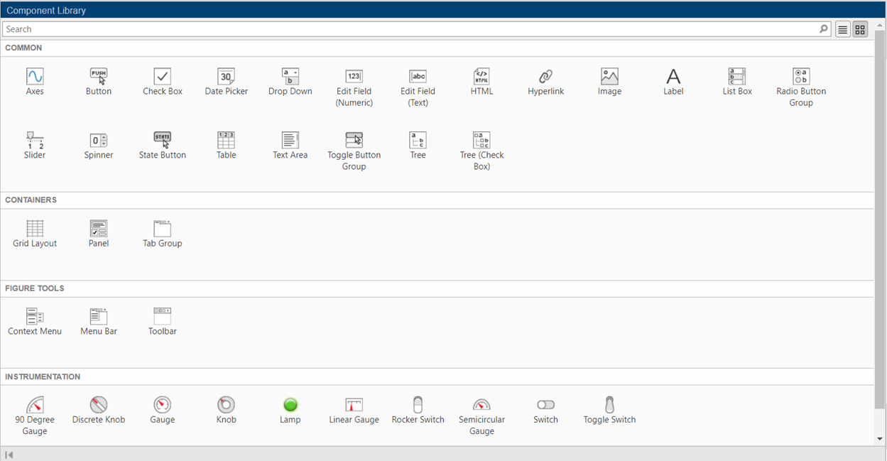
Common Components
These are pre-built graphical user interface (GUI) elements such as buttons, sliders, checkboxes, and text boxes that can be easily added to your MATLAB app. Common components provide multiple ways of interacting and controlling MATLAB applications.
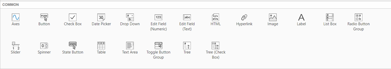
Axes: It represents a coordinate system in a MATLAB figure where you can plot data, such as lines, curves, and images.
Button: It is a clickable element that acts when pressed.
Checkbox: It is a small box that can enable or disable a specific option or feature.
Date Picker: It is a user interface element using which we can pick dates from a calendar.
Drop-Down: It is a list of options that can be expanded or collapsed, allowing the selection of a single option from the list.
Edit Field Numeric: It is an input field where numeric values can be entered by the user.
Edit Field Text: It is an input field where text or alphanumeric values can be entered by the user.
HTML: It allows displaying and rendering HTML content within the MATLAB app.
Hyperlink: It is a clickable text or image that navigates to a specific URL or location.
Image: It displays an image within the MATLAB app.
Label: It is used to display static text or descriptions.
List Box: It is a scrollable list using which we can review and select different items.
Radio Button Group: It is a group of mutually exclusive options. Using this component only one option can be chosen at once.
Slider: It is a visual control element that allows the selection of a value within a specified range by sliding a thumb along a track.
Spinner: It provides an input field with up and down arrows to increase or decrease numeric values.
State Button: It represents a button that can be used as an On or Off state for various applications.
Table: It displays tabular data in a grid format, allowing the user to view and edit the data.
Text Area: It is a multi-line input field for entering and displaying larger amounts of text.
Toggle Button Group: It is a group of buttons that can be independently toggled on or off.
Tree: It displays hierarchical data in a tree-like structure, allowing the expansion and collapse of tree nodes.
Tree (Check Box): It displays hierarchical data, but with the additional feature of checkboxes to select multiple items.
Containers
Containers are GUI elements that allow you to organize and group other components within your MATLAB app. They include panels, tabs, and grids, which help in arranging and structuring the layout of your application’s user interface.
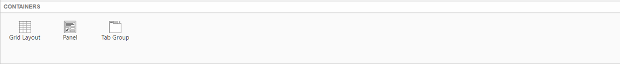
Grid Layout: It is a layout manager that arranges components in a grid-like structure.
Panel: It is a container used to group and organize components within a MATLAB app.
Tab Group: It organizes components into multiple tabs, allowing the user to switch between them.
Figure Tools
Figure Tools provide interactive visualizations and data exploration capabilities in MATLAB apps. They include features like zooming, panning, rotating, and data brushing, which enhance the user’s ability to analyze and manipulate plots and figures within the application.
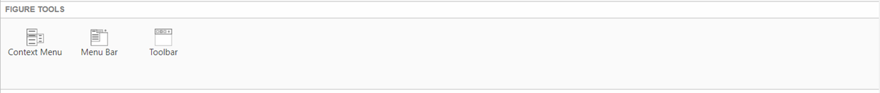
Context Menu: It is a pop-up menu that provides additional options or actions relevant to a specific component or context.
Menu Bar: It is a horizontal bar that contains a set of menus, typically used for organizing and accessing various application commands.
Toolbar: It is a collection of icons or buttons that represent frequently used actions or tools, providing quick access to those functions.
Instrumentation
Instrumentation components enable you to create interactive displays for real-time data visualization and monitoring. These components, such as gauges, meters, and scopes, help in presenting data in a meaningful way and are commonly used in applications involving data acquisition, control systems, and measurements.
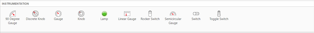
90-Degree Gauge: It is a visual element that represents a measurement value within a 90-degree.
Discrete Knob: It is a control element that allows the selection of discrete values by rotating a knob.
Gauge: It is a visual element that represents a measurement value, typically displayed as a needle pointing to a scale.
Knob: It is a control element that allows the selection of a continuous value by rotating a knob.
Lamp: It is a visual indicator that represents a binary state, such as On or Off, typically displayed as.
Conclusion
MATLAB offers a comprehensive set of components that simplify the process of app building. From UI design to data visualization and deployment, we can use MATLAB’s capabilities to create user-friendly applications. By utilizing MATLAB’s app-building components, we can save time, reduce complexity, and deliver high-quality apps that meet the demands of today’s digital world.