In MATLAB when we create a new plot the axes are automatically created. However, understanding how to modify and customize these axes can greatly enhance the clarity and presentation of your visualizations.
This article will cover all the different techniques and ways of modifying axes in a MATLAB plot.
Changing Axes in MATLAB
Now we will cover different MATLAB techniques for modifying the axis in MATLAB:
1: Change Axis Using Axis Function
2: Change Axis Using xlim and ylim Function
3: Change Axis Using Set Function
4: Adjusting Axis Labels
5: Customizing Tick Marks
6: Changing Axis Properties
7: Reverse Axis Direction
8: Display Axis Lines through Origin
1: Change Axis Using Axis Function
There are a few ways to change the axis in MATLAB. One is by using the MATLAB axis function. The axis function takes three arguments:
- Minimum value of the axis
- Maximum value of the axis
- Step size
Example Code
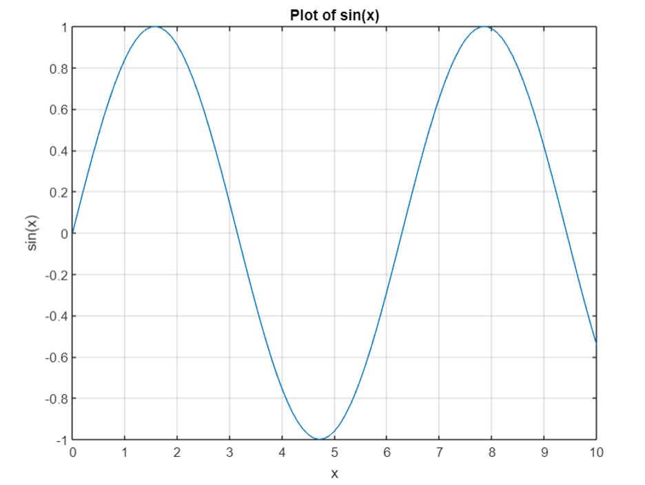
For example, to change the x-axis to range from 0 to 10 with a step size of 1, use the following code:
Here we generate some sample data x and y using a step size of 0.1. Then, we plot the data using the plot function. After that, we use the axis function to change the x-axis range to 0 to 10 and the y-axis range to -1 to 1. It the end of the code, we added labels, a title, and grid lines to the plot.
2: Change Axis Using xlim and ylim Function
Another way to change the axis is to use the xlim and ylim functions.
The xlim function takes two arguments:
- Minimum value of the x-axis
- Maximum value of the x-axis
The ylim function takes two arguments:
- Minimum value of the y-axis
- Maximum value of the y-axis
Example Code
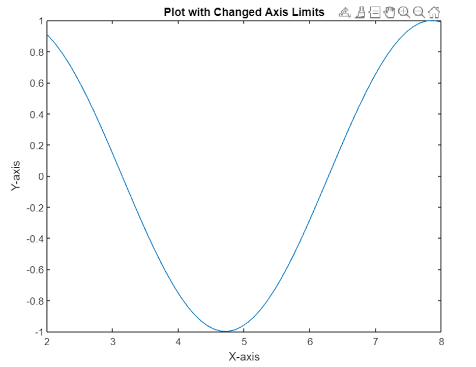
Here’s a simple MATLAB code example that explains how to change the axis limits using the xlim and ylim functions:
This code started by creating a sine wave plot. Then, we use the xlim function to change the x-axis limits to the range from 2 to 8, and the ylim function to change the y-axis limits to the range from -1 to 1. In the end, we add labels to the x and y axes, as well as a title to the plot.
3: Change Axis Using Set Function
We can also change the axis by using the set function. The set function takes two arguments:
- Name of the property we want to change
- New value of the property
Example Code
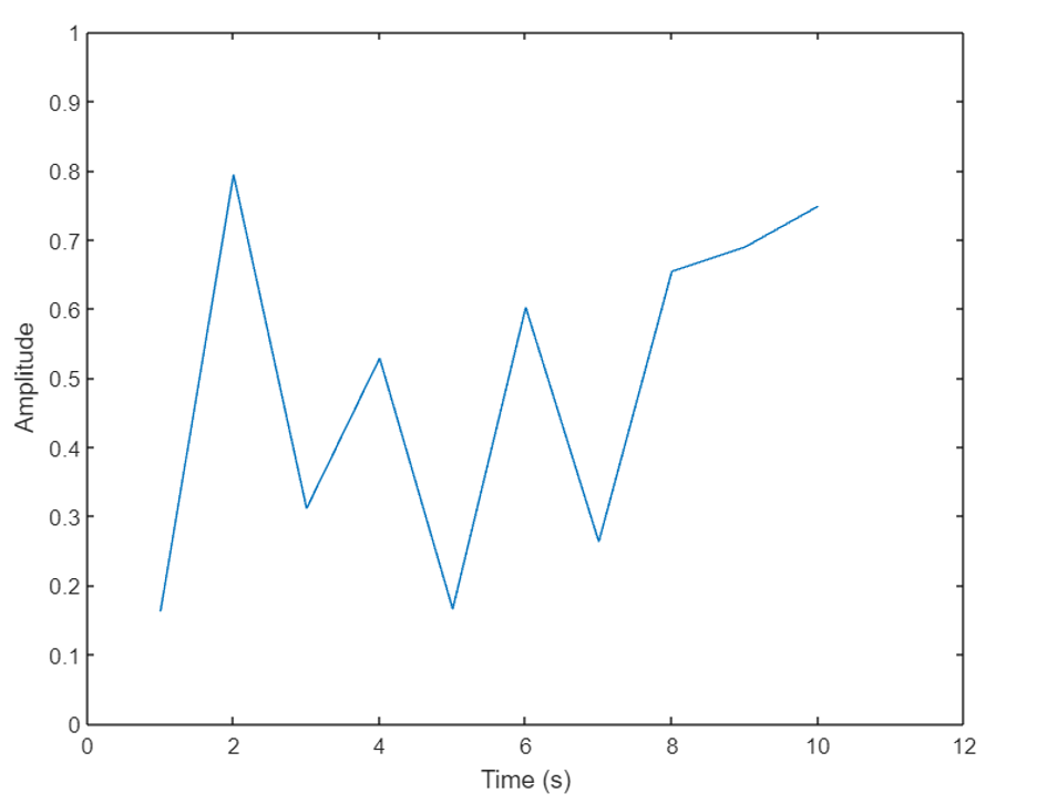
Here’s a simple MATLAB code example that shows how to change the axis limits using the set function:
x = 1:10;
y = rand(1, 10);
plot(x, y);
% Change the x-axis limits and label
newXAxisLimits = [0, 12];
newXAxisLabel = 'Time (s)';
set(gca, 'XLim', newXAxisLimits);
xlabel(newXAxisLabel);
% Change the y-axis limits and label
newYAxisLimits = [0, 1];
newYAxisLabel = 'Amplitude';
set(gca, 'YLim', newYAxisLimits);
ylabel(newYAxisLabel);
Here we created a sample plot using the plot function. Then, we use the set function to change the x-axis limits and label by accessing the current axes object (gca) and specifying the property name (XLim) and the new value (newXAxisLimits). The gca is used here which is a handle to the current axes of the plot.
Similarly, we change the y-axis limits and labels by specifying the property name (YLim) and the new value (newYAxisLimits). We updated the x-axis label using the xlabel function and the y-axis label using the ylabel function.
4: Adjusting Axis Labels
MATLAB allows us to adjust axis labels to make them more informative and visually appealing. We can modify the labels using the xlabel, ylabel, and zlabel functions for X, Y, and Z-axes, respectively.
These functions accept a string argument that represents the label text. We can customize the labels by specifying the font, font size, color, and other properties using additional optional parameters.
Example Code
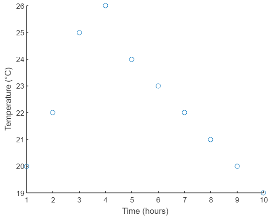
Next, let’s consider an example of adjusting axis labels to provide more descriptive information about the plotted data. The below-given code plots a scatter plot. The x and y axes of this plot represent time and temperature values respectively.
In this example, we create a scatter plot using the scatter function. To make the plot more informative, we adjust the X-axis label using the xlabel function and provide the label as “Time (hours)”. Similarly, we adjust the Y-axis label using the ylabel function and provide the label as “Temperature (°C)”.
5: Customizing Tick Marks
Tick marks are the small marks or indicators along the axes that help users read and interpret the plotted data accurately.
We can use the xticks, yticks, and zticks functions to specify the positions of the tick marks on the respective axes. Additionally, the xticklabels, yticklabels, and zticklabels functions are used to customize the labels associated with the tick marks. By providing a vector of values for the tick positions and a cell array of strings for the labels, we can have full control over the appearance of the tick marks.
Example Code
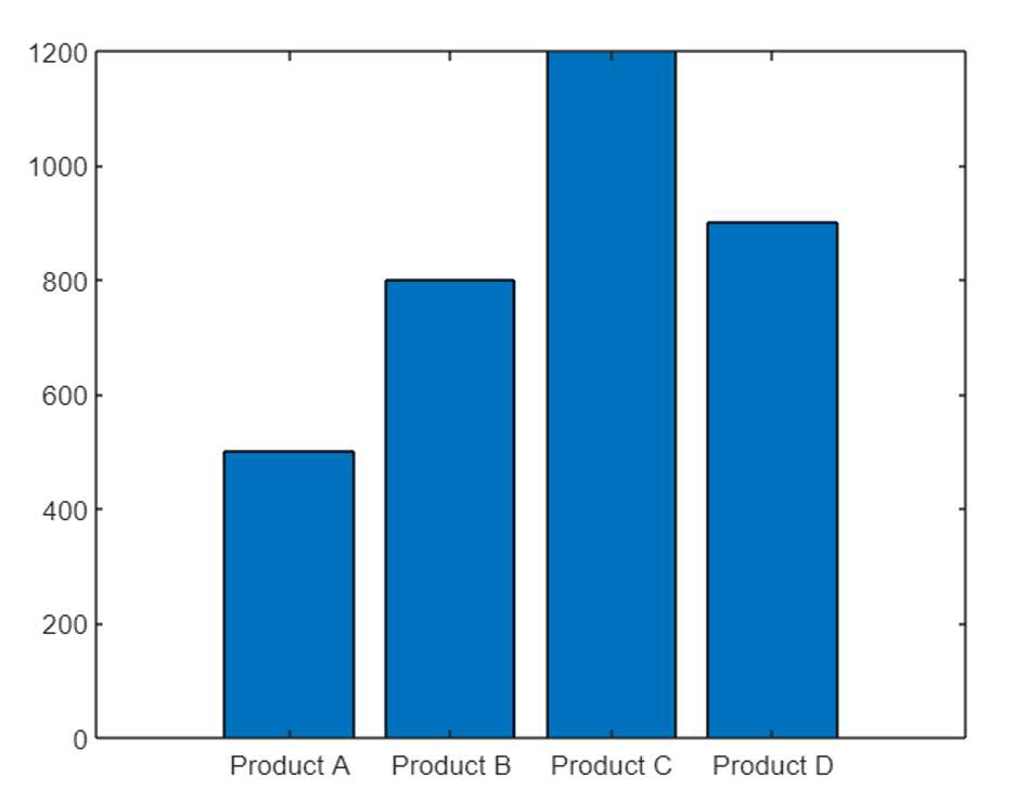
Now let’s explore an example of customizing tick marks on the axes. Suppose we have a bar plot representing sales data for different products.
products = {'Product A', 'Product B', 'Product C', 'Product D'};
sales = [500, 800, 1200, 900];
% Create a bar plot
bar(sales);
% Customize the X-axis tick marks and labels
xticks(1:4);
xticklabels(products);
Here we defined an array of product names and their respective sales. Next bar function will plot a bar graph for the defined data. To customize the X-axis tick marks, we use the xticks function and specify the positions as 1 to 4 (corresponding to the number of products). We then customize the X-axis labels using the xticklabels function and provide an array of product names.
6: Changing Axis Properties
In addition to modifying axis limits, labels, and tick marks, MATLAB allows us to change various other properties of the axes to fine-tune their appearance. Some common properties include the axis color, line style, line width, font size, and more.
You can access and modify these properties using the set function in combination with the handle to the axes object. By specifying the desired property name and its new value, we can customize the appearance of the axes according to requirements.
Example Code
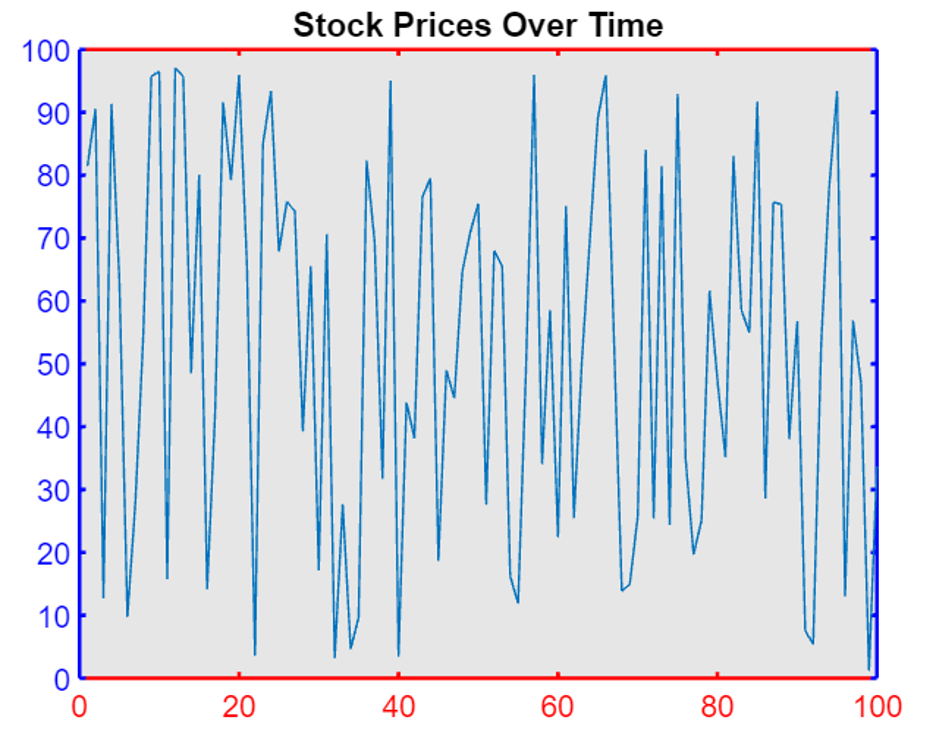
In the example below we have a line plot representing the stock prices of a company over time. This example modifies the axis properties.
time = 1:100;
stockPrices = rand(1, 100) * 100;
% Create a line plot
plot(time, stockPrices);
% Change axis properties
ax = gca; % Get current axes handle
% Modify axis color
ax.XColor = 'red';
ax.YColor = 'blue';
% Adjust line width
ax.LineWidth = 1.5;
% Change font size of axis labels
ax.FontSize = 12;
% Add a title to the axes
title('Stock Prices Over Time');
% Set the background color of the axes
ax.Color = [0.9, 0.9, 0.9];
In this example, we generated a random stock price over time and created a line plot using the plot function. We then obtain the handle to the current axes using the gca function.
We changed the color of the X-axis to red and the color of the Y-axis to blue. We also adjust the line width of the plot to 1.5, increase the font size of the axis labels to 12, add a title to the axes, and set the background color of the axes to a light gray shade.
7: Reverse Axis Direction
In MATLAB we can control values direction along the x and y axis by adjusting the XDir and YDir attributes of the Axes object.
In MATLAB, XDir refers to the direction of the x-axis in a plot (e.g., ‘normal’ for increasing values from left to right, ‘reverse’ for decreasing values). Similarly, YDir refers to the direction of the y-axis (e.g., ‘normal’ for increasing values from bottom to top, ‘reverse’ for decreasing values).
Now we will modify these attributes to either ‘reverse’ or ‘normal’ (the default) values. After that, we will use the gca command to get axes objects with new settings.
Example Code
The code uses MATLAB to plot the numbers 1 to 10 on a graph with the x-axis reversed and the y-axis normal.
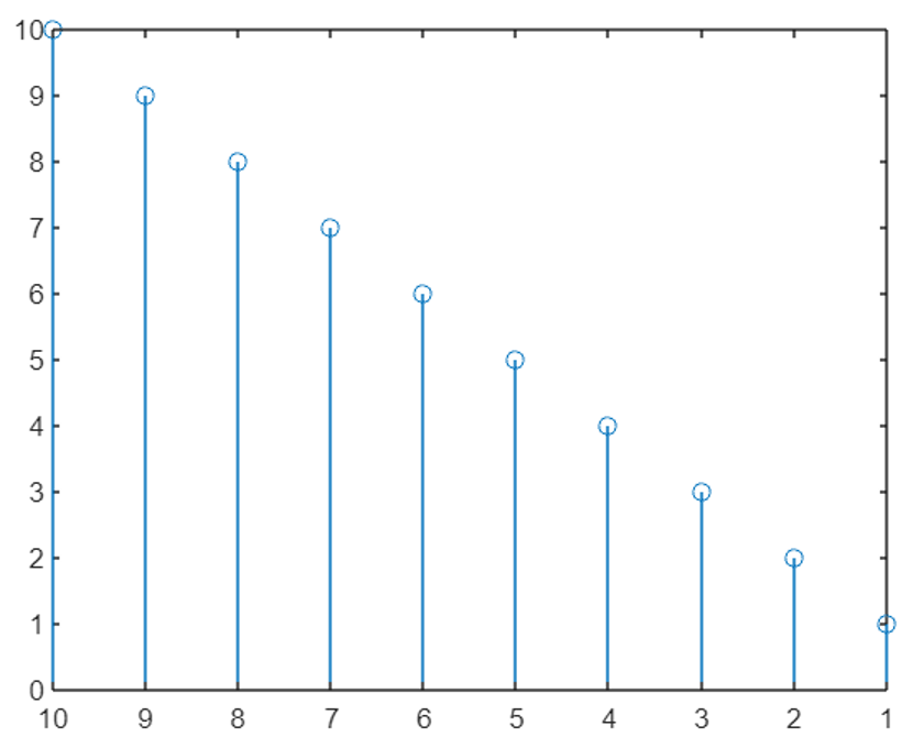
Now we can see that the value of the y-axis is now reversed and plotted from bottom to top instead of the default top-to-bottom approach.
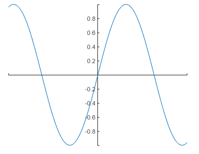
8: Display Axis Lines through Origin
The x and y axes are by default on the outer bounds of the plot. We can modify the axis location and can pass the MATLAB plot from the origin (0,0) by setting the location for both the x and y axis using the XAxisLocation and YAxisLocation properties.
The x-axis location can be displayed at the top, bottom, or origin. Similarly, the y-axis can also be displayed on the left, right, or origin. We can only modify the axis location in a 2-D plot.
Example Code
In the following example, both the x and y axis are set to origin so our plot will pass from the center of the plot.
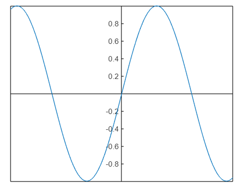
To remove the axes box outline we can use the box off property:
Here are some additional MATLAB functions to modify and change the axis:
- autoscale: Automatically set axis limits to data range.
- grid: Add grid lines to the axis.
- colormap: Change axis colormap.
- title: Add axis title.
- xlabel and ylabel: Add x and y axis labels.
Conclusion
Changing axis properties in MATLAB can display detailed and informative plots. MATLAB has different properties to modify the axis limits, adjusting labels, customizing tick marks, and changing the color of text and background. In MATLAB we have different functions like xlim, ylim, and set function to modify our plot. All of these are discussed in this article, read for more information.