
This post provides various ways to set the axis labels of the given seaborn plot. Let’s start with the following methods:
- Using the “axes.set()” Function.
- Using the “matplotlib.pyplot.xlabel()” and “matplotlib.pyplot.ylabel()” Functions.
- Using the “set_xlabel()” and “set_ylabel()” Functions.
Method 1: Using the “axes.set()” Function
The “axes.set()” function is used to set the “x” and “y” labels of the given seaborn plot which can be demonstrated in the below code.
Example
Following is an example code:
import matplotlib.pyplot as plt
import pandas
df = pandas.DataFrame({"Day 1": [7,1,5,6,3,10,5,8],
"Day 2" : [1,2,8,4,3,9,5,2]})
ax = seaborn.scatterplot(data=df)
ax.set(xlabel='Day_1', ylabel='Day-2')
plt.show()
In the above code:
- The libraries named “seaborn”, “matplotlib.pyplot” and “pandas” are imported.
- The “pd.DataFrame()” function is used to create the data and store it in a variable called “df”.
- The “sns.scatterplot()” function takes the created “data” as its argument and plots a scatter graph.
- The “ax.set()” function is used to set the “xlabel” and “ylabel” of the scatter plot.
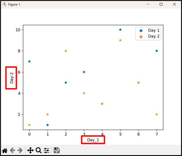
Output

In the above output, the axis of the given seaborn plot has been set appropriately.
Method 2: Using the “matplotlib.pyplot.xlabel()” and “matplotlib.pyplot.ylabel()” Functions
The “matplotlib.pyplot.xlabel()” and “matplotlib.pyplot.ylabel()” functions of the matplotlib library are used to set the “x” and “y” labels of the seaborn plot.
Example
Let’s understand it via the following example:
import matplotlib.pyplot as plt
import pandas
df = pandas.DataFrame({"Day 1": [7,1,5,6,3,10,5,8],
"Day 2" : [1,2,8,4,3,9,5,2]})
seaborn.scatterplot(data=df)
plt.xlabel("Day_1")
plt.ylabel("Day-2")
plt.show()
In the above lines of code:
- Firstly, the required libraries are imported.
- After that, the “sns.scatterplot()” function takes the input data created using the “pd.DataFrame()” function and plots the scatter plot.
- The “plt.xlabel()” and “plt.ylabel()” function is used to label the “x” and “y” axes.
Output
This output implies that the axis of the given seaborn plot has been set.
Method 3: Using the “set_xlabel()” and “set_ylabel()” Functions
Matplotlib axes instance type objects are returned by a “seaborn” plot. The “set_xlabel()” and “set_ylabel()” functions are used to set the “x” and “y” axes labels respectively.
Example
Here is an example code:
import matplotlib.pyplot as plt
import pandas
df = pandas.DataFrame({"Day 1": [7,1,5,6,3,10,5,8],
"Day 2" : [1,2,8,4,3,9,5,2]})
z = seaborn.scatterplot(data=df)
z.set_xlabel("Day_1")
z.set_ylabel("Day-2")
plt.show()
In the above code block:
- Recall the discussed approaches for creating a data frame and returning the scatter plot graph.
- Now, apply the “set_xlabel()” and “set_ylabel()” functions to set the labeling of the “x” and “y” axes of the seaborn plot.
Output

As observed, the axis of the given seaborn plot has been set accordingly.
Conclusion
The “axes.set()” function, the Matplotlib library functions, or the “set_xlabel()” and “set_ylabel()” functions are used to set the axes of the plot. These functions take the allocated data frame values as arguments and set the axis of the seaborn plot accordingly. This post presented multiple ways to set the axis of the given seaborn plot.