Orange is a data mining software that provides its users with unique and ready-to-use solutions to everyday data analytics problems. It utilizes a visual programming interface that lets the users understand and control their data workflows in a visually intuitive manner. At its core, it uses Python-based modules that let it inherit their core functionality to be implemented on the data that is loaded into it. Apart from data mining techniques, it also provides great support for machine learning algorithms that help the users generate keen insights from their data.
Orange is widely used in the education and research domain and is considered a great tool by non-programming-based research groups. The visual programming interface called Orange Canvas makes it easy to get the work done even for people who do not have a comprehensive background in programming. The canvas works by letting the users put in widgets that represent some core functionality of a data analysis workflow. These widgets can then be stacked one after the other to create a complete pipeline that the data moves through and generates the required output.
At the end of this article, you will be able to:
-
- Download and install Orange on your Linux machine
- Understand the importance it holds for the data science community
- Learn the different ways that this toolkit can be beneficial to you
Installation
As previously discussed, Orange uses Python modules which is why it can be easily downloaded from the Python package manager called pip. To use pip, we first need to download and install it.
Follow the steps for the complete installation of Orange on your Linux machine.
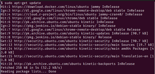
1. First, we need to update the local apt repositories using the following command:
You should get an output which is similar to this:
2. After updating the apt local repositories, you now install some Python packages that will help you download and install Orange. This is done since Orange is essentially a Python module that uses some core functionality from other Python modules to provide you with data mining and analysis capabilities.
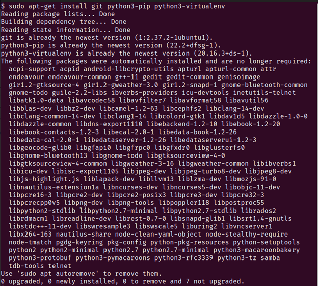
Run the following command to download the pip package manager and Python virtualenv setup:
You should get an output similar to this:
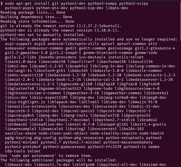
Now, run the second command that downloads all the necessary Python modules that are required by Orange to run properly:
python3-pyqt4 python-qt4-dev python3-sip-dev libqt4-dev
Note: This command can take some time to complete running depending on your internet connection.
Secondly, you might be prompted to press the Y key to accept the installation of other core packages.
You should expect an output similar to this:
3. We now create a virtual environment to install all of the Orange modules and dependencies.
Run the following commands:
Note: If the previous command does not work, run the following command:
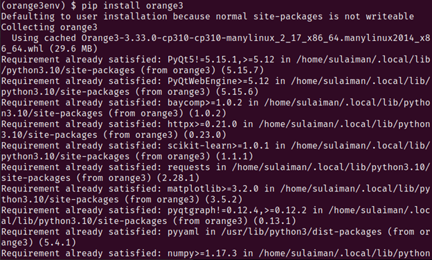
4. Install Orange by calling on pip which we previously downloaded.
Run the following command:
You should get the following output:
5. The successful output of the previous step means that Orange has been downloaded and installed using the Python package manager pip.
We now run the following command to run Orange:
Note: If the following Orange gui screens open up, that means that all of your efforts were successful and Orange is installed and opened up on your Linux machine.
User Guide
Orange is a hands on data mining and analysis tool that allows the users to create data analysis workflows in a visual and interactive manner. This means that you can create complex models using a simple drag and drop technique.
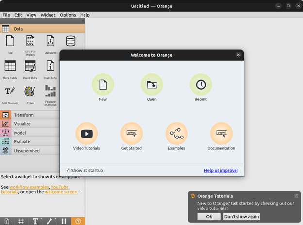
The Orange module comes with a canvas that can be used to drag and drop the widgets that represent the different functionalities. We will build a simple pipeline in this guide that imports the data into Orange and then perform some actions on that data and output the results.
For example, we can see all of the different ways in the following image in which the data can be imported into the Orange tool which include importing from SQL tables, CSV files, Paint data, and more.
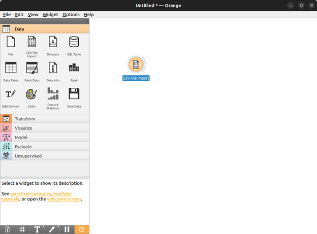
We import the data from a csv file for the purpose of this tutorial.
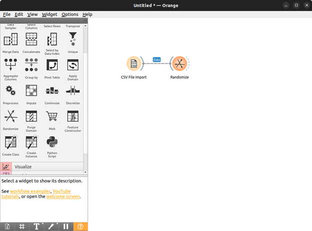
Now that we specified what data format we are expecting to input into our pipeline, we select an action that we want to perform on this data.
We now go to the Transform tab and select the randomize widget that takes all of the data entries in our data and randomize their order.
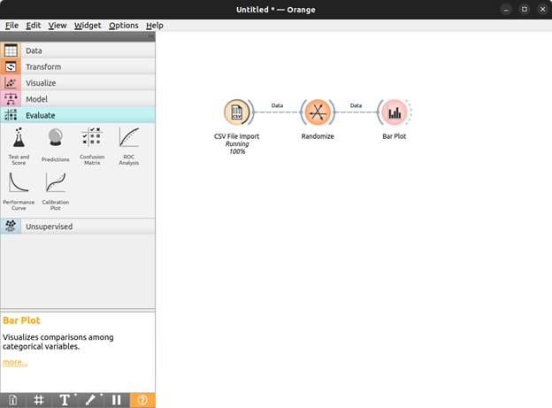
Now that we know what we want to do with our imported data, we can choose how we want to display the results of this data.
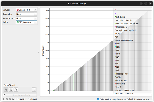
For our guide, let’s build a bar plot of the randomized data so that we can see what classes the data belongs to and how much of the data is contained in those classes.
After the data is imported into the model that we created, it automatically traverses the entire pipeline, making its way from the import to the bar plot creation. The output that we receive on our data can be seen in the following:
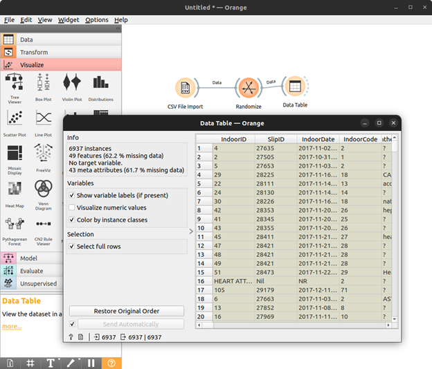
Furthermore, we can also simply display the data using the widget Data Table under the visualize category.
Conclusion
As it can be seen, working in Orange for data science is extremely easy and intuitive. All you have to do is drag and drop the different functionalities that you want your data to go through and collect the outputs. This tool is especially helpful for people who do not have a programming background but still needs to run certain assessments on their data. The research and academia communities use Orange abundantly since it allows them to generate the inference and insights on their data with relative ease and little to no prior programming knowledge.

